Track service health
The Service health tab tracks metrics about a Workload's response latency and reliability. This helps identify bottlenecks and assess capacity, which is critical to proper provisioning. For example, if a Workload seems to have generally slowed in its response times, the Service health tab can help. You might notice in the tab that median latency goes up with an increase in requests. If latency increases when a new artifact is rolled out, you can consult with your team to determine whether the new artifact can be replaced with one offering better performance.
To access Service health, select an individual Workload from the deployed Workloads list and then, from the Overview, click Monitoring > Service health. The tab provides informational tiles and a chart to help assess the activity level and health of the Workload.
Understand metric tiles and chart
DataRobot displays informational statistics based on the active settings for artifact and time frame. That is, tile values correspond to the same units as those selected on the slider. If the slider interval values are weekly, the displayed tile metrics show values corresponding to weeks. Clicking a metric tile updates the chart.
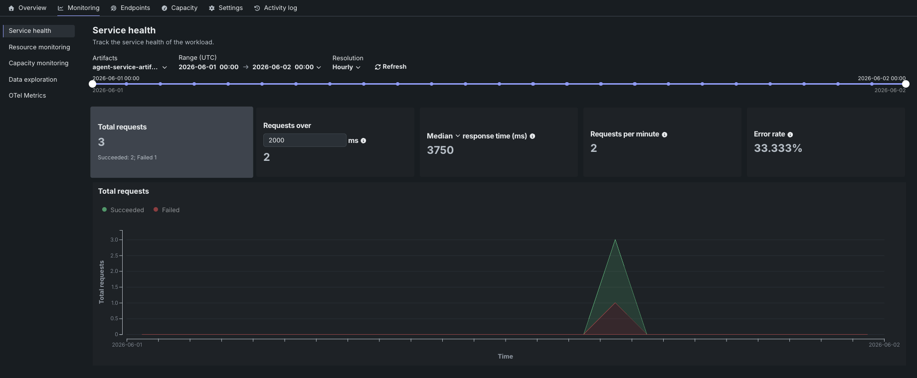
The Service health tab reports the following metrics on the dashboard:
| Statistic | Reports (for selected time period) |
|---|---|
| Total requests | The number of requests the Workload has received, with a Succeeded/Failed breakdown. |
Requests over x ms |
The number of requests where the response time was longer than the specified number of milliseconds. The default is 2000 ms; click in the box to enter a different value or adjust with the controls. |
| Response time | The time (in milliseconds) the Workload spent receiving a request, calculating the response, and returning it. The report does not include time due to network latency. Select the percentile to display from the dropdown. The display reports a dash if no requests have been made against the Workload. |
| Requests per minute | The average number of requests per minute over the selected time period. |
| Error rate | The percentage of requests that returned an error. |
You can configure the dashboard to focus the visualized statistics on specific artifacts and time frames. The following controls are available:
| Control | Description |
|---|---|
| Artifacts | Updates the dashboard displays to reflect the artifacts selected from the dropdown. |
| Range (UTC) | Sets the date range displayed for the Workload date slider. You can also drag the date slider to set the range. |
| Resolution | Sets the time granularity of the Workload date slider. Available options are Minutes, Hourly, Daily, and Weekly. |
| Refresh | Initiates an on-demand update of the dashboard with new data. |
The chart paired with the metric tiles displays individual metrics over time, helping to identify patterns in the quality of service. Clicking a metric tile updates the chart to represent that information; adjusting the data range slider focuses on a specific period.