Track service health
The Service health tab tracks metrics about a Workload's response latency and reliability. これは、ボトルネックを特定し、適切なプロビジョニングに不可欠なキャパシティを評価するのに役立ちます。 For example, if a Workload seems to have generally slowed in its response times, the Service health tab can help. You might notice in the tab that median latency goes up with an increase in requests. If latency increases when a new artifact is rolled out, you can consult with your team to determine whether the new artifact can be replaced with one offering better performance.
To access Service health, select an individual Workload from the deployed Workloads list and then, from the Overview, click Monitoring > Service health. The tab provides informational tiles and a chart to help assess the activity level and health of the Workload.
指標タイルとチャートの理解
DataRobot displays informational statistics based on the active settings for artifact and time frame. したがって、タイル値は、スライダーで選択された単位に対応します。 スライダーの間隔値が週の場合、表示されるタイル指標は週に対応します。 Clicking a metric tile updates the chart.
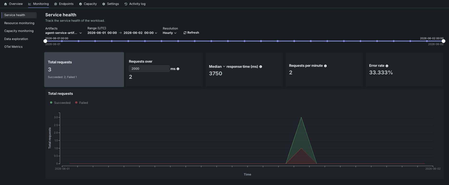
サービスの正常性タブでは、ダッッシュボード上で以下の指標をレポートします。
| 統計 | 選択した時間枠のレポート... |
|---|---|
| リクエストの合計数 | The number of requests the Workload has received, with a Succeeded/Failed breakdown. |
xミリ秒以上のリクエスト |
指定されたミリ秒よりもレスポンス時間が長かったリクエストの数。 The default is 2000 ms; click in the box to enter a different value or adjust with the controls. |
| レスポンス時間 | The time (in milliseconds) the Workload spent receiving a request, calculating the response, and returning it. レポートにはネットワークレイテンシーの時間は含まれません。 Select the percentile to display from the dropdown. The display reports a dash if no requests have been made against the Workload. |
| 1分あたりのリクエスト数 | The average number of requests per minute over the selected time period. |
| エラー率 | The percentage of requests that returned an error. |
You can configure the dashboard to focus the visualized statistics on specific artifacts and time frames. 次のコントロールを使用できます。
| コントロール | 説明 |
|---|---|
| アーティファクト | Updates the dashboard displays to reflect the artifacts selected from the dropdown. |
| 範囲 (UTC) | Sets the date range displayed for the Workload date slider. 日付スライダーをドラッグして範囲を設定することもできます。 |
| 単位 | Sets the time granularity of the Workload date slider. Available options are Minutes, Hourly, Daily, and Weekly. |
| 表示を更新 | 新しいデータを使用してダッシュボードのオンデマンド更新を開始します。 |
The chart paired with the metric tiles displays individual metrics over time, helping to identify patterns in the quality of service. Clicking a metric tile updates the chart to represent that information; adjusting the data range slider focuses on a specific period.