Usage
After deploying a model and making predictions in production, monitoring model quality and performance over time is critical to ensure the model remains effective. This monitoring occurs on the Data drift and Accuracy tabs and requires processing large amounts of prediction data. Prediction data processing can be subject to delays or rate limiting. Track prediction processing progress on the Usage tab.
Two different versions of the Usage tab are available, depending on deployment type:
- For non-agentic and non-NIM (NVIDIA Inference Microservices) deployments, this page provides prediction tracking details.
- For agentic workflow and NIM deployments, this page provides quota usage monitoring details.
Prediction tracking chart
On the left side of the Monitoring > Usage tab is the Prediction tracking chart, a bar chart of the prediction processing status over the last 24 hours or 7 days, tracking the number of processed, missing association ID, and rate-limited prediction rows. Depending on the selected view (24-hour or 7-day), the histogram's bins are hour-by-hour or day-by-day.
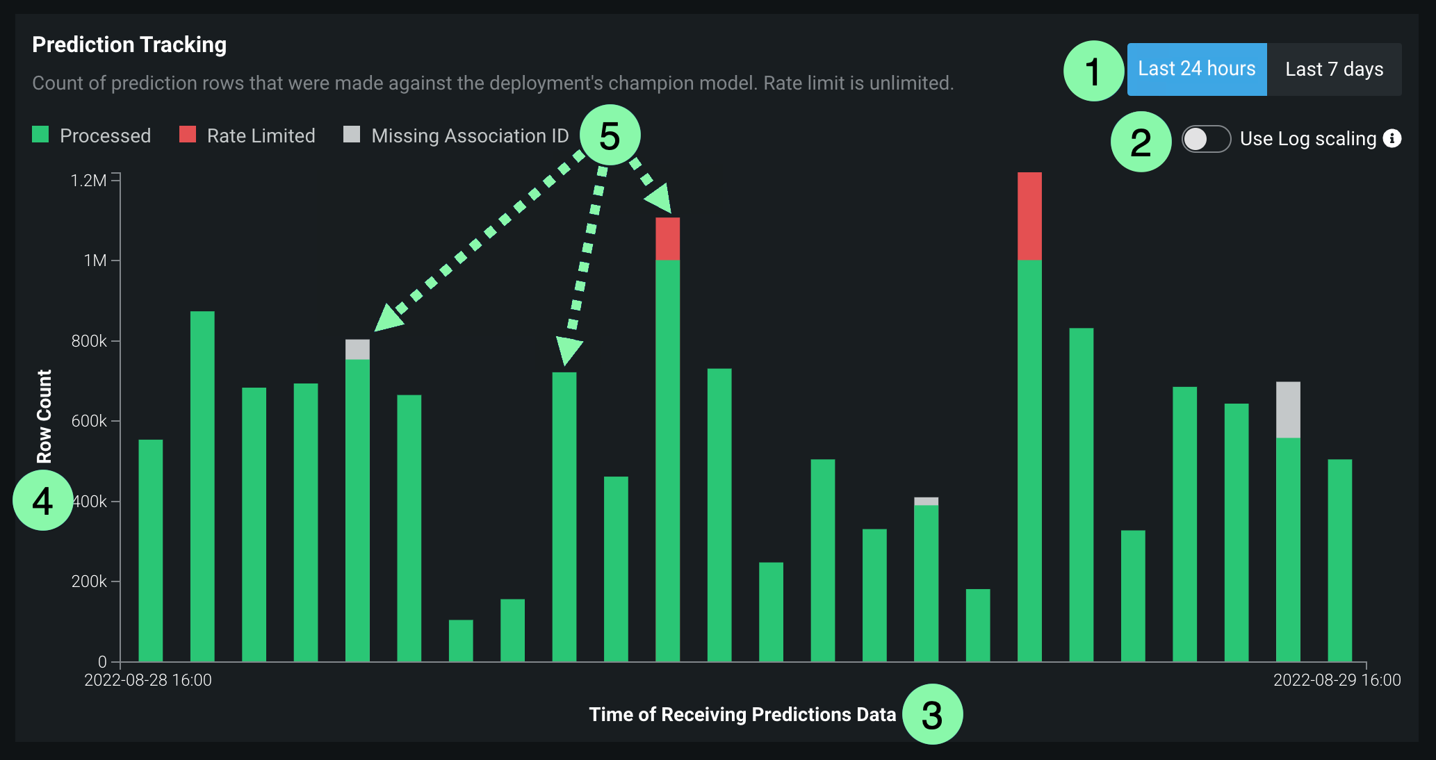
| Chart element | Description | |
|---|---|---|
| 1 | Select time period | Selects the Last 24 hours or Last 7 days view. |
| 2 | Use log scaling | Applies log scaling to the Prediction Tracking chart for deployments with more than 250,000 rows of predictions. |
| 3 | Time of Receiving Predictions Data (X-axis) |
Displays the time range (by day or hour) represented by a bin, tracking the rows of prediction data received within that range. Predictions are timestamped when a prediction is received by the system for processing. This "time received" value is not equivalent to the timestamp in service health, data drift, and accuracy. For DataRobot prediction environments, this timestamp value can be slightly later than prediction timestamp. For agent deployments, the timestamp represents when the DataRobot API received the prediction data from the agent. |
| 4 | Row Count (Y-axis) |
Displays the number of prediction rows timestamped within a bin's time range (by day or hour). |
| 5 | Prediction processing categories | Displays a bar chart tracking the status of prediction rows:
|
How does prediction rate limiting work?
The Usage tab displays the number of prediction rows subject to your organization's monitoring rate limit. However, rate limiting only applies to prediction monitoring, all rows are included in the prediction results, even after the rate limit is reached. Processing limits can be hourly, daily, or weekly—depending on the configuration for your organization. In addition, a megabyte-per-hour limit (typically 100MB/hr) is defined at the system level. To work within these limits, you should span requests over multiple hours or days.
Large-scale monitoring prediction tracking
For a monitoring agent deployment, if you implement large-scale monitoring, the prediction rows won't appear in this bar chart; however, the Predictions Processing (Champion) delay will track the pre-aggregated data.
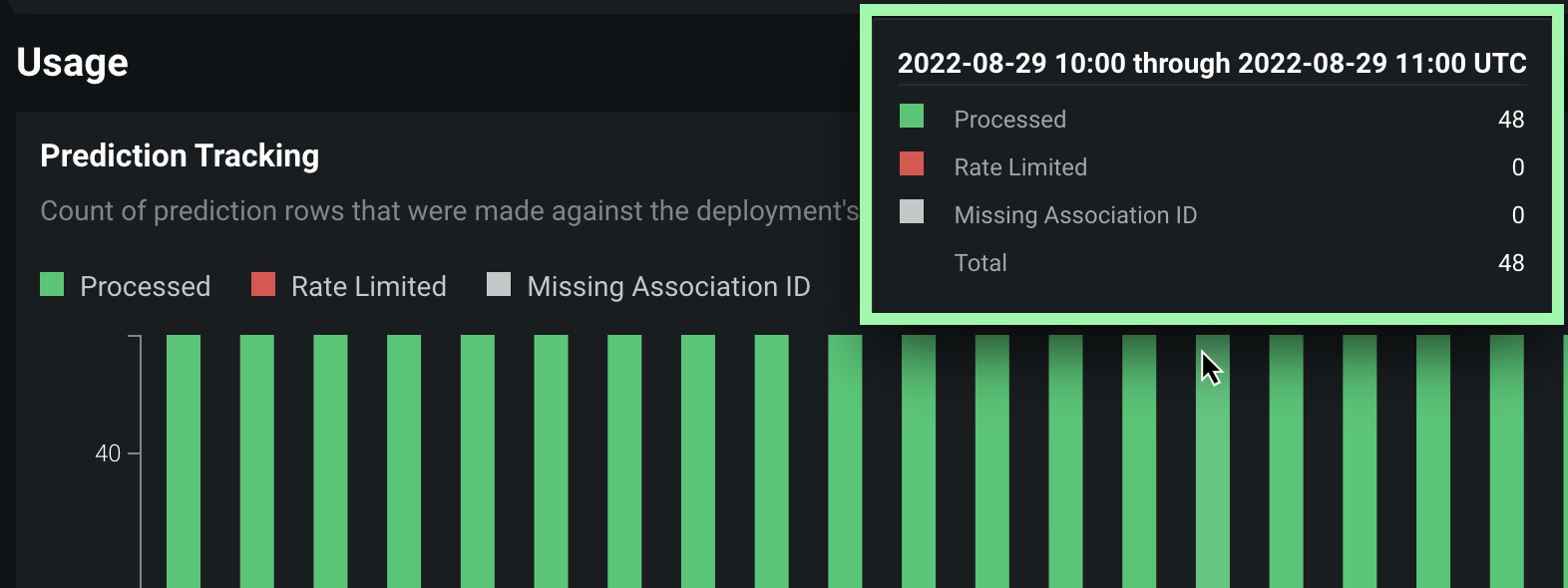
To view additional information on the Prediction Tracking chart, hover over a column to see the time range during which the prediction data was received and the number of rows that were Processed, Rate Limited, or Missing Association ID:
Prediction and actuals processing delay
On the right side of the Usage tab are the processing delays for Predictions Processing (Champion) and Actuals Processing (the delay in actuals processing is for all models in the deployment):
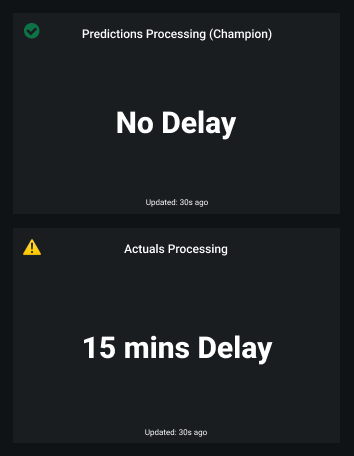
The Usage tab recalculates the processing delays without reloading the page. You can check the Updated value to determine when the delays were last updated.
Predictions and actuals upload limits
Availability information
Configurable predictions and actuals upload limits are off by default. Contact your DataRobot representative or administrator for information on enabling this preview feature.
Feature flag: Enable Configurable Prediction and Actuals Limits
From the Usage tab, you can monitor the hourly, daily, and weekly upload limits configured for your organization's deployments. View charts that visualize the number of predictions and actuals processed and tiles that display the table size limits for returned prediction results.
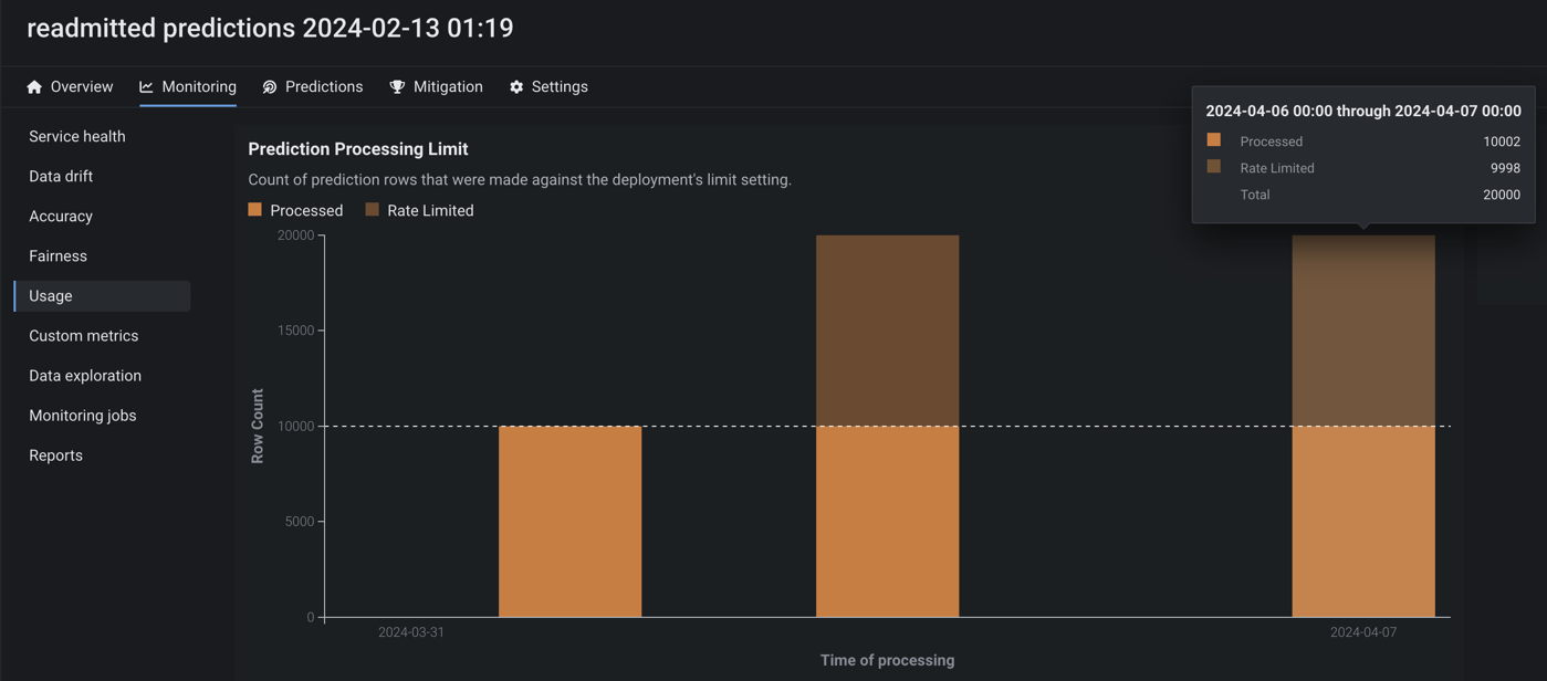
The Totals tile shows how many predictions and actuals have been processed relative to the configured interval limit (displayed at the bottom of the tile). Additionally, you can view the table size limit for returned prediction results. The table size limits the number of prediction rows stored in DataRobot's database for a deployment. DataRobot stores one row per prediction (or two, for binary classification deployments). For multiclass deployments, information for all classes is stored in one row. Note that the table limit does not change when you change the time interval limit (hourly, daily, weekly). Any request that exceeds the table limit will be rejected, regardless of the time.
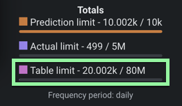
If you reach the exact processing limit value (for example, uploading 50,000 actuals in an hour with 50,000 as the limit), and you make an additional request (uploading 10,000 more actuals), then DataRobot processes the additional request and none of the actuals are rate limited. However, DataRobot treats predictions differently because they are processed in smaller chunks. A small chunk is processed, while the remaining predictions are rate limited. For example, if you reached a 50,000 prediction limit and uploaded 50,000 more, a chunk of 1,000 predictions may be processed as part of the small chunk.
You can view the prediction limits configured for a deployment by navigating to the Settings > Service Health tab to know when you can make predictions next if you have already reached the processing limit.

Quota usage monitoring
On the Monitoring > Usage tab for agentic workflow and NIM (NVIDIA Inference Microservices) deployments, the Quota monitoring dashboard visualizes the historical usage of an agentic workflow or NIM deployment segmented by user or agent.
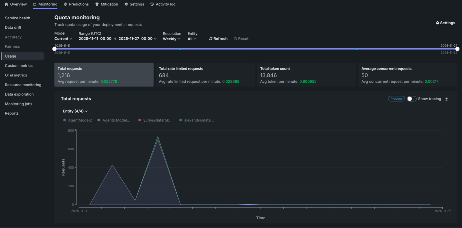
The Quota monitoring dashboard displays three key metric tiles at the top of the page:
| Metric | Description |
|---|---|
| Total requests | The total number of requests made during the selected time range, along with the average requests per minute. |
| Total rate limited requests | The total number of requests that were rate limited during the selected time range, along with the average rate limited requests per minute. |
| Total token count | The total number of tokens consumed during the selected time range, along with the average tokens per minute. |
| Average concurrent requests | The average number of simultaneous API calls processed by the agent service over the defined interval, tracked as a key metric for observability and used to enforce the system's quota limit on simultaneous operations. |
Each metric displays the value for the selected time frame and the average per minute in green. Click the metric tile to review the corresponding chart below:
- Total requests
- Total rate limited requests
- Total token count
- Average concurrent requests
You can configure the Quota monitoring dashboard to focus the visualized statistics on specific entities and time frames. The following controls are available:
| Filter | Description |
|---|---|
| Model | Select the model version to monitor. The Current option displays data for the active model version. |
| Range (UTC) | Select the date and time range for the data displayed. Use the date pickers to set the start and end times in UTC. |
| Resolution | Select the time resolution for aggregating data: Hourly, Daily, or Weekly. |
| Entity | Filter by entity type: All, User, or Agent. |
| Refresh | Updates the dashboard with the latest data based on the current filter settings. |
| Reset | Resets all filters to their default values. |
Quota monitoring charts
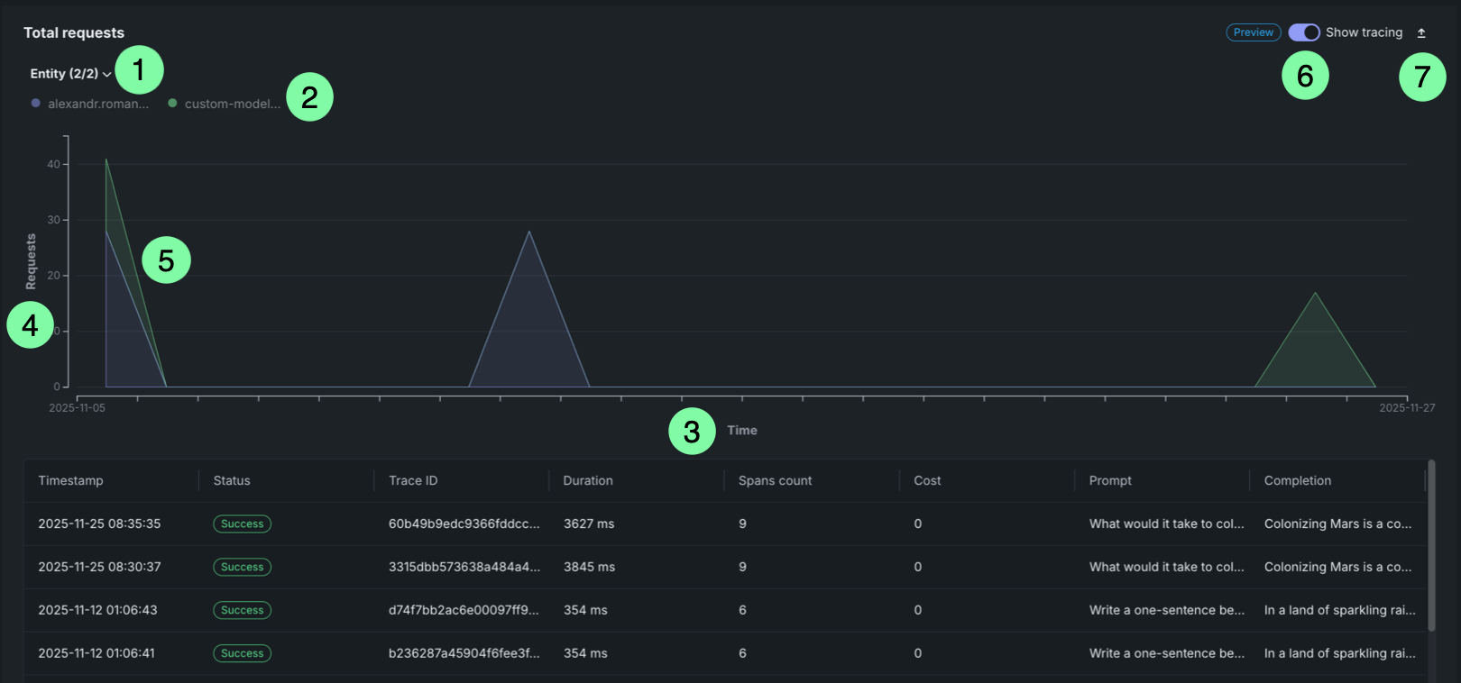
The Quota monitoring charts display an area chart showing the distribution of requests over time, rate limited requests over time, or token count over time. This chart is a stacked chart (or stacked graph), a chart stacking multiple data series on top of each other to visualize how each entity contributes to the total over time and across categories. Each chart is segmented by entity (user or agent). Each entity is represented by a different color in the chart legend.
| Chart element | Description | |
|---|---|---|
| 1 | Entity filter | Displays all entities (users or agents) included in the selected time range. Each entity is represented by a dot that matches the area in the chart. |
| 2 | Entity legend | Displays all entities (users or agents) included in the selected time range. Each entity is represented by a dot that matches the area in the chart. |
| 3 | Time range (X-axis) | Displays the time range selected in the filters, showing the date range from start to end. |
| 4 | Metric (Y-axis) | Displays the number of requests, rate limited requests, or tokens on the vertical axis. |
| 5 | Request areas | Overlapping areas show the volume of requests per entity over time. The height of each area at any point represents the number of requests for that entity at that time. This chart is a stacked chart (or stacked graph), a chart stacking multiple data series on top of each other to visualize how each entity contributes to the total over time and across categories. |
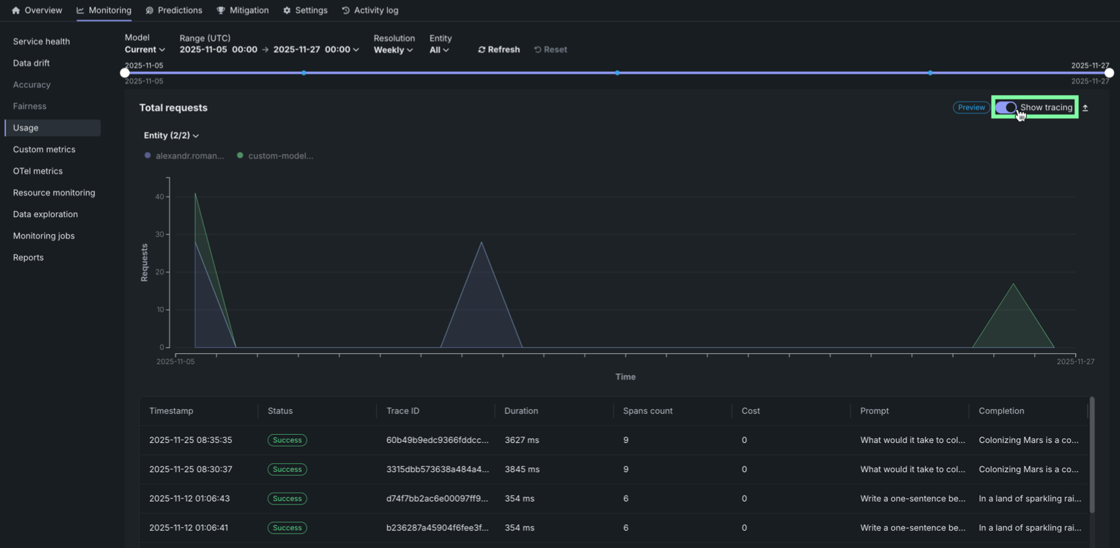
| 6 | Tracing | Click Show tracing to view tracing data for the requests. |
| 7 | Export | Click Export to download a .csv file. |
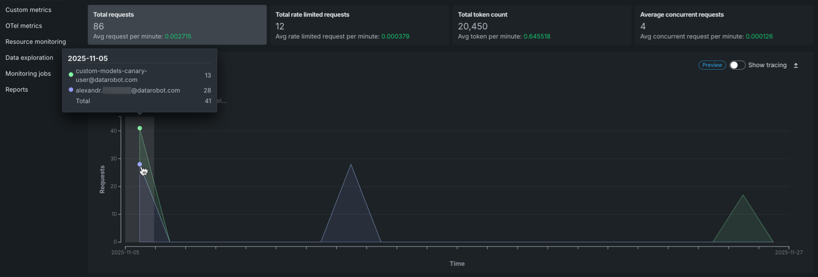
Hover over the chart to view detailed information about the number of requests for each entity at specific time points.
Request tracing table
On any Quota monitoring chart, click Show tracing to view tracing data for the deployment. This tracing chart uses the same interface as the dedicated Tracing tab.
Rate limited requests table
The Rate limited requests table provides a detailed breakdown of rate limiting by entity:
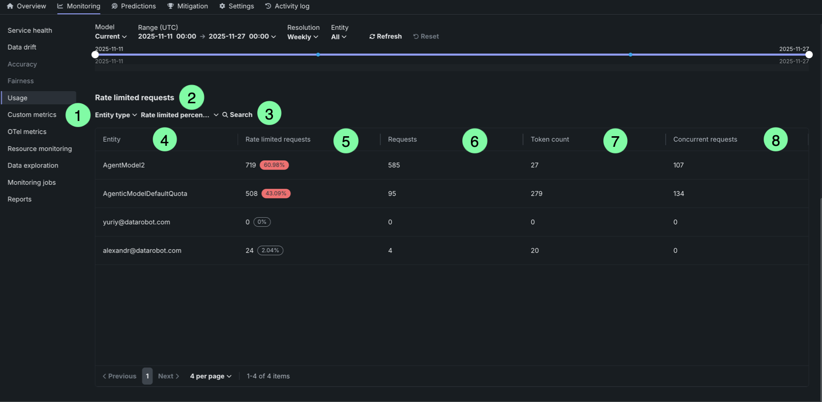
| Table element | Description | |
|---|---|---|
| 1 | Entity type filter | Filter the table by entity type (user or agent). |
| 2 | Rate limited percentage filter | Filter entities by their rate limited percentage threshold (zero, low, medium, or high). |
| 3 | Search box | Search for specific entities by name or identifier. |
| 4 | Entity column | Displays the entity identifier (user email or agent name). |
| 5 | Rate limited requests column | Shows the number of rate limited requests and the percentage of total requests that were rate limited. The percentage is highlighted in red when it exceeds a threshold, or displayed in gray when it is 0%. |
| 6 | Requests column | Displays the number of requests that were rate limited due to exceeding the request quota. |
| 7 | Token count column | Displays the number of requests that were rate limited due to exceeding the token quota. |
| 8 | Concurrent requests column | Displays the number of requests that were rate limited due to exceeding the concurrent requests quota. |
The table helps identify which entities are experiencing rate limiting and to what extent, allowing you to adjust quotas or usage patterns accordingly.
Next steps
After reviewing prediction and quota usage, explore the other monitoring dashboards to get a full picture of deployment health.
- Data drift: Monitor whether a deployed model's input data is diverging from its training data distribution.
- Accuracy: Analyze deployment performance over time using standard statistical measures to determine whether a model's quality is decaying.
- Service health: Track how quickly and reliably a deployment responds to prediction requests to identify bottlenecks and assess capacity.