Analyze data insights
| Tile | Description |
|---|---|
 |
Displays a more visual representation of the features in your dataset, including frequent values. |
 |
Displays features in a table format alongside feature importance and summary statistics. Select specific features to view more detailed data insights than those shown on the Data preview tile. |
 |
Allows you to create new feature lists, manage existing ones, and retrain all the models in an experiment on a different feature list. |
 |
Helps you track and visualize associations within your data using the Feature Associations insight. |
Time-aware experiments
For time-aware experiments, the Data preview, Features, and Feature lists tiles have a toggle that controls whether the display is derived data only or derived and original data.
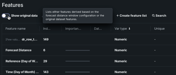
The information displayed in the tabs below is generated as part of EDA2:
The Data preview tile provides a simplified, visual way to explore and understand training data. Using these insights, you can continue iterating on models, all within the same experiment.
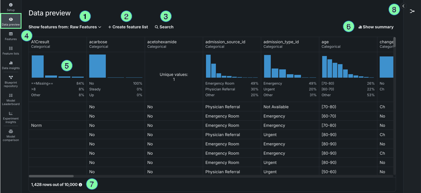
| Element | Description | |
|---|---|---|
| 1 | Show features from dropdown | Allows you to view features from a specific feature list. |
| 2 | + Create feature list | Creates a new feature list. |
| 3 | Search | Searches for a specific feature in the dataset or feature list you're currently viewing. |
| 4 | Frequent values chart | Plots the counts of each individual value for the most frequent values of a feature. |
| 5 | Show summary | Displays the following summary information for the dataset:
|
| 6 | Wrangling recipe | Allows you to view the wrangling recipe, if applicable, associated with the dataset, as well as continue wrangling the dataset. |
| 7 | Preview sample | Displays the number of rows used to generate the preview out of the total number of rows in the dataset. |
Select a feature to view additional summary statistics and insights.
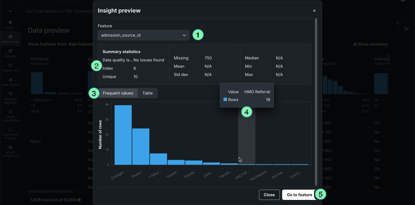
| Element | Description | |
|---|---|---|
| 1 | Feature dropdown | Allows you to change the feature you're currently viewing. |
| 2 | Summary statistics | Displays summary statistics for the feature, including data quality issues and unique values. |
| 3 | Insights | Allows you to view available insights for the variable type of the feature. |
| 4 | Hover details | Displays additional information when you hover on the chart. |
| 5 | Go to feature | Opens the Features tile and expands the feature you were viewing. |
The Features tile displays the features in your dataset alongside information, including summary statistics (e.g., data quality issues) and importance scores. You can also click on a feature to view additional insights, helping you better understand your data.
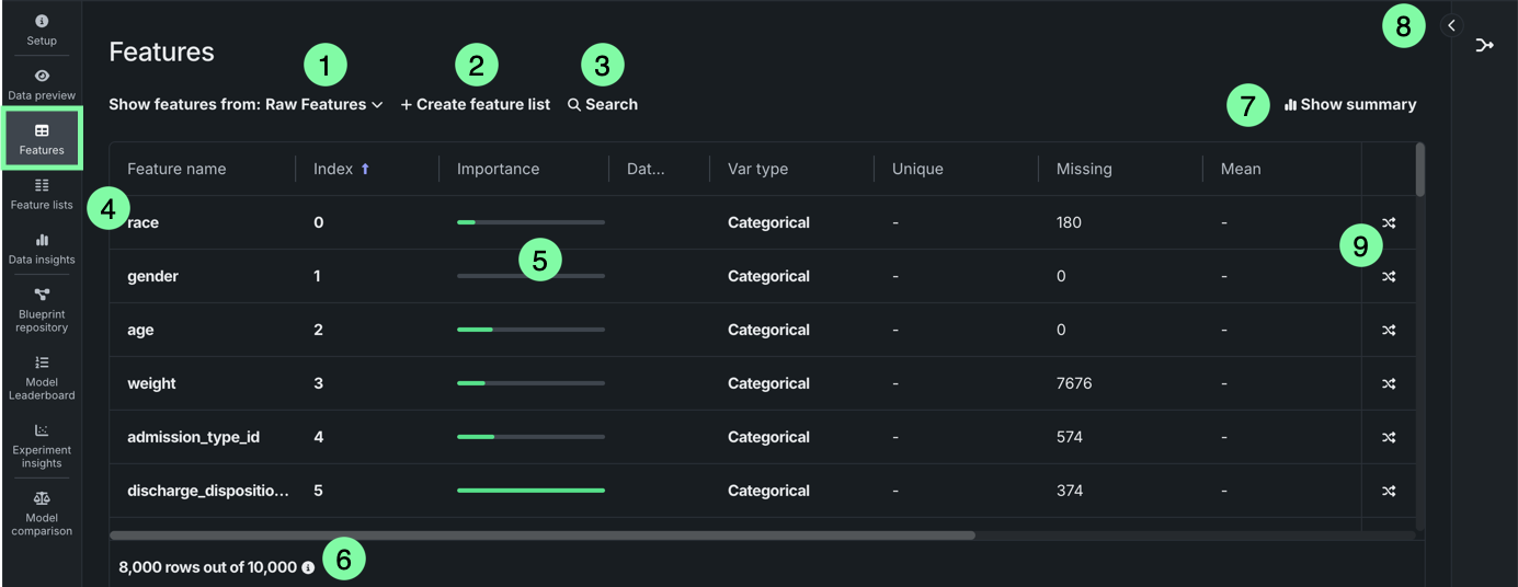
| Element | Description | |
|---|---|---|
| 1 | Show features from dropdown | Allows you to switch between feature lists, which you can compare to the full dataset, helping you to further refine your feature list. |
| 2 | + Create feature list | Creates a new feature list. |
| 3 | Search | Searches for a specific feature in the dataset or feature list you're currently viewing. |
| 4 | Features | Displays each feature as a column, which includes the data type and frequency chart. |
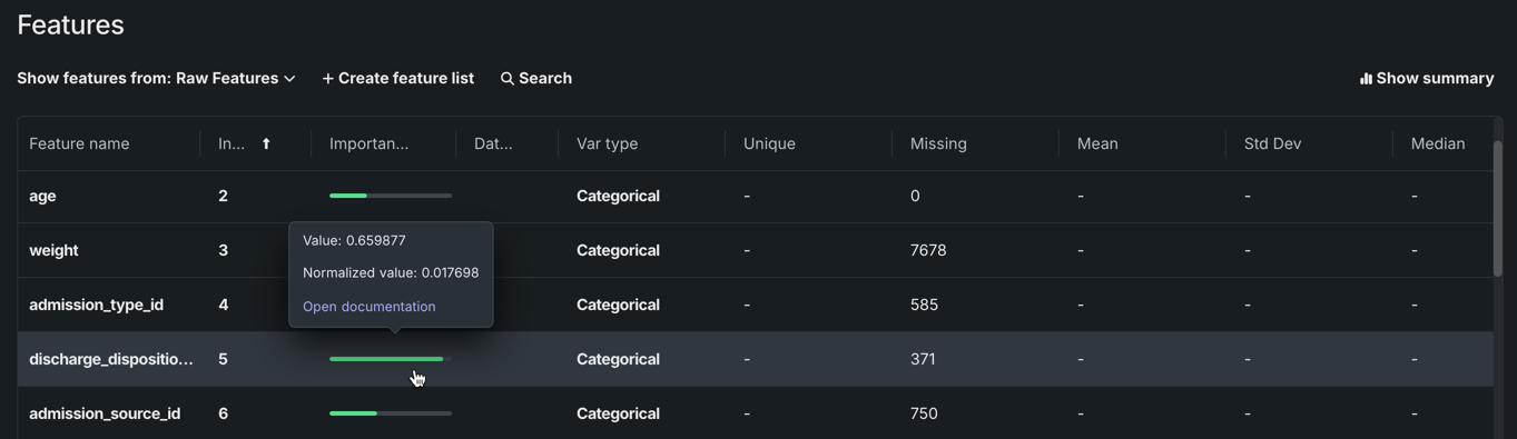
| 5 | Importance column | Displays green bars in the Importance column which are a measure of how much a feature, by itself, is correlated with the target variable feature importance. |
| 6 | Preview sample | Displays the number of rows used to generate the preview out of the total number of rows in the dataset. |
| 7 | Show summary | Displays the following summary information for the dataset:
|
| 8 | Wrangling recipe | Allows you to view the wrangling recipe, if applicable, associated with the dataset, as well as continue wrangling the dataset. |
| 9 | Create feature transformation | Allows you create a new feature by transforming an existing feature in the dataset. |
Select a feature to view additional summary statistics and insights:
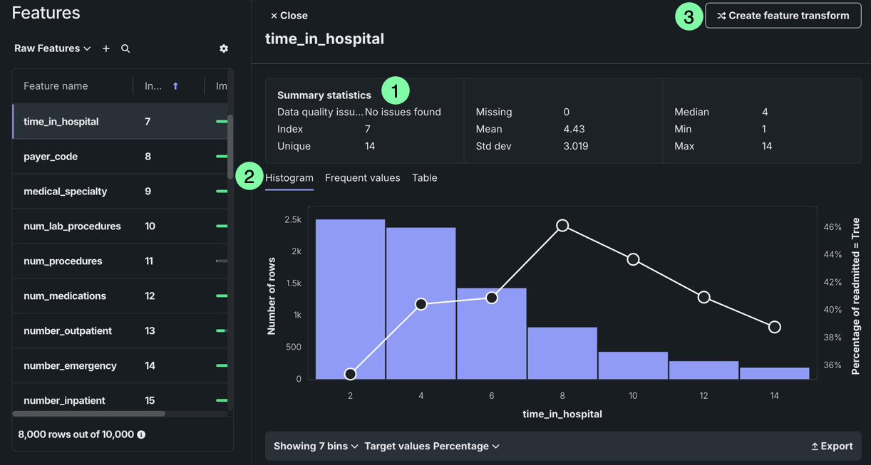
| Element | Description | |
|---|---|---|
| 1 | Summary statistics | Displays summary statistics for the feature, including data quality issues and unique values. |
| 2 | Insights | Allows you to view available insights for the variable type of the feature. |
| 3 | Create feature transform | Allows you create a new feature by transforming an existing feature in the dataset. |
The Feature lists tile displays all feature lists associated with the experiment. Feature lists control the subset of features that DataRobot uses to build models and make predictions.
When you select the Feature lists tile, the display shows both DataRobot's automatically created lists and any custom feature lists. Custom feature lists can be created prior to modeling from the data explore page or after modeling from Data preview, Features, or this tile.
For information on feature lists and creating custom feature lists, see the Feature lists reference page.
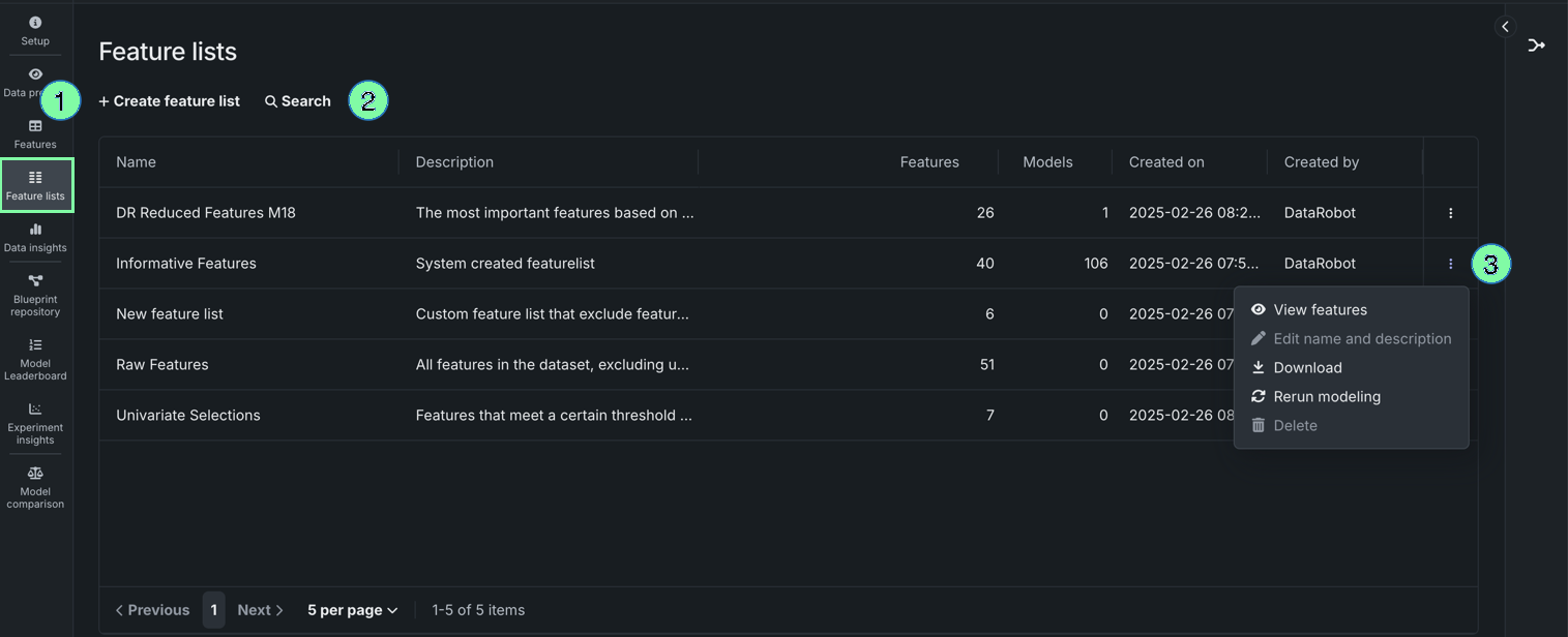
| Element | Description | |
|---|---|---|
| 1 | + Create feature list | Allows you to create a custom feature list. For more information, see Create a feature list. |
| 2 | Search | Filters existing feature lists based on the key words entered in the search bar. |
| 3 | Actions menu | Opens the Actions menu for a specific feature list. |
The following actions are available for feature lists from the Actions menu :
| Action | Description |
|---|---|
| View features | Explore insights for a feature list. This selection opens the Features tile with the filter set to the selected list. |
| Edit name and description | (Custom lists only) Opens a dialog to change the list name and change or add a description. |
| Download | Downloads the features contained in that list as a CSV file. |
| Rerun modeling | Opens the Rerun modeling modal to allow selecting a new feature list, training with GPU workers, and restarting Autopilot. |
| Delete | (Custom lists only) Permanently deletes the selected list from the experiment. |
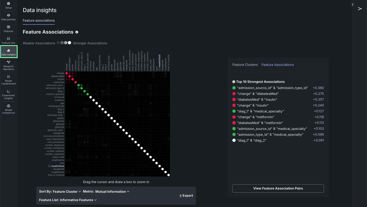
The Data insights tile generates the Feature Associations insight to help you track and visualize associations within your data. This insight can help you further refine the dataset used to train your model by highlighting features with the strongest associations, that might be redundant, as well as those that have potential to cause data leakage.
Once modeling is complete, click a feature name to view its details and also (in some cases) modify its type. The options available are dependent on variable type:
| Insight | Description | Variable Type |
|---|---|---|
| Feature Associations | Available only from the Data insights tile. Provides a matrix using the Importance score to track and visualize associations within your data. It lists up to the top 50 features, sorted by cluster, on both the X and Y axes. | n/a |
| Histogram | Buckets numeric feature values into equal-sized ranges to show a rough distribution of the variable. | numeric, summarized categorical, multicategorical |
| Frequent Values | Plots the counts of each individual value for the most frequent values of a feature. If there are more than 10 categories, DataRobot displays values that account for 95% of the data; the remaining 5% of values are bucketed into a single "All Other" category. | numeric, categorical, text, boolean |
| Feature Statistics | Reports overall multilabel dataset characteristics, as well as pairwise statistics for pairs of labels and the occurrence percentage of each label in the dataset. | multilabel |
| Feature Lineage (time series) or (Feature Discovery) | Provides a visual description of how a derived feature was created. | numeric, categorical, text, boolean |
| Over Time (time-aware only) | Identifies trends and potential gaps in data by displaying, for both the original modeling data and the derived data, how a feature changes over the primary date/time feature. | numeric, categorical, text, boolean |
| Data Quality Assessment | Detects and surfaces common data quality issues and, often, handles them with minimal or no action on the part of the user. | n/a |
| Table | Provides a table of feature values and their occurrence counts. Note that if the value displayed contains a leading space, DataRobot includes the tag [leading space] to indicate as much. This is to help clarify why a particular value may show twice in the histogram (for example, 36 months and 36 months are both represented). |
numeric, categorical, text, boolean, summarized categorical, multilabel |
| Illustration | Shows how summarized categorical data—features that host a collection of categories—is represented as a feature. See also the summarized categorical tab differences for information on Overview and Histogram. | summarized categorical |
Note
The values and displays for a feature may differ between EDA1 (viewed from Data assets) and EDA2 (viewed from an experiment). For EDA1, the charts represent data straight from the dataset. After you have selected a target and built models, the data calculations may have fewer rows due to, for example, holdout or missing values. Additionally, after EDA2, DataRobot displays average target values which were not yet calculated for EDA1.
Feature Associations
Accessed from the Data insights tile, the Feature Associations insight provides a matrix to help track and visualize associations within your data. It is created during EDA2 using the feature importance score and based on numeric and categorical features found in the Informative Features feature list.
- Help to determine the extent to which features depend on each other.
- Provide a protocol that partitions features into separate clusters or "families."
To use the matrix, within an experiment, click the Data insights tile.
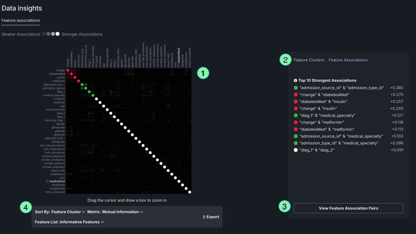
| Element | Description | |
|---|---|---|
| 1 | Matrix | Lists up to the top 50 features, sorted by cluster, on both the X and Y axes. |
| 2 | Details pane | Displays more specific information on clusters, general associations, and association pairs. |
| 3 | Feature pairs | Displays associations and relationships between specific feature pairs. |
| 4 | Matrix controls | Allows you to modify the view. |
The Feature Associations matrix provides information on association strength between pairs of numeric and categorical features (that is, num/cat, num/num, cat/cat) and feature clusters. Clusters, families of features denoted by color on the matrix, are features partitioned into groups based on their similarity. With the matrix's intuitive visualizations you can:
- Quickly perform association analysis and better understand your data.
- Gain understanding of the strength and nature of associations.
- Detect families of pairwise association clusters.
- Identify clusters of high-association features prior to model building (for example, to choose one feature in each group for model input while differencing the others).
View the matrix
Once EDA2 completes, the matrix becomes available. It lists up to the top 50 features, sorted by cluster, on both the X and Y axes. Look at the intersection of a feature pair for an indication of their level of co-occurrence. By default, the matrix displays by the Mutual Information values.
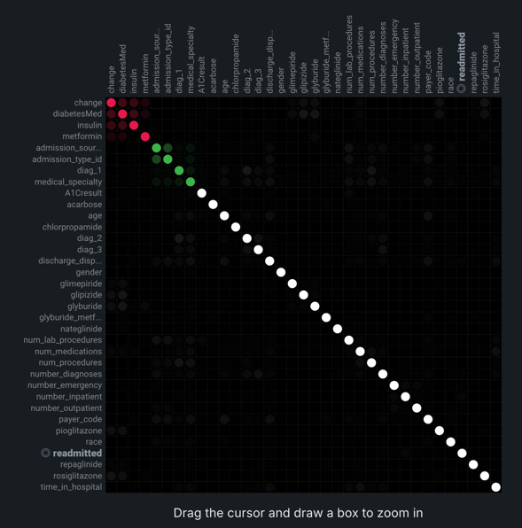
The following are some general takeaways from looking at the default matrix:
- The target feature is bolded in white.
- Each dot represents the association between two features (a feature pair).
- Each cluster is represented by a different color.
- The opacity of color indicates the level of co-occurrence (association or dependence) 0 to 1, between the feature pair. Levels are measured by the set metric, either mutual information or Cramer's V.
- Shaded gray dots indicate that the two features, while showing some dependence, are not in the same cluster.
- White dots represent features that were not categorized into a cluster.
- The "Weaker ... Stronger" associations legend is a reminder that the opacity of the dots in the metric represent the strength of the metric score.
Clicking points in the matrix updates the detail pane to the right. To reset to the default view, click again in the selected cell. Use the controls beneath the matrix to change the display criteria.
You can also filter the matrix by importance, which instead ranks your top 50 features by ACE (importance) score for binary classification, regression, and multiclass experiments.
Click on any point in the matrix to highlight the association between the two features:
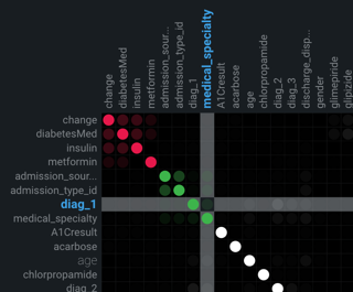
Drag the cursor to outline any section of the matrix. DataRobot zooms the matrix to display only those points within your drawn boundary. To return to the full matrix view, click Reset Zoom below the matrix.
You can modify the matrix view by changing the sort criteria or the metric used to calculate the association. These controls are available below the matrix:
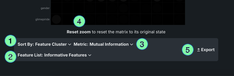
| Element | Description | |
|---|---|---|
| 1 | Sort by dropdown | Allows you to sort by:
|
| 2 | Feature list dropdown | Allows you to compute feature association for any of the experiments's feature lists. If you select a list, the page refreshes and displays the matrix for the selected feature list. |
| 3 | Metric dropdown | Determines how DataRobot calculates the association between feature pairs, using either the Mutual Information or Cramer's V correlation algorithms. |
| 4 | Reset zoom | Returns to the full matrix view if you previously highlighted a section of the matrix for closer observation. |
| 5 | Export | Exports either the full or zoomed matrix. |
Details pane
By default, with no matrix cells selected, the details pane:
- Displays the strongest associations (Feature Associations tab) found, ranked by association metric score.
- Displays a list of all identified clusters (Feature Clusters tab) and their average metric score.
- Provides access to charting of feature pair association details.
The listings are based on internal calculations DataRobot runs when creating the matrix.
Once a cell is selected in the matrix, the Feature Associations tab updates to reflect information specific to the selected feature pair:
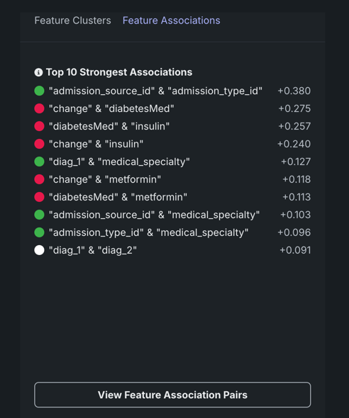
The table below describes the fields:
| Category | Description |
|---|---|
| "feature_1" & "feature_2" | |
| Cluster | The cluster that both features of the pair belong to, or if from different clusters, displays "None." |
| Metric name | A measure of the dependence features have on each other. The value is dependent on the metric set, either Mutual Information or Cramer's V. |
| Details for "feature_1" Details for "feature_2" |
|
| Importance | The normalized importance score, rounded to three digits, indicating a feature's importance to the target. |
| Type | The feature's data type, either numeric or categorical. |
| Mean | The mean of the feature value. |
| Min/Max | The minimum and maximum values of the feature. |
| Strong associations with "feature_1" | |
| feature_1 | When you select a feature's intersection with itself on the matrix, a list of the five most strongly associated features, based on metric score. |
By default DataRobot displays all found clusters, ranked by the average metric score. These rankings illustrate the clusters with the strongest dependence on each other. The displayed name is based on the feature in the cluster with the highest importance score relative to the target. Clicking on a point in the matrix changes the Feature Clusters tab display to report:
- Score details for the cluster.
- A list of all member features.
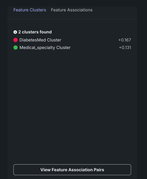
Feature association pairs
Click View Feature Association Pairs to open a modal that displays plots of the individual association between the two features of a feature pair. From the resulting insights, you can see the values that are impacting the calculation, the "metrics of association." Initially, the plots auto-populate to the points selected in the matrix (which are also those highlighted in the details pane). For each display, DataRobot displays the cluster that the feature with the highest metric score belongs to as well as the metric association score for the feature pair. You can change features directly from the modal (and the cluster and score update):

The insight is the same whether accessed from the Feature Clusters or the Feature Associations tab. Once displayed, click Download PNG to save the insight.
There are three types of plots that display, type being dependent on the data type:
- Scatter plots for numeric vs. numeric features.
- Box and whisker plots for numeric vs. categorical features.
- Contingency tables for categorical vs. categorical features.
The following shows an example of each type, with a brief "reading" of what you can learn from the insight.
When comparing numeric features against each other, a scatter plot results with the X axis spanning the range of results. The dot size, or overlapping dots, represents the frequency of the value.
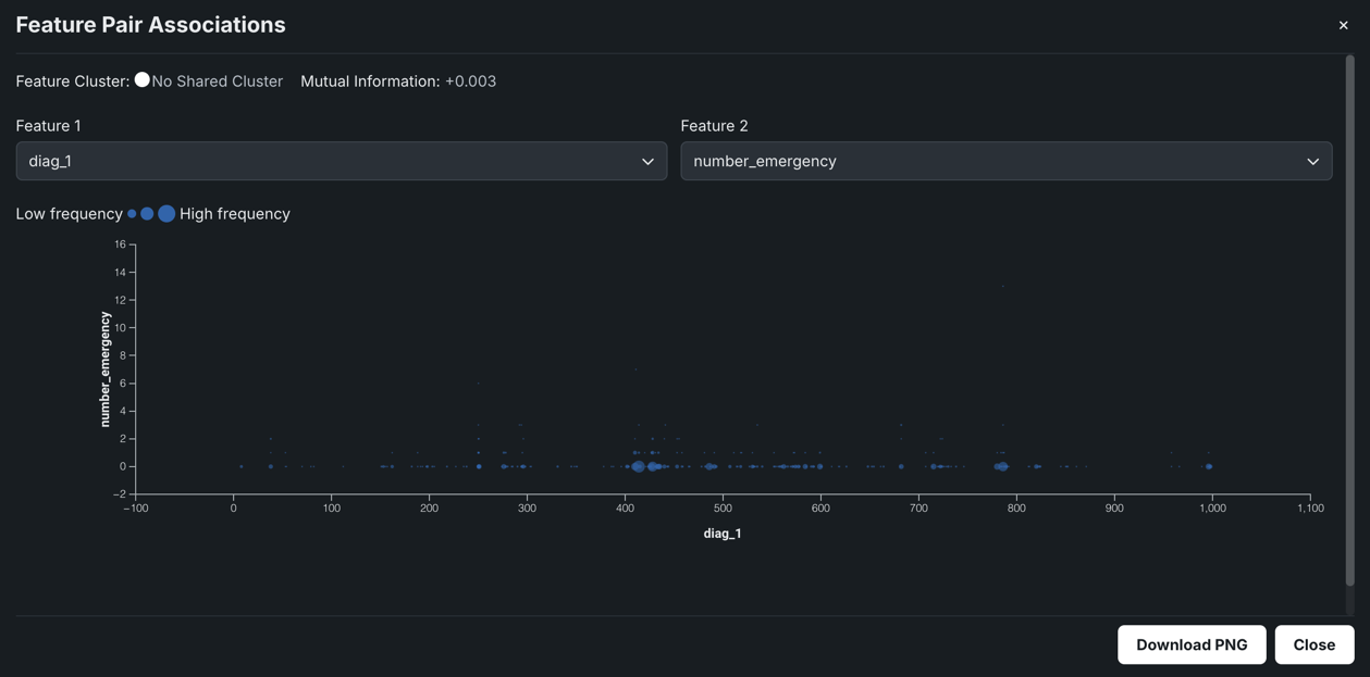
For example, in the chart above you might assume there's no discernible dependence of num_lab_procedures on number_emergency, and as a result, measure very different, unrelated parts of a patient's healthcare.
Box and whisker plots graphically display upper and lower quartiles for a group of data. It is useful for helping to determine whether a distribution is skewed and/or whether the dataset contains a problematic number of outliers. Depending on the which feature sets the X or Y axis, the plot may rise vertically or lay horizontally. In either case, the end points represent the upper and lower extremes, with the box illustrating the highest occurrence of a value. DataRobot uses box and whisker plots to create insights for numeric and categorical feature pairs.
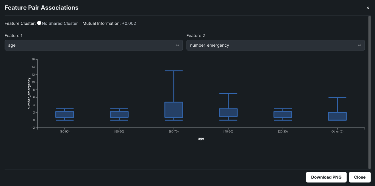
In the example above, the plot shows that there's a weak association between the two features, however, while the number of emergency room visits is low across all age groups, a significant portion of the 60-70 group has a very high number of visits.
When both features are categorical, DataRobot creates a contingency table which shows a frequency distribution of values for the selected features. The table can contain up to six bins, each representing a unique feature value. For features with more than five unique values, the top five are displayed with the rest accumulated in a bin named Other.
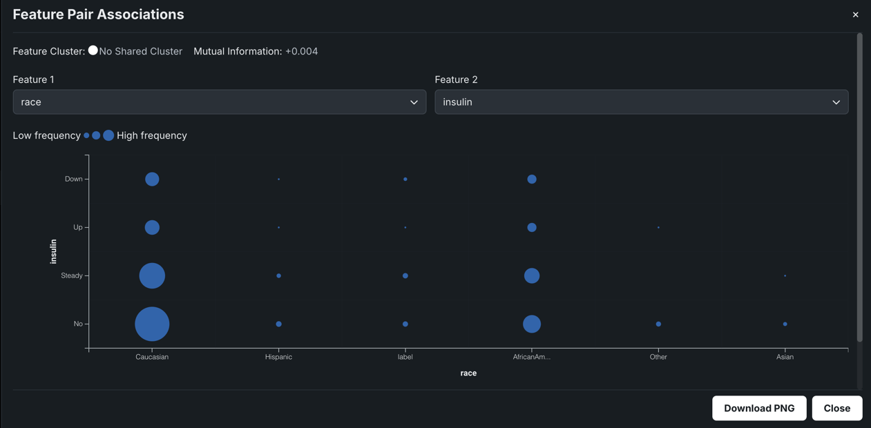
In the example above, the larger the circle, the more patients that fall into the race x insulin combination. The plot indicates that there's essentially no correlation between race and insulin dosage. The key takeaway from this chart is that a more even distribution of race should be included for a more accurate analysis.
Histogram
The Histogram chart is the default display for numeric features. It "buckets" numeric feature values into equal-sized ranges to show frequency distribution of the variable—the target observation (left Y-axis) plotted against the frequency of the value (X-axis). The height of each bar represents the number of rows with values in that range.
The display differs depending on whether the data quality issue "Outliers" was found:
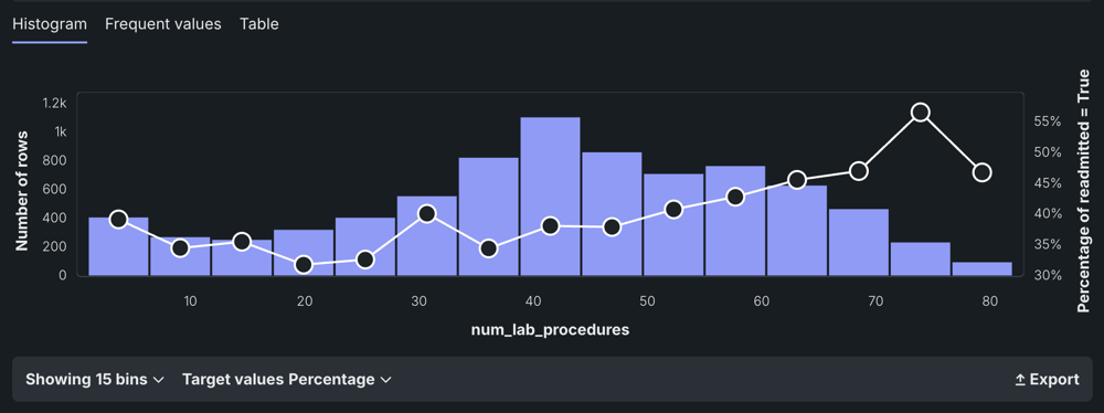
After EDA2 completes, the histogram also displays an average target value overlay.
Set feature distribution
DataRobot breaks data into several bins; the size of the bin depends on the number of rows in the dataset. You can change the number of bins to change the distribution range. The bin options depend largely on the number of unique values in the dataset.
For classification projects, you can also change the basis of the display to fill bins based on the number of rows or percentage of target value. The displays of the histogram and average target value overlay also change to match your selection.
For numeric features, use the histogram to view a rough distribution of values:
-
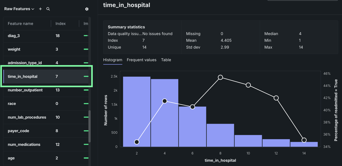
After running an experiment, navigate to the Features tile and select a feature.
For numeric features, the histogram displays equal-sized ranges (bins). The height of each bar represents the number of rows with values in that range.
-
Hover over a bin to view the range and the number of rows that fall within the range.
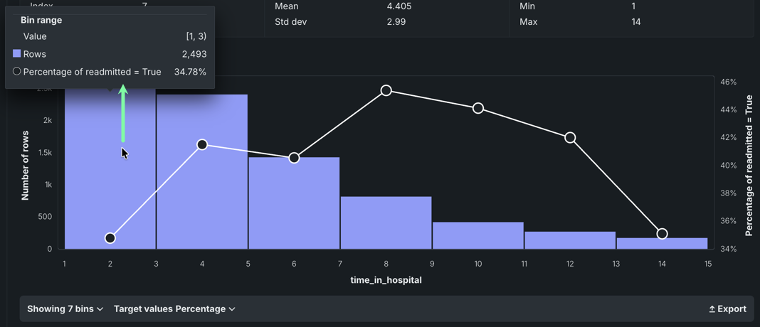
For example, the
time_in_hospitalfeature is the number of days spent in the hospital. The histogram indicates that a visit of one to three days is most common. -
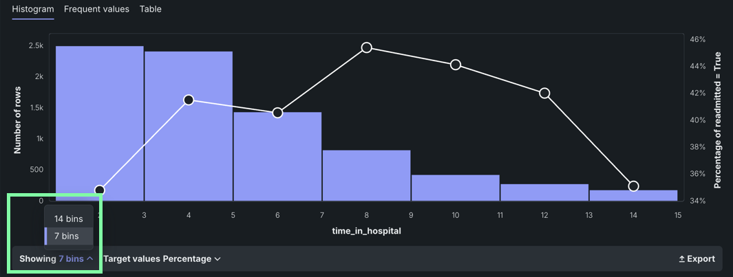
Click the Showing dropdown menu on the bottom left to change the number of bins.
Calculate outliers
Outliers—the observation points at the far ends of the sample mean—may be the result of data variability. They can also represent data error, in which case you may want to exclude them from the histogram. Note that outlier detection—run as part of EDA1 using a combination of heuristics—is strictly a histogram visualization tool and does not influence the modeling process. For more information, see Data quality checks.
The traditional box plot above the chart (shown in gold) highlights the middle quartiles for the data to help you determine whether the distribution is skewed. To determine whisker length and identify outlier points, DataRobot uses Ueda's algorithm—the whiskers depict the full range for the lowest and highest data points in the dataset excluding those outliers. This is useful for helping to determine whether a distribution is skewed and/or whether the dataset contains a problematic number of outliers.
Use the histogram to investigate a feature that has outlier values:
-
Select a feature that has outliers if one exists in your feature list.
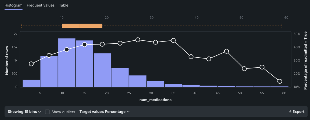
-
Below the histogram chart, toggle Show outliers on to initiate a calculation identifying the rows containing outliers. DataRobot then re-displays the histogram with outliers included.
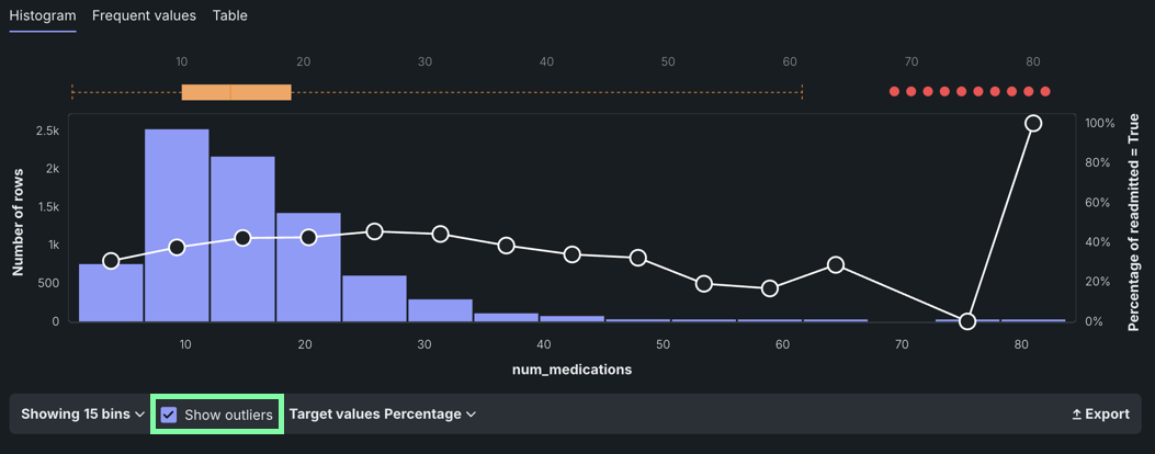
The red dots at the top of the histogram represent outlier values. The gold box plot shows the middle quartiles for the data to help you determine whether the distribution is skewed.
Why are the bins resized after calculating outliers?
DataRobot reshuffles the bin values based on the display. With outliers excluded, there are more bins and each contains a smaller number of rows. When toggled on, each bin contains a greater number of rows because the bin has expanded its range of values.
The change in the X-axis scale and compression of the box plot to allow for outlier display. Because there tend to be fewer rows recording an outlier value (it's what makes them outliers), the purple bar may not display. Hover on that column to display a tooltip with the actual row count.
The bin selection dropdown works as usual, regardless of the outlier display setting.
-
Hover over a red dot to view the value of the outlier.
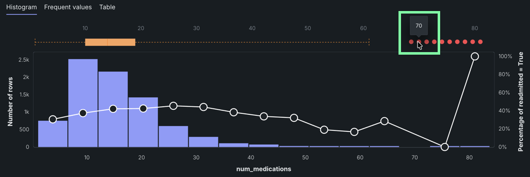
In this example, the outlier shown for the
num_medicationsfeature is 70—far from the median of 14.
Frequent Values
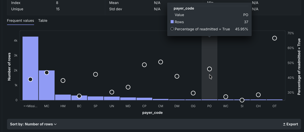
The Frequent Values chart is a histogram that, in addition to showing the number of rows containing each value of a feature and the percentage of rows for each value of the target, also reports inliers, disguised missing values, and excess zeros. This version of the histogram is the default display for categorical, text, and boolean features, although it is also available to other feature types. The display is dependent on the results of the data quality check.
The Feature Values chart displays each value that appears in the dataset for the feature and the number of rows with that value. With no data quality issues:
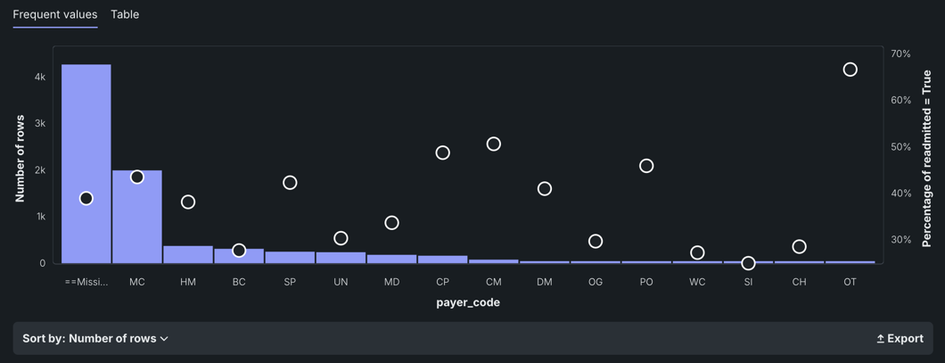
In many cases, you can change the display using the Sort by dropdown. By default, DataRobot sorts by frequency (Number of rows), from highest to lowest. You can also sort by <feature_name>, which displays either alphabetically or, in the case of numerics, from low to high. The Export link allows you to download an image of the Frequent Values chart as a PNG file.
The white circles that overlay the histogram indicate the average target value(calculated during EDA2) for a bin.
Feature Lineage
The Feature Lineage insight—available for Feature Discovery and time series experiments—provides a visual description of how the feature was derived as well as the datasets that were involved in the feature derivation process. It visualizes the steps followed to generate the features (on the right) from the original dataset (on the left). Each element represents an action or a JOIN.
For more information, see the DataRobot Classic documentation on Feature Discovery and time series.
Over Time
The Over time chart helps you identify trends and potential gaps in your data by displaying, for both the original modeling data and derived data, how a feature changes over the primary date/time feature. It is available for all time-aware experiments (OTV, single series, and multiseries). For time series, it is available for each user-configured forecast distance.
For more information, see Understand a feature's Over Time chart in the DataRobot Classic documentation.
Importance scores
On the Features tile, the green bars displayed in the Importance column are a measure of how much a feature, by itself, is correlated with the target variable. Hover on the bar to see the exact value.
For more information, see the Modeling process reference documentation.
Data Quality Assessment
The Data Quality Assessment capability automatically detects and surfaces common data quality issues and, often, handles them with minimal or no action on the part of the user. The assessment not only saves time finding and addressing issues, but provides transparency into automated data processing (you can see the automated processing that has been applied). It includes a warning level to help determine issue severity.
To access the Data Quality Assessment from an experiment, open either the Features or Data preview tile and click Show Summary (unless already open, then the button displays Hide summary).

For more information, including additional instructions and a description of processing logic, see the Data Quality Assessment reference documentation.
Average target values
After EDA2, DataRobot displays white circles as graph overlays on the Histogram and Frequent Values charts. The circles indicate the average target value for a bin. (These circles are connected for numeric features and not for categorical, since the ordering of categorical variables is arbitrary and histograms display a continuous range of values.)
For example, consider the feature num_lab_procedures:
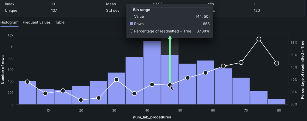
In this example, there are 858 people who had between 44-49.999999 lab procedures. The average target value is represented by the circle in each bin, corresponding to the right axis of the histogram—in this case, the percent readmitted—37.88%.
How Exposure changes output
If you used the Exposure parameter when building models for the experiment, the Histogram and Frequent values tabs display the graphs adjusted to exposure. In this case:
- The number of rows in each bin.
- The sum of exposure in each bin. That is, the sum of the weights for all rows weighted by exposure.
- The sum of target value divided by the sum of the exposure in a bin.
For information about required dataset formatting, see the Modeling process documentation.
How Weight changes output
If you set the Weight parameter for an experiment, DataRobot weights the number of rows and average target values by weight.
Summarized categorical features
The summarized categorical variable type is used for features that host a collection of categories (for example, the count of a product by category or department). If your original dataset does not have features of this type, DataRobot creates them (where appropriate as described here) as part of EDA2. The summarized categorical variable type offers unique feature details in its Overview, Histogram, Illustration, and Table insights.
Differences between multilabel and summarized categorical
The primary distinction between the two feature types is their role in a modeling project:
- Multilabel features are used exclusively as the target variable for multilabel classification problems. If a column is formatted as multicategorical but is not selected as the target, it will be ignored during modeling.
- Summarized categorical features are used as input features for modeling and cannot be used as the target.
Overview
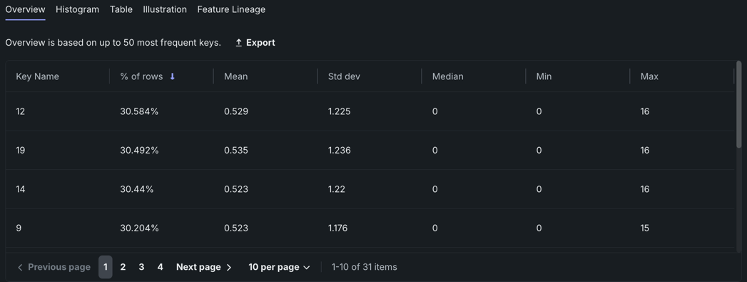
The Overview tab presents the top 50 most frequent keys for your feature. Each key displays the percentage of rows that it appears in, its mean, standard deviation, median, min, and max. You can sort the keys by any of these fields. Most of this information is available for other feature types in the Summary statistics above feature insights, but for summarized categorical features each individual key has its own values for these fields.
On this tab, you can:
- Click Export to export the list of keys and their associated values as a PNG. You can choose to include the chart title in the image and edit the file name before downloading it.
- Click on a given key to open its histogram.
Histogram
While most of the functionality for this tab is the same as described in the histogram section above, there are some differences unique to this variable type. The histograms displayed in this tab correspond to the individual labels (keys) of a feature instead of a feature itself. The list of keys can be sorted by percentage of occurrence in the dataset's rows or alphabetically.
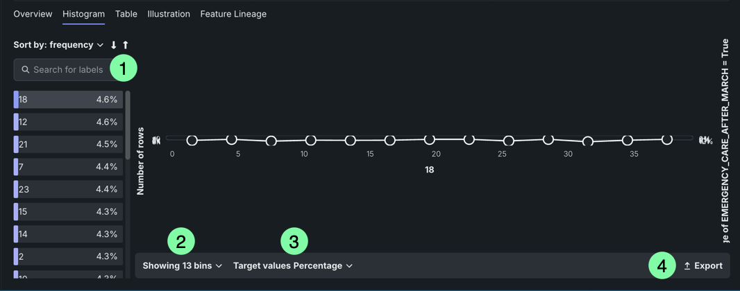
| Element | Description | |
|---|---|---|
| 1 | Search | Searches for labels. |
| 2 | Showing | Changes the bin distribution. Select the number of bins to view. |
| 3 | Target values | Sets the basis of the target value display. |
| 4 | Export | Exports the histogram. |
Note
DataRobot automatically filters out stopwords when calculating values for the histogram.
Table
The Table insight, which is the default tab for multilabel projects, displays a two-column table detailing counts for the top 50 most frequent label sets in the multicategorical feature.
The table lists each key in the Values column, and the respective key's count in the Count column.
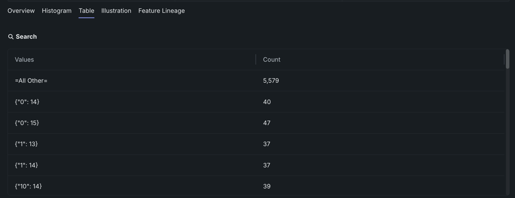
Unicode text in the Values column
If you are using Unicode text and it appears abnormal in the Values column, make sure your text is UTF8 encoded.
Illustration
The Illustration tab shows how summarized categorical data is represented as a feature. For example, in the below image, the Values column contains five summarized categorical features displayed in JSON dictionary format (selected at random), as described here.
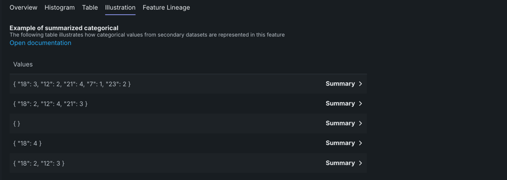
Click Summary to display a box that visualizes how categorical values appeared in their initial state, prior to being engineered as summarized categorical features.
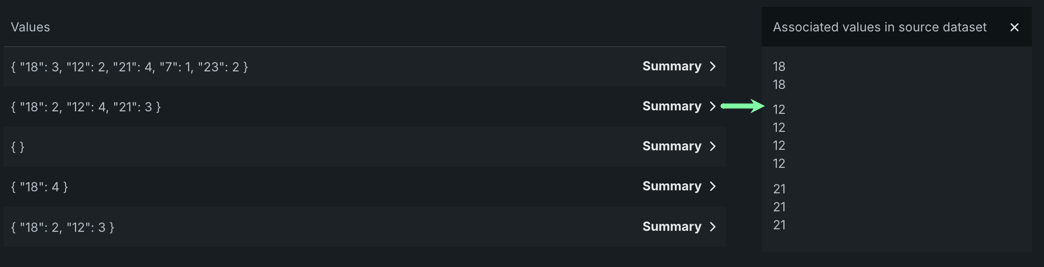
Next steps
After reviewing your data insights, revisit the experiment setup, browse available blueprints, or check how your models perform.
- Experiment setup: Review the parameters used to build the models on the Leaderboard, or duplicate the experiment.
- Blueprint repository: Browse the library of blueprints compatible with your experiment's data and settings.
- Model Leaderboard: View the performance-ranked list of built models and access their insights and actions.