Anomaly Over Time
| Tab | Description |
|---|---|
| Performance | Helps to understand when anomalies occur across the timeline of your data. Time-aware only |
Anomaly Over Time functions similarly to the non-anomaly Accuracy Over Time insight. See the that documentation for details of the configurable elements (backtest, forecast distance, etc.) and controlling the display.
Note
Because multiseries projects can have up to 1 million series and up to 1000 forecast distances, calculating accuracy charts for all series data can be extremely compute-intensive and often unnecessary. To avoid this, DataRobot provides alternative calculation options.
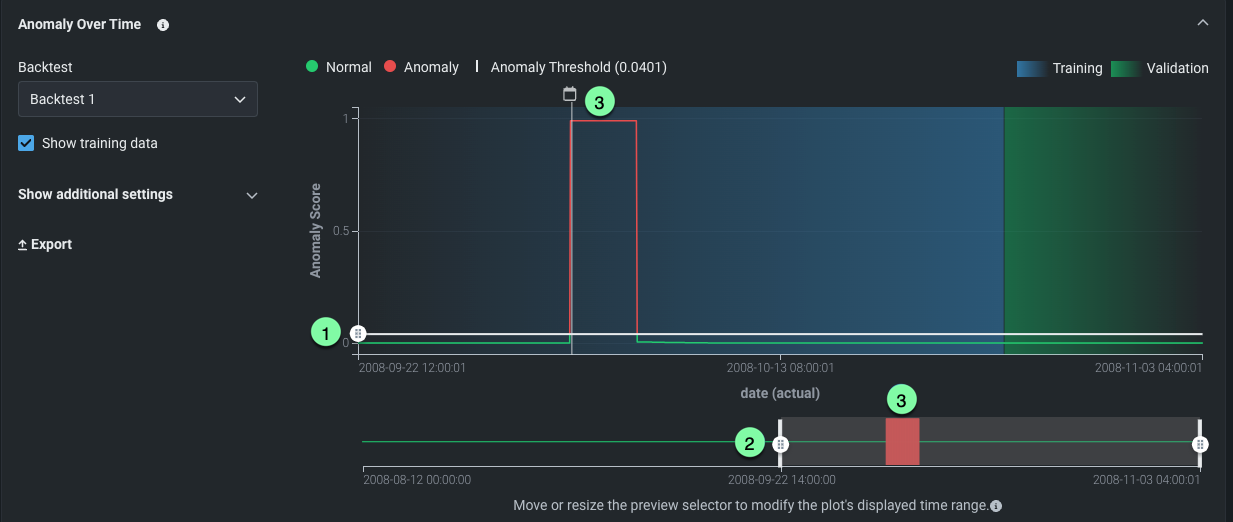
Anomaly Over Time provides the following chart controls:
| Label | Description | |---|---|---| | 1 | Sets the time frame of the preview. | | 2 | Controls the anomaly threshold. Drag the handle up and down to set the threshold that defines whether plot values should be considered as anomalies.| | 3 | Indicates, in red, points that fall above the threshold. |
Next steps
After reviewing where anomalies fall across the timeline, dig into individual anomalous points or compare against standard accuracy over time.
- Anomaly Assessment: Inspect SHAP explanations for the most anomalous points in a selected backtest.
- Accuracy Over Time: Compare with the non-anomaly view of predicted versus actual values across time.
- Anomaly Over Space: Map anomaly scores geographically if your dataset includes location features.