Prediction Explanation clustering with R
This notebook outlines how to use Prediction Explanation clustering with the DataRobot R package, as implemented in the datarobot.pe.clustering R package, hosted on the pe-clustering-R repository.
Prediction Explanation clustering is a powerful technique used to understand important patterns in the data of a predictive model. It aggregates the row-by-row Prediction Explanations from a DataRobot model to produce clusters of observations with similar profiles of predictive factors for the target of interest.
This notebook explains how to:
- Apply Prediction Explanation methodology to a sample dataset.
- Identify the clusters present in a DataRobot model's Prediction Explanations.
- Characterize and interpret clusters.
- Use Prediction Explanation clusters to inform feature engineering.
- Include Prediction Explanation clusters in an output, consumable alongside model predictions.
Requirements
In order to use the code provided in this notebook, you must install and configure the DataRobot R client.
Install the clustering package
You can install the datarobot.pe.clustering package directly from GitHub. To do so, you need to set up a GitHub Personal Access (PAT) token and then export GITHUB_PAT=<token> into your shell before running install_github.
Once set up, run the following commands.
install.packages("mlbench")
The downloaded binary packages are in
	/var/folders/x9/3l8ny90j1g9cx0cx90d3m4440000gr/T//RtmpDaxdJ1/downloaded_packages
if (!require("remotes")) { install.packages("remotes") }
if (!require("datarobot.pe.clustering")) { remotes::install_github("datarobot-community/pe-clustering-R", build_vignettes=TRUE, upgrade = "never") }
Import libraries
This notebook uses the datarobot.pe.clustering package and a few additional libraries to help illustrate the results.
library(datarobot.pe.clustering)
library(ggplot2)
library(dplyr)
library(tidyr)
library(mlbench)
Prepare the data
This notebook uses the "Pima Indians Diabetes" dataset from the mlbench package as a sample dataset. It contains health diagnostic measurements and diabetes diagnoses for 768 women of Pima Indian heritage. To import it, use the following commands.
dataset_file_path <- "/Users/nathan.goudreault/Downloads/diabetes.csv"
training_data <- utils::read.csv(dataset_file_path)
head(training_data)
| Pregnancies | Glucose | BloodPressure | SkinThickness | Insulin | BMI | DiabetesPedigreeFunction | Age | Outcome | |
|---|---|---|---|---|---|---|---|---|---|
| <int> | <int> | <int> | <int> | <int> | <dbl> | <dbl> | <int> | <int> | |
| 1 | 6 | 148 | 72 | 35 | 0 | 33.6 | 0.627 | 50 | 1 |
| 2 | 1 | 85 | 66 | 29 | 0 | 26.6 | 0.351 | 31 | 0 |
| 3 | 8 | 183 | 64 | 0 | 0 | 23.3 | 0.672 | 32 | 1 |
| 4 | 1 | 89 | 66 | 23 | 94 | 28.1 | 0.167 | 21 | 0 |
| 5 | 0 | 137 | 40 | 35 | 168 | 43.1 | 2.288 | 33 | 1 |
| 6 | 5 | 116 | 74 | 0 | 0 | 25.6 | 0.201 | 30 | 0 |
Obtain a DataRobot model
Prediction Explanation clustering requires an appropriate DataRobot model. For documentation on fitting models with DataRobot, reference the datarobot package.
For this example, start a new DataRobot project with the Pima Indians Diabetes dataset, training models to predict the diabetes diagnosis.
project <- StartProject(dataSource = training_data,
                        projectName = "PredictionExplanationClusteringVignette",
                        target = "diabetes",
                        mode = "quick",
                        wait = TRUE)
models <- ListModels(project$projectId)
model <- models[[1]]
When modeling completes, this output reports the top-performing model, which will be used in the following steps.
summary(model)['modelType']
Run Prediction Explanation clustering
For full validity, run Prediction Explanation clustering on a separate dataset that was not used for training models. However, for example purposes in this notebook, re-use the training dataset.
scoring_df <- training_data %>% select(-diabetes)
Next, run the Prediction Explanation clustering function. This will run the Prediction Explanations themselves, and then perform the clustering routines on those explanations.
results <- cluster_and_summarize_prediction_explanations(
      model,
      scoring_df,
      num_feature_summarizations=10,
      num_neighbors=50,
      min_dist=10^-100,
      min_points=25
    )
The results object captures the intermediate and final outputs of the Prediction Explanation clustering process. You can analyze these results in a variety of ways.
str(results, max.level = 1)
Sample output:
List of 5
   plot_data      :'data.frame':	768 obs. of  3 variables:
   summary_data   : tibble [3 × 10] (S3: tbl_df/tbl/data.frame)
   cluster_ids    : num [1:768] 3 2 3 2 3 2 3 2 3 3 ...
   pe_frame       :'data.frame':	768 obs. of  22 variables:
   strength_matrix:'data.frame':	768 obs. of  8 variables:
 - attr(*, "class")= chr "dataRobotPEClusterResults"
When the job completes successfully, you should see the output file in the GCS bucket.
Interpret the results
You can use summary() to view a summary of the clusters based on the features most important to the predictive performance of the model. Notice that the clusters differ on average across a wide array of features:

Use plot() to plot the results and see how the clusters are distributed in the reduced-dimensionality space. This gives you a sense of how well the clusters are separated from each other in Prediction Explanation space.
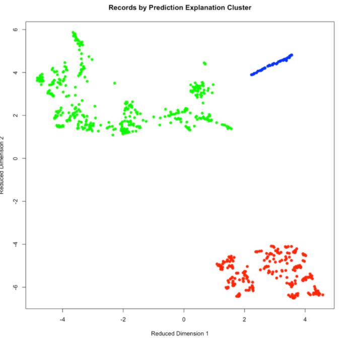
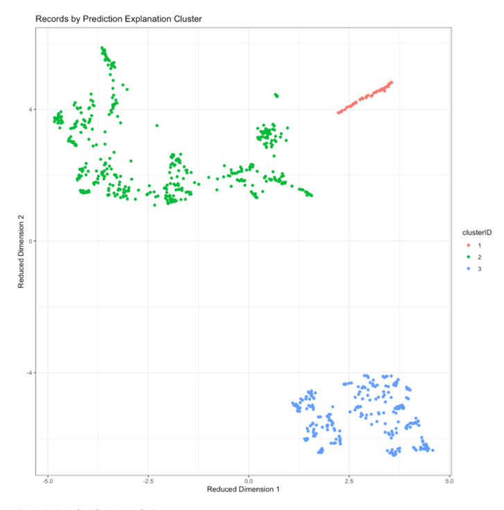
The same plotting data is available within the results, allowing for plotting through libraries like ggplot2:
ggplot(results$plot_data, aes(x=dim1, y=dim2, color=clusterID)) +
  geom_point()+
  theme_bw()+
  labs(title='Records by Prediction Explanation Cluster', x='Reduced Dimension 1', y='Reduced Dimension 2')
Characterize clusters by prediction risk and feature values
By joining the cluster IDs and predicted scores supplied by the results back to the original dataset, you can get further insight into the patterns captured by the clusters.
scoring_df_with_clusters <- scoring_df
scoring_df_with_clusters$cluster <- factor(results$cluster_ids)
scoring_df_with_clusters$predicted_risk <- results$pe_frame$class1Probability
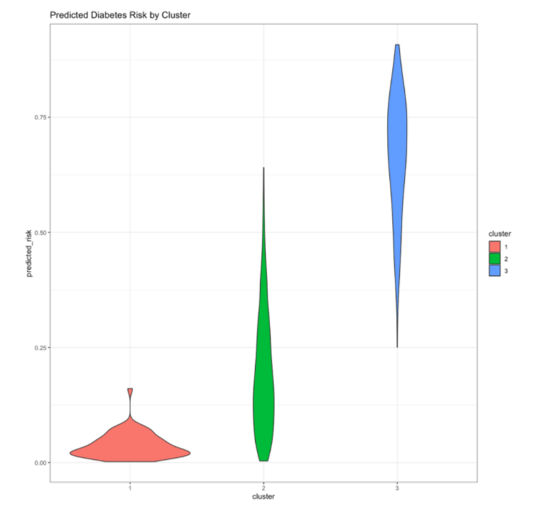
For example, you can examine how the predicted risk of diabetes varies by cluster. Here, note that one of the clusters has especially high diabetes risk, while the other two clusters have mostly lower levels of risk.
scoring_df_with_clusters %>%
    ggplot(aes(x=cluster,y=predicted_risk, fill=cluster))+geom_violin()+
    labs(title='Predicted Diabetes Risk by Cluster')+
    theme_bw()
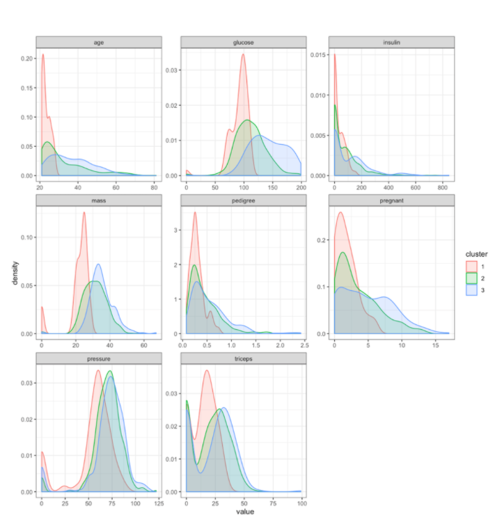
You can also examine how the clusters differ on the original feature values. Based on the distributions of these features, you can see that the clusters differ on a number of different features. Because these clusters are derived from Prediction Explanation clustering, you can have more confidence that the differences between the clusters are associated with meaningful differences in the diabetes risk profile.
scoring_df_with_clusters %>%
    gather(key='feature',value='value',-cluster)%>%
    ggplot(aes(x=value, group=cluster, color=cluster, fill=cluster)) +
    geom_density(alpha=0.2)+
    facet_wrap(~feature, scales='free')+
    theme_bw()
Characterize clusters by Prediction Explanation strength
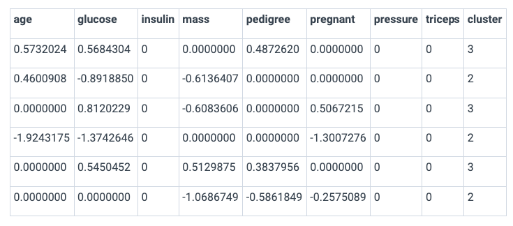
In addition to looking at the clusters based on the original features, you can also look at the clusters based on the Prediction Explanation strengths. These will give you insights into which features in the clusters contributed most to the predicted diabetes risk profile of the clusters’ members, and whether a feature’s contribution increased or decreased risk.
strength_matrix_with_clusters <- results$strength_matrix
strength_matrix_with_clusters$cluster <- factor(results$cluster_ids)
head(strength_matrix_with_clusters)
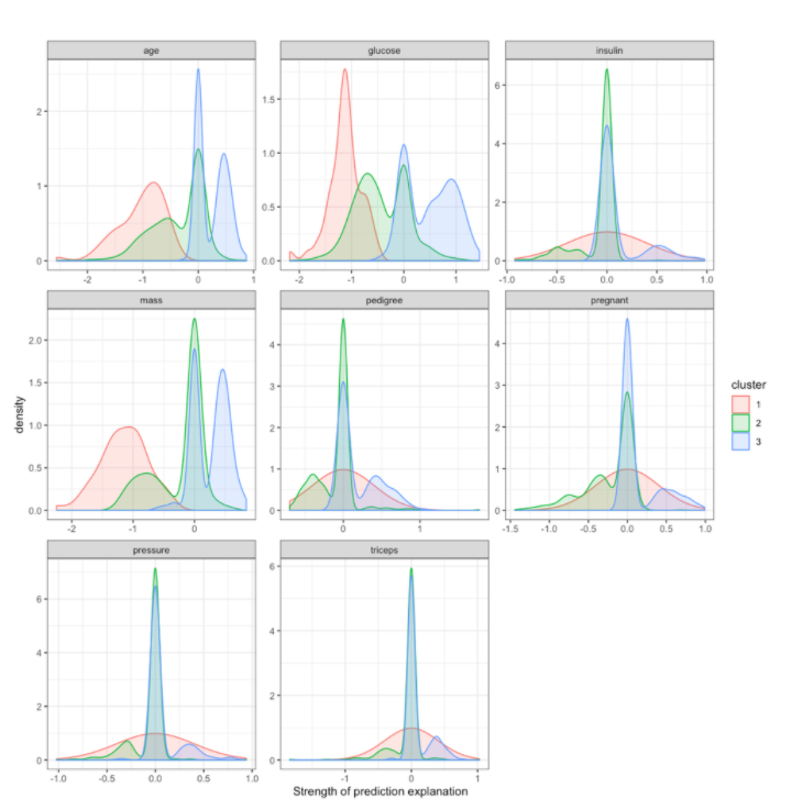
By examining the distribution of Prediction Explanation strengths by cluster, you can see that cluster 1 members tend to have a lower predicted diabetes risk due to their age, glucose levels, and mass. Looking back at the feature values by cluster above, cluster 1 tends to be younger, lighter, and have lower glucose levels.
In contrast, cluster 3 members often are predicted to have elevated risks due to age, glucose, and mass. Looking back at the feature values by cluster (above), cluster 3 members tend to be older, heavier, and have higher glucose values.
strength_matrix_with_clusters %>%
  gather(feature, strength, -cluster)%>%
  ggplot(aes(x=strength, group=cluster, color=cluster, fill=cluster)) +
  geom_density(alpha=0.2)+
  facet_wrap(~feature, scales='free')+
  xlab('Strength of prediction explanation')+
  theme_bw()
Using the datarobot.pe.clustering R package and the techniques illustrated in this notebook, you can apply this methodology to your own datasets. Download the notebook and adapt it to your own data. Once you are comfortable with how the package works, explore different variations on the methodology coded in the package, and discover what works best for your use case.