Advanced feature selection with R
This notebook shows how you can use R to accomplish feature selection by creating aggregated feature impact. A Python notebook is also available.
Requirements
To use the code provided in this tutorial, make sure you have the following:
- R version 3.6.2+.
- The DataRobot R package.
- DataRobot API version 2.2.0+.
- A DataRobot
Projectobject in R. - A DataRobot
Modelobject in R.
library(datarobot)
library(dplyr)
library(stringr)
library(ggplot2)
library(purrr)

ConnectToDataRobot(endpoint = "YOUR ENDPOINT",
                   token = "YOUR TOKEN")
List models
After installing the libraries above, select the project you want to use and get its project ID. Then, use the code below to list all of the models built for that project.
project <- GetProject("YOUR_PROJECT_ID")
allModels <- ListModels(project)
modelFrame <- as.data.frame(allModels)
metric <- modelFrame$validationMetric
if (project$metric %in% c('AUC', 'Gini Norm')) {
  bestIndex <- which.max(metric)
} else {
  bestIndex <- which.min(metric)
}
model <- allModels[[bestIndex]]
model$modelType
Filter the model list
Next, choose which models to use for the Feature Impact calculation. This tutorial only uses highly ranked, non-blender or auto-tuned models to optimize for speed and computational power. However, you can include these types of models if runtime is not a concern for your project. DataRobot recommends that you not select models trained on small sample sizes; instead, use models trained on 64% and 80% of the data.
The following code filters the model list to only use the top-performing models, trained on over 63% of the data. However, you can take alternative approaches, such as only using models within one modeling family or increasing the sample size.
models <- ListModels(project)
bestmodels <- Filter(function(m) m$featurelistName == "Informative Features" & m$samplePct >= 64 &  m$samplePct <= 80 & !str_detect(m$modelType, 'Blender') & !str_detect(m$modelType, 'Auto-Tuned') , models)
bestmodels <- Filter(function(m) m$samplePct >= 63, models)
Get Feature Impact
Now, calculate Feature Impact for selected models. This for loop iterates over the list and isolates the feature impact data.
all_impact<- NULL
for(i in 1:length(bestmodels)) {
    featureImpact <- GetFeatureImpact(bestmodels[[i]])
    featureImpact$modelname <- bestmodels[[i]]$modelType
    all_impact <- rbind(all_impact,featureImpact)
  }
Plot Feature Impact
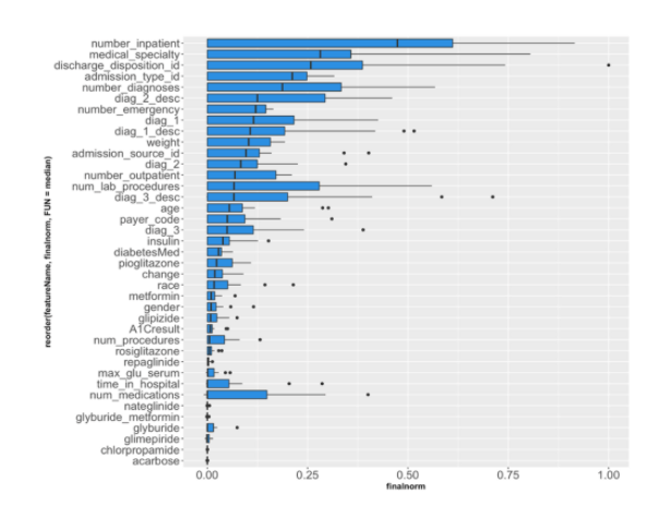
You can plot the project's features and their medians using GGplot’s geom_boxplot (displayed below). This tutorial plots the boxplots for unnormalized feature impact; however, there are other ways to display this information, such as plotting the standard deviation.
all_impact <- all_impact %>% mutate(finalnorm = impactUnnormalized/max(impactUnnormalized))
p <- ggplot(all_impact, aes(x=reorder(featureName, finalnorm, FUN=median), y=finalnorm))
p + geom_boxplot(fill= "#2D8FE2") + coord_flip() + theme(axis.text=element_text(size=16),
        axis.title=element_text(size=12,face="bold"))

This plot helps you identify the features that are driving model decisions the most.
Create a new feature list
After computing the most impactful features, create a new feature list that includes only those features. You can check the application to see the feature list in the project.
ranked_impact <- all_impact %>% group_by(featureName) %>%
    summarise(impact = mean(finalnorm)) %>%
    arrange(desc(impact))

topfeatures <- pull(ranked_impact,featureName)
No_of_features_to_select <- 10
listname = paste0("TopFI_", No_of_features_to_select)
Feature_id_percent_rank = CreateFeaturelist(project, listName= listname , featureNames = topfeatures[1:No_of_features_to_select])$featurelistId
Re-run Autopilot
Now, you can rerun Autopilot using the new feature list to see how performance changes with the application of the new list.
StartNewAutoPilot(project,featurelistId = Feature_id_percent_rank)
WaitForAutopilot(project)
You can create feature lists of varying lengths, plot the performance for each, and compare. This can help you decide how many features to include when building your model.
The code below creates a loop that runs Autopilot using the top 9, 6, 3, and 1 feature(s).
No_of_features_to_loop <- c(9, 6, 3, 1)

for(i in 1:length(No_of_features_to_loop)) {
  listname = paste0("TopFI_", No_of_features_to_loop[i])
  Feature_id_percent_rank = CreateFeaturelist(project, listName= listname , featureNames = topfeatures[1:i])$featurelistId
  StartNewAutoPilot(project,featurelistId = Feature_id_percent_rank)
  WaitForAutopilot(project)
}
Measure and plot AUC scores
As a final step, measure the Area Under the Curve (AUC) score for each model trained on the new feature list. AUC is a common error metric for binary classification projects that considers all possible thresholds and summarizes performance in a single value on the ROC Curve.
{r eval=FALSE}
#Create a list of models and select the ones that used the new feature lists.
models <- ListModels(project)
FI_list <- c("TOPFI_1", "TOPFI_3", "TOPFI_6", "TOPFI_9")
unpack_func <- function(i) {
  unpack <- models[[i]]
  modelid <- unpack$modelId
  auc <- unpack$metrics$AUC$validation
  fname <- unpack$featurelistName
 output <- c(modelid, auc, fname)
  return(output)
}
# map over function and convert to dataframe
fi_models <- map(1:length(models), unpack_func)
output <- as.data.frame(t(sapply(fi_models, function(x) x[1:3])))
output$V2 <- as.numeric(as.character(output$V2))
#find the max score for each feature list.
result <- output %>%
             group_by(V3) %>%
             filter(V2 == max(V2)) %>%
            filter(!duplicated(V3))
#Filter only the ones we want to plot
graph <-  filter(result, V3 == "TopFI_1" |  V3 == "TopFI_3"  | V3 == "TopFI_6" |  V3 == "TopFI_9")
#Create numeric for the number of features in each list.
graph$number_of_features <- c(1, 3, 6, 9)
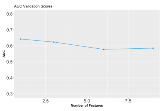
The code below is a custom function that pulls this data from an updated model list and then graphs it using ggplot (displayed below).
{r eval=FALSE}
ggplot(data=graph, aes(x=graph$number_of_features, y=graph$V2) ) +
  geom_line(color = "#2D8FE2")+
  geom_point(color = "#2D8FE2" )+
  theme(axis.text=element_text(size=16), axis.title=element_text(size=12,face="bold")) +
  labs(title= "AUC Validation Scores") +
  xlab("Number of Features") +
  ylab("AUC") +
  ylim(0, 0.8)

You can see in this example that increasing the size of the feature list lowers the model's AUC score.
Documentation