Residuals
| Tab | Description |
|---|---|
| Performance | Helps to understand a model's predictive performance and validity. |
For regression experiments, Residuals allows you to gauge how linearly your models scale relative to the actual values of the dataset used. It provides multiple scatter plots and a histogram to assist your residual analysis:
- Predicted vs. Actual
- Residual vs. Actual
- Residual vs. Predicted
- Residuals histogram
Predicted values are those predicted by the model, actual values are the real-world outcome data, and residual values represent the difference of predicted value - actual value.
Note
The Residuals tab is not available for frozen run models if there are no out-of-sample predictions. You are redirected to the Residuals tab of the parent model.
Access individual plots
From the Residuals tab, you can access Residuals or Predictions distribution independently:
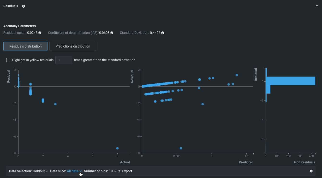
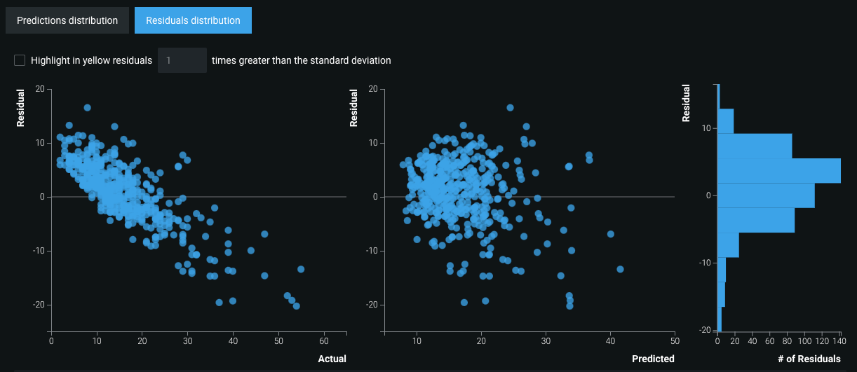
- Select Residuals distribution to view the Residual vs Actual plot, the Residual vs Predicted plot, and the Residuals histogram.
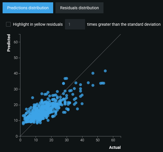
- Select Predictions distribution to display the Predicted vs. Actual scatter plot.
Interpret plots and graphs
Each scatter plot has a variety of analytical components.
Accuracy Parameters

The reported Residual mean value (1) is the mean (average) difference between the predicted value and the actual value.
The reported Coefficient of determination value (2), denoted by r^2, is the proportion of the variance in the dependent variable that is predictable from the independent variable.
The Standard Deviation value (3) measures variation in the dataset. A low value indicates that the data points tend to be close to the mean; a high value indicates that the data points are spread over a wider range of values.
Plot and graph actions
Tip
This visualization supports sliced insights. Slices allow you to define a user-configured subpopulation of a model's data based on feature values, which helps to better understand how the model performs on different segments of data. See the full documentation for more information.
The Residuals plots and graphs have multiple actions available, including data selection, data slices, export, and settings.

Below each scatter plot, the Data Selection dropdown allows you to switch between data sources. Choose between Validation, Cross Validation, or Holdout data.
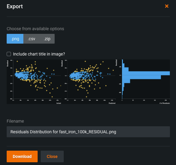
The Export button allows you to export the scatter plots as a PNG, CSV, or ZIP file:
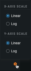
The settings wheel icon allows you to adjust the scaling of the x- and y-axes. Select linear or log scaling for each axis, and all graphs will adjust accordingly.
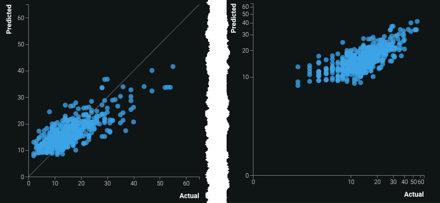
For example, compare the Predicted vs. Actual plot with linear scaling (left) to log scaling (right):
To examine an area of any plot more closely, hover over the plot and zoom in or out.
Once zoomed in, click and drag the plot to examine different areas.
Interact with the scatter plots
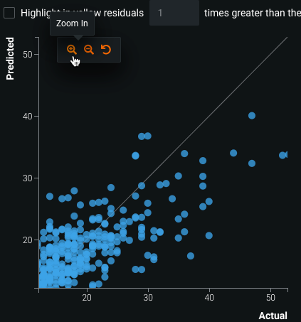
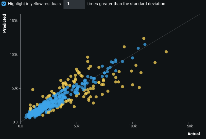
You can highlight residuals x times greater than the standard deviation by toggling the check box on.

Enter a value to change the number of times greater the residuals must be than the standard deviation in order for the residuals to be highlighted. For example, if set to 3, the only points highlighted are those with values three times greater than the standard deviation. Highlighted residuals are represented by yellow points:
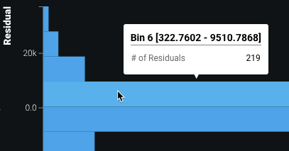
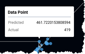
Hovering over individual points on the plots displays the Data Point bin. The bin allows you to compare the predicted or residual values to the actual values for a given blue dot. For the predicted vs actual plot, hover over a specific dot to compare how far the predicted value (represented by the blue dot) differs from that specific actual value (represented by the gray line).
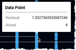
For the Residual vs Actual plot, hover over a specific point to see the exact residual value for a given actual value. Each dot's coordinates are based on these values (residual for the y-axis coordinate and actual for the x-axis coordinate), and the distance from the horizontal gray line indicates the difference between the predicted and actual values. The greater the difference, the further a point is from the line.
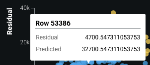
The Residual vs Predicted plot is structured the same way, but compares the predicted values to residuals instead.
The Residuals histogram bins residuals by ranges of values, and measures the number of residuals in each bin.