Challengers
During model development, models are often compared to one another until one is chosen to be deployed into a production environment. The Mitigation > Challengers tab provides a way to continue model comparison post-deployment. You can submit challenger models that shadow a deployed model and replay predictions made against the deployed model. This allows you to compare the predictions made by the challenger models to the currently deployed model (the "champion") to determine if there is a superior model that would be a better fit.
Enable the Challengers tab
To enable the Challengers tab, you must enable target monitoring and prediction row storage. Configure these settings while creating a deployment or on the Settings > Data drift Settings > Challengers tab. If you enable challenger models during deployment creation, prediction row storage is automatically enabled for the deployment; it cannot be turned off, as it is required for challengers.
Unsupported model deployments
To enable challengers and replay predictions against them, the deployed model must support target drift tracking and not be a Feature Discovery project or unstructured custom inference model.
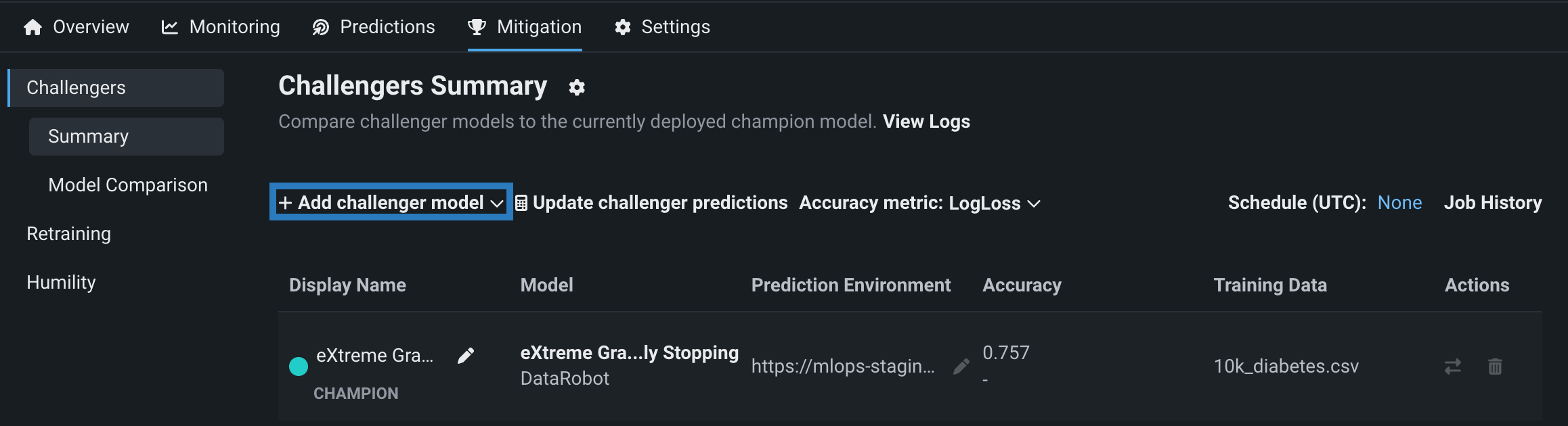
Add challengers to a deployment
To add a challenger model to a deployment, navigate to the Mitigation > Challengers tab and click + Add challenger model > Select existing model. The selection list contains only model packages where the target type and name are the same as the champion model.
Note
Before adding a challenger model to a deployment, you must either choose and select a model from Workbench or register a custom model. The challenger:
- Must have the same target type as the champion model.
- Cannot be the same Leaderboard model as an existing champion or challenger; each challenger must be a unique model. If you create multiple model packages from the same Leaderboard model, you can't use those models as challengers in the same deployment.
- Cannot be from a Feature Discovery project.
- Does not need to be trained on the same feature list as the champion model; however, it must share some features, and, to successfully replay predictions, you must send the union of all features required for champion and challengers.
- Does not need to be built from the same Use Case as the champion model.
In the Select model version from the registry dialog box, click a registered model, then select the registered model version to add as a challenger and click Select model version. You can add up to four challengers to each deployment. This means that in total, with the champion model included, up to five models can be compared during challenger analysis. DataRobot verifies that the model shares features and a target type with the champion model; after verification, click Add challenger. The model is now added to the deployment as a challenger.
Replay predictions
After adding a challenger model, you can replay stored predictions made with the champion model for all challengers, allowing you to compare performance metrics such as predicted values, accuracy, and data errors across each model. To replay predictions, click Update challenger predictions:
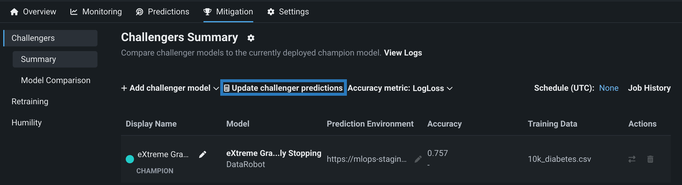
The champion model computes and stores up to 100,000 prediction rows per hour. The challengers replay the first 10,000 rows of the prediction requests made each hour, within the time range specified by the date slider. (Note that for time series deployments, this limit does not apply.) All prediction data is used by the challengers to compare statistics. After predictions are made, click Refresh on the date slider to view an updated display of performance metrics for the challenger models.
Schedule prediction replay
You can schedule challenger replays instead of executing them manually. Navigate to a deployment's Settings > Challengers tab, enable Automatically replay challengers, and configure the replay cadence. Once enabled, the prediction replay applies to all challengers in the deployment.
Who can schedule challenger replay?
Only the deployment owner can schedule challenger replay.
If you have a deployment with prediction requests made in the past and add challengers, the scheduled job scores the newly added challenger models on the next run cycle.
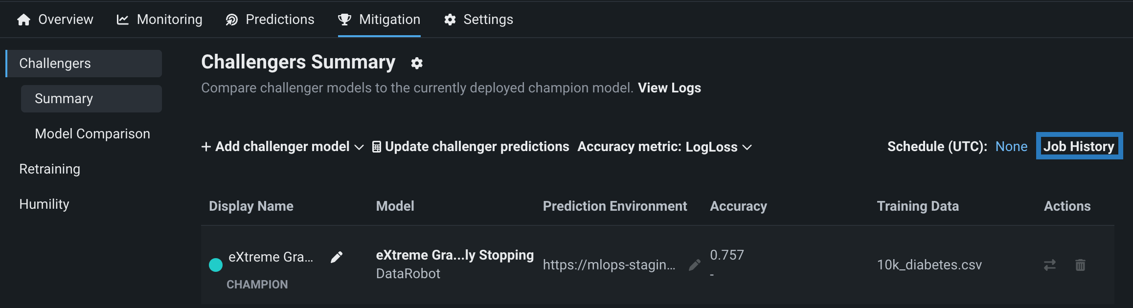
View challenger job history
After adding one or more challenger models and replaying predictions, click Job History to view challenger prediction jobs for a deployment's challengers on the Console > Batch Jobs page:
Challenger models overview
The Challengers tab displays information about the champion model, marked with the CHAMPION badge, and each challenger.
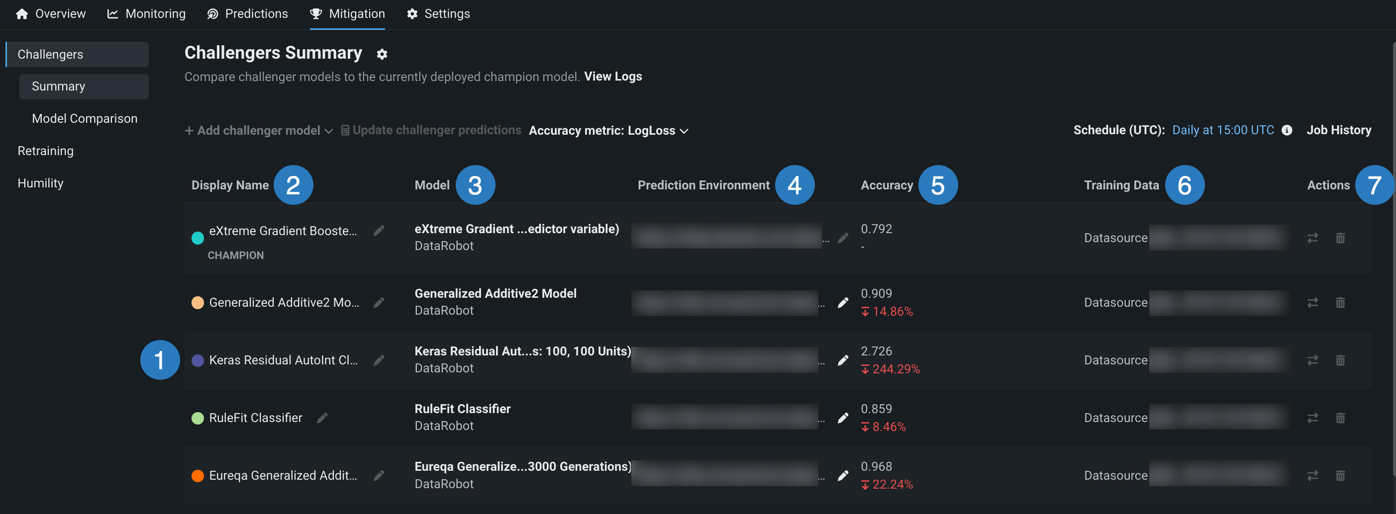
| Element | Description | |
|---|---|---|
| 1 | Challenger models | The list of challenger models. Each model is associated with a color. These colors allow you to compare the models using visualization tools. |
| 2 | Display Name | The display name for each model. Use the pencil icon to edit the display name. This field is useful for describing the purpose or strategy of each challenger (e.g., "reference model," "former champion," "reduced feature list"). |
| 3 | Model | The model name and the execution environment type. |
| 4 | Prediction Environment | The environment a model uses to make deployment predictions. For more information, see Prediction environments. |
| 5 | Accuracy | The model's accuracy metric calculation for the selected date range and, for challengers, a comparison with the champion's accuracy metric calculation. Use the Accuracy metric dropdown menu above the table to compare different metrics. For more information, see the Accuracy chart. |
| 6 | Training Data | The filename of the data used to train the model. |
| 7 | Actions | The actions available for each model:
|
Challenger performance metrics
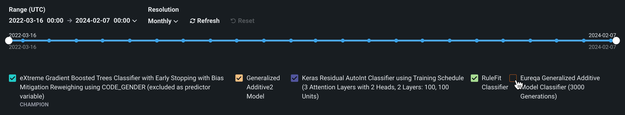
After prediction data is replayed for challenger models, scroll down to examine a variety of charts that capture the performance metrics recorded for each model. To customize the chart displays, you can configure the range, resolution, segment, and models shown. Each model is listed with its corresponding color. Clear a model's checkbox to stop displaying the model's performance data on the charts:
| Control | Description | |
|---|---|---|
| 1 | Range (UTC) selector | Sets the date range displayed for the deployment date slider. The range selector only allows you to select dates and times between the start date of the deployment's current version of a model and the current date. |
| 2 | Date slider | Limits the range of data displayed on the dashboard (i.e., zooms in on a specific time period). |
| 3 | Resolution selector | Sets the time granularity of the deployment date slider. The following resolution settings are available, based on the selected range:
|
| 4 | Segment attribute / Segment value | Sets the individual attribute and value to filter the data drift visualizations for segment analysis. |
| 5 | Refresh | Initiates an on-demand update of the dashboard with new data. Otherwise, DataRobot refreshes the dashboard every 15 minutes. |
| 6 | Reset | Reverts the dashboard controls to the default settings. |
| 7 | Model selector | Selects or clears a model's checkbox to display or hide the model's performance data on the charts. |
Predictions chart
The Predictions chart records the average predicted value of the target for each model over time. Hover over a point to compare the average value for each model at a specific point in time.
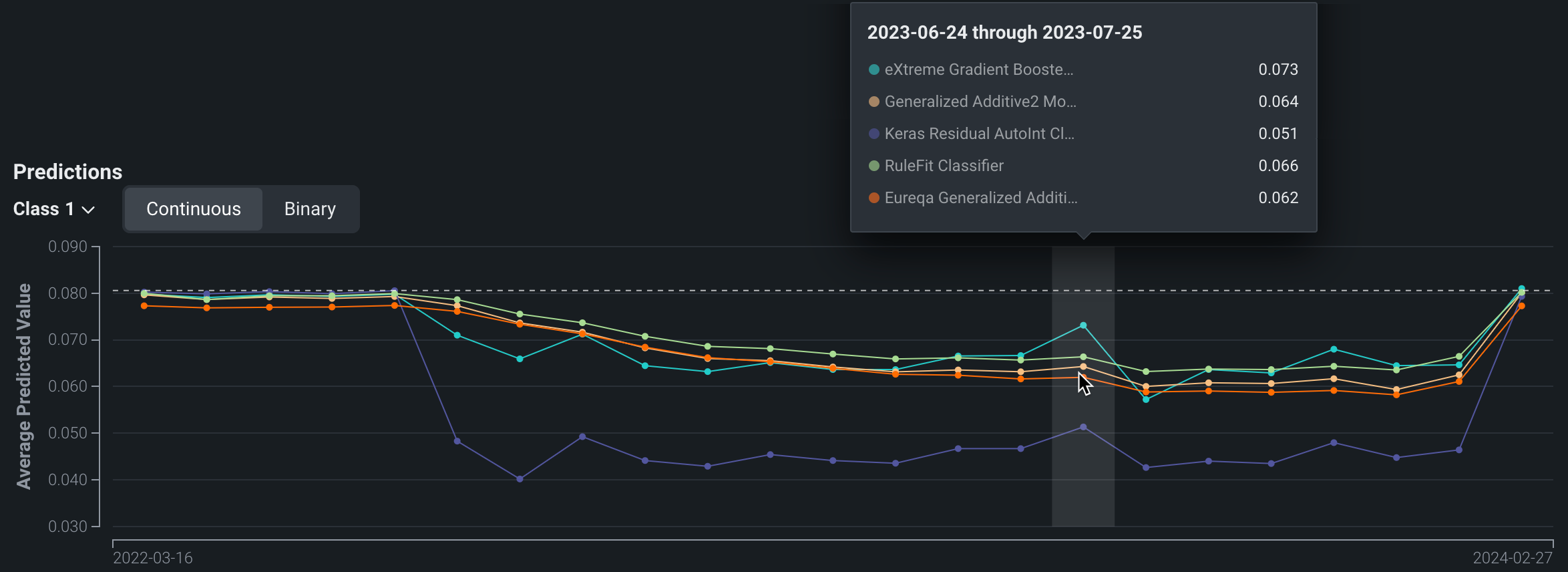
For binary classification projects, use the Class dropdown to select the class for which you want to analyze the average predicted values. The chart also includes a toggle that allows you to switch between Continuous and Binary modes. Continuous mode shows the positive class predictions as probabilities between 0 and 1 without taking the prediction threshold into account. Binary mode takes the prediction threshold into account and shows, for all predictions made, the percentage for each possible class.
Accuracy chart
The Accuracy chart records the change in a selected accuracy metric value (LogLoss in this example) over time. These metrics are identical to those used for the evaluation of the model before deployment. Use the dropdown to change the accuracy metric. You can select from any of the supported metrics for the deployment's modeling type.
Accuracy tracking requires association ID
You must set an association ID before making predictions to include those predictions in accuracy tracking.
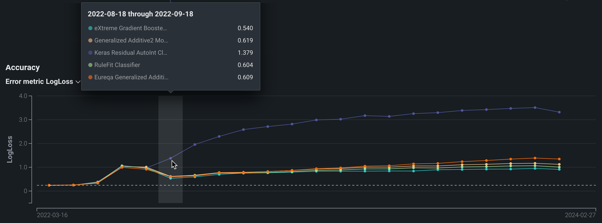
The metrics available depend on the modeling type used by the deployment: regression, binary classification, or multiclass.
| Modeling type | Available metrics |
|---|---|
| Regression | RMSE, MAE, Gamma Deviance, Tweedie Deviance, R Squared, FVE Gamma, FVE Poisson, FVE Tweedie, Poisson Deviance, MAD, MAPE, RMSLE |
| Binary classification | LogLoss, AUC, Kolmogorov-Smirnov, Gini-Norm, Rate@Top10%, Rate@Top5%, TNR, TPR, FPR, PPV, NPV, F1, MCC, Accuracy, Balanced Accuracy, FVE Binomial |
| Multiclass | LogLoss, FVE Multinomial |
Note
For more information on these metrics, see the Optimization metrics documentation.
Data Errors chart
The Data Errors chart records the data error rate for each model over time. Data error rate measures the percentage of requests that result in a 4xx error (problems with the prediction request submission).
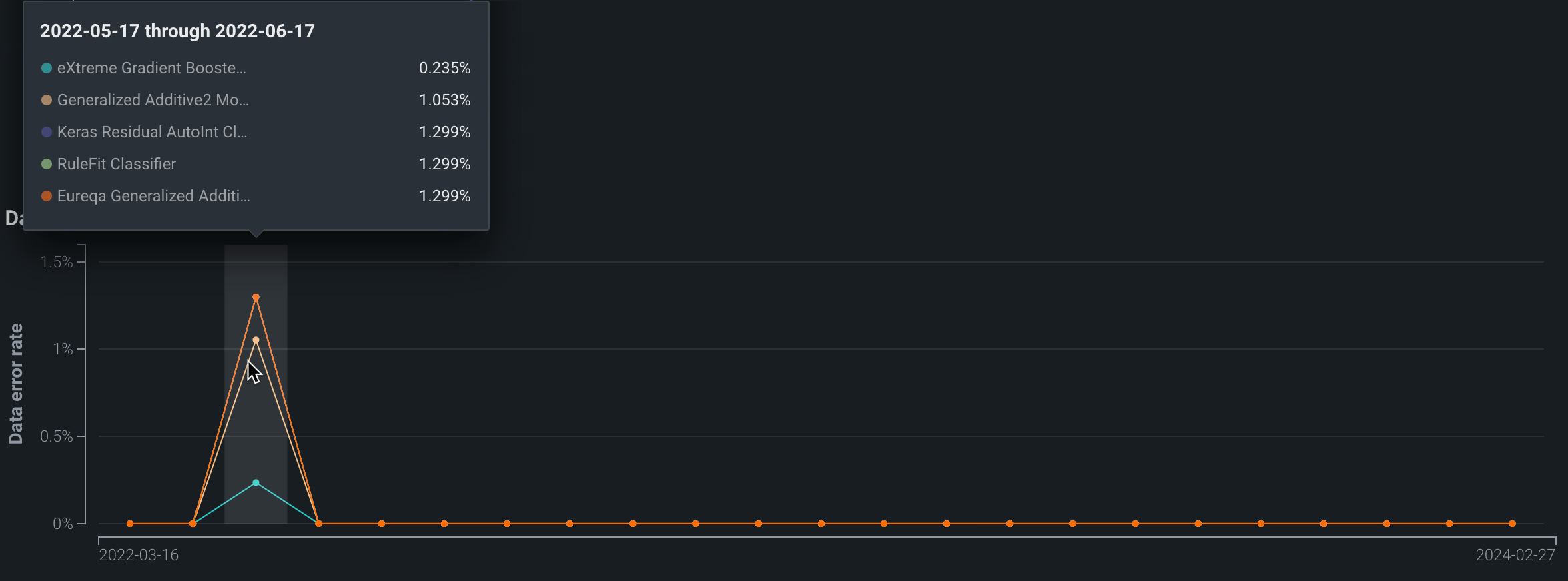
Custom segments and the data error chart
If a user-configured segment attribute is selected, the data error chart is not available.
Challenger model comparisons
MLOps allows you to compare challenger models against each other and against the currently deployed model (the "champion") to ensure that your deployment uses the best model for your needs. After evaluating DataRobot's model comparison visualizations, you can replace the champion model with a better-performing challenger.
DataRobot renders visualizations based on a dedicated comparison dataset, which you select, ensuring that you're comparing predictions based on the same dataset and partition while still allowing you to train champion and challenger models on different datasets. For example, you may train a challenger model on an updated snapshot of the same data source used by the champion.
Comparison dataset consideration
Make sure your comparison dataset is out-of-sample for the models being compared (i.e., it doesn't include the training data from any models included in the comparison).
Generate model comparisons
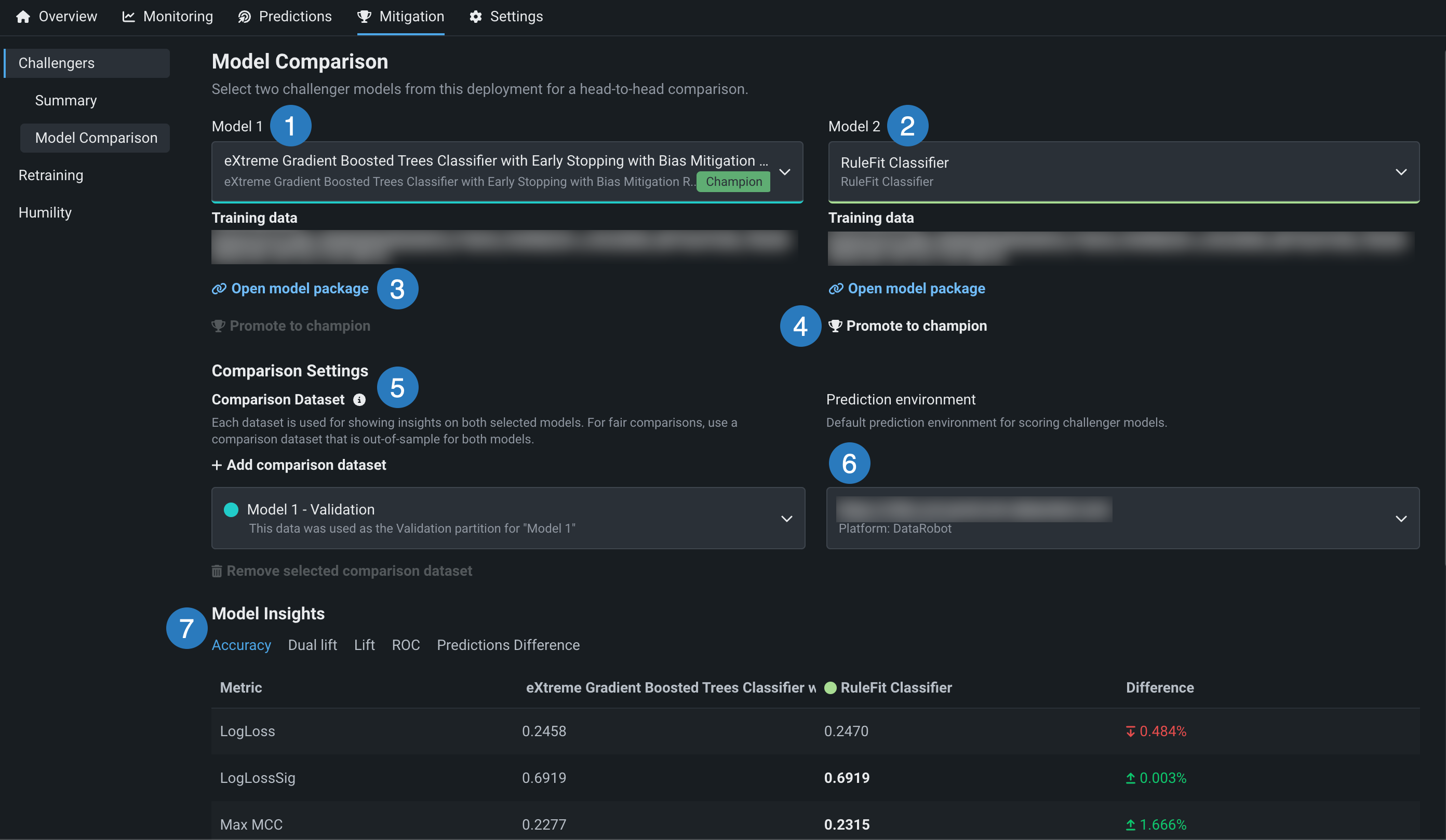
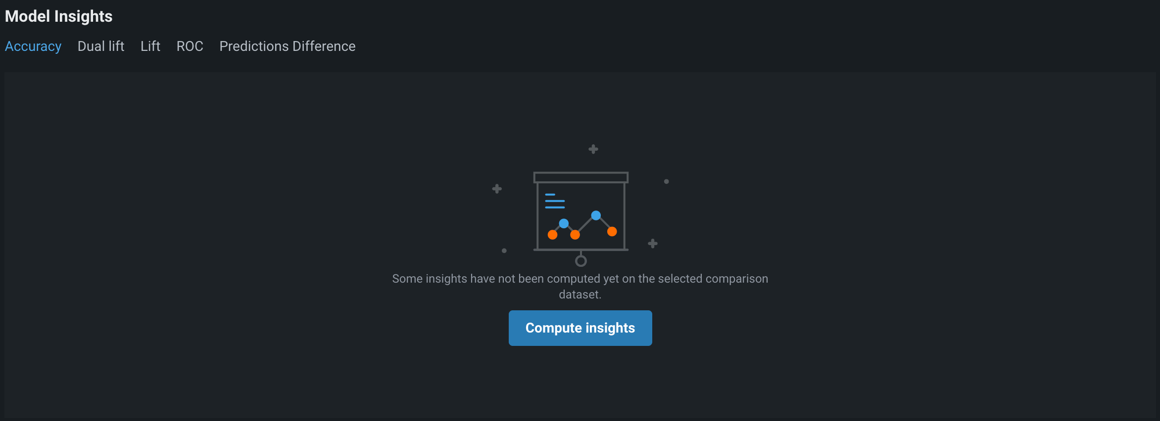
After you enable challengers, add one or more challengers to a deployment, and replay predictions, you can generate comparison data and visualizations. In the Console, on the Mitigation > Challengers tab of the deployment containing the champion and challenger models you want to compare, click the Model Comparison tab. If the Model Insights section is empty, first compute insights as described below.
The following table describes the elements of the Model Comparison tab:
| Element | Description | |
|---|---|---|
| 1 | Model 1 | Defaults to the champion model—the currently deployed model. Click to select a different model to compare. |
| 2 | Model 2 | Defaults to the first challenger model in the list. Click to select a different model to compare. If the list doesn't contain a model you want to compare to Model 1, click the Challengers Summary tab to add a new challenger. |
| 3 | Open model package | Click to view the registered model's details on the Registry > Models tab. |
| 4 | Promote to champion | If the challenger model in the comparison is the best model (of the champion and all challengers), click Promote to champion to replace the deployed model (the "champion") with this model. |
| 5 | Add comparison dataset | Select a dataset for generating insights on both models. Be sure to select a dataset that is out-of-sample for both models (see stacked predictions). Holdout and validation partitions for Model 1 and Model 2 are available as options if these partitions exist for the original model. By default, the holdout partition for Model 1 is selected. To specify a different dataset, click + Add comparison dataset and choose a local file or a snapshotted dataset from the Data tab. |
| 6 | Prediction environment | Select a prediction environment for scoring both models. |
| 7 | Model Insights | Compare model predictions, metrics, and more. |
Compute insights
If the Model Insights section is empty, click Compute insights. You can also generate new insights using a different dataset by clicking + Add comparison dataset, then clicking Compute insights again.
View model comparisons
Once you compute model insights, the Model Insights page displays the following tabs depending on the modeling type:
| Accuracy | Dual lift | Lift | ROC | Predictions Difference | |
|---|---|---|---|---|---|
| Regression | ✔ | ✔ | ✔ | ✔ | |
| Binary | ✔ | ✔ | ✔ | ✔ | ✔ |
| Multiclass | ✔ | ||||
| Time series | ✔ | ✔ | ✔ | ✔ |
In the dual lift, lift, and ROC insights, the curves for the two models represented maintain the color they were assigned when added to the deployment (as either a champion or challenger).
After DataRobot computes model insights for the deployment, you can compare model accuracy.
Under Model Insights, click the Accuracy tab to compare accuracy metrics:
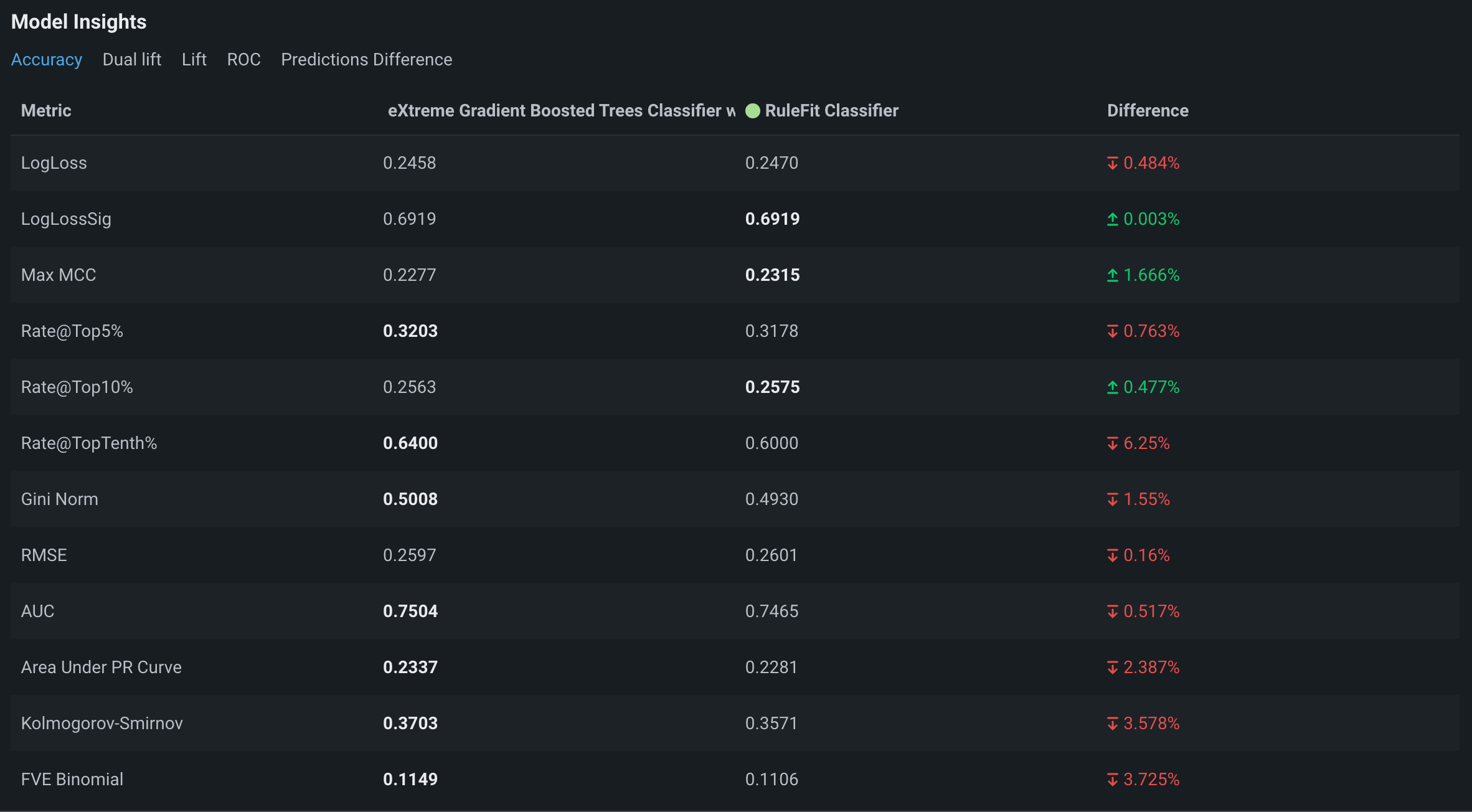
The columns show the metrics for each model. Highlighted numbers represent favorable values. In this example, the champion, Model 1, outperforms Model 2 for most metrics shown.
For time series projects, you can evaluate accuracy metrics by applying the following filters:
-
Forecast distance: View accuracy for the selected forecast distance row within the forecast window range.
-
For all x series: View accuracy scores by metric. This view reports scores in all available accuracy metrics for both models across the entire time series range (x).
-
Per series: View accuracy scores by series within a multiseries comparison dataset. This view reports scores in a single accuracy metric (selected in the Metric dropdown menu) for each Series ID (e.g., store number) in the dataset for both models.
For multiclass projects, you can evaluate accuracy metrics by applying the following filters:
-
For all x classes: View accuracy scores by metric. This view reports scores in all available accuracy metrics for both models across the entire multiclass range (x).
-
Per class: View accuracy scores by class within a multiclass classification problem. This view reports scores in a single accuracy metric (selected in the Metric dropdown menu) for each Class (e.g., buy, sell, or hold) in the dataset for both models.
A dual lift chart is a visualization comparing two selected models against each other. This visualization can reveal how models underpredict or overpredict the actual values across the distribution of their predictions. The prediction data is evenly distributed into equal size bins in increasing order.
To view the dual lift chart for the two models being compared, under Model Insights, click the Dual lift tab:
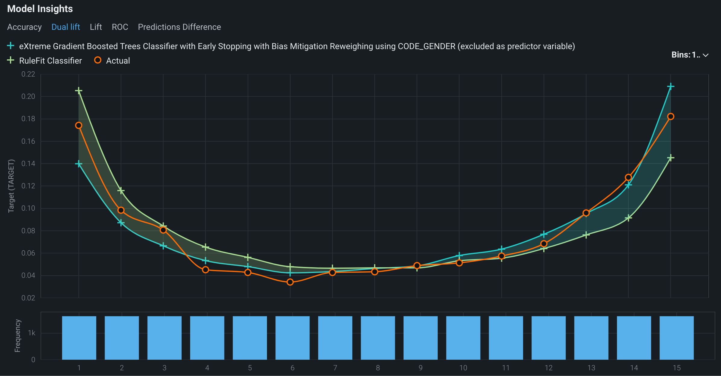
The curves in the dual lift chart represent the two models selected and the deployment's actuals. You can hide either of the model curves or the actual curve.
- The + icons in the plot area of the chart represent the models' predicted values. Click the + icon next to a model name in the header to hide or show the curve for a particular model.
- The orange icons in the plot area of the chart represent the actual values. Click the orange icon next to Actual to hide or show the curve representing the actual values.
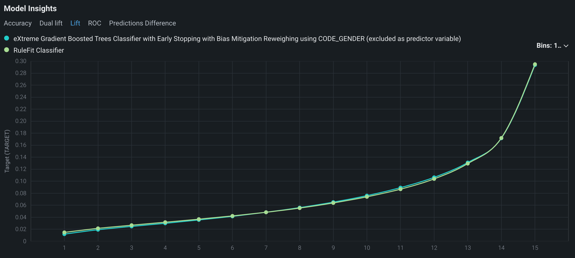
A lift chart depicts how well a model segments the target population and how capable it is of predicting the target, allowing you to visualize the model's effectiveness.
To view the lift chart for the models being compared, under Model Insights, click the Lift tab:
Note
The ROC tab is only available for binary classification projects.
An ROC curve plots the true-positive rate against the false-positive rate for a given data source. Use the ROC curve to explore classification, performance, and statistics for the models you're comparing.
To view the ROC curves for the models being compared, under Model Insights, click the ROC tab:
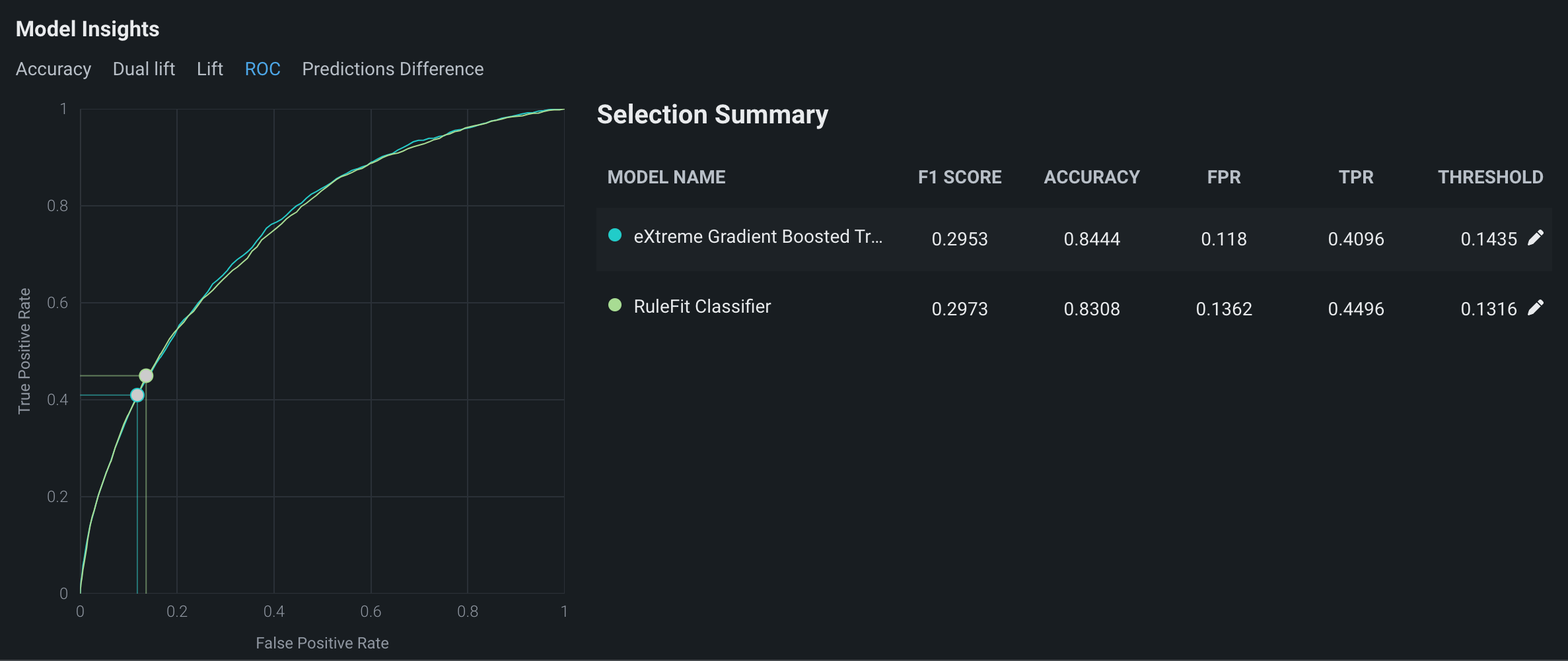
You can update the prediction thresholds for the models by clicking the pencil icons.
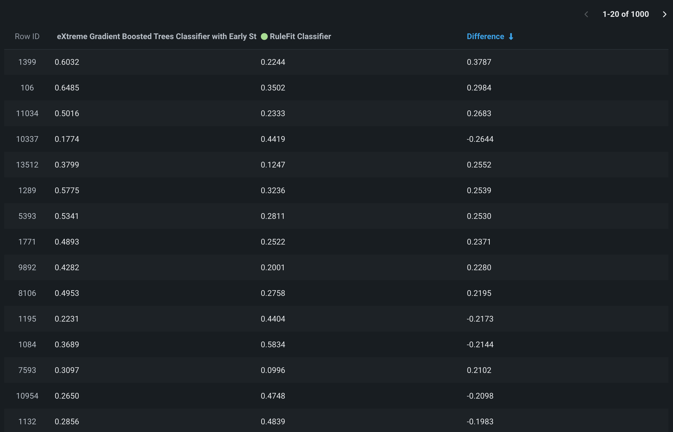
Click the Predictions Difference tab to compare the predictions of two models on a row-by-row basis. The histogram shows the percentage of predictions (along with the corresponding numbers of rows) that fall within the match threshold you specify in the Prediction match threshold field.
The header of the histogram displays the percentage of predictions:
- Between the positive and negative values of the match threshold (shown in green)
- Greater than the upper (positive) match threshold (shown in red)
- Less than the lower (negative) match threshold (shown in red)
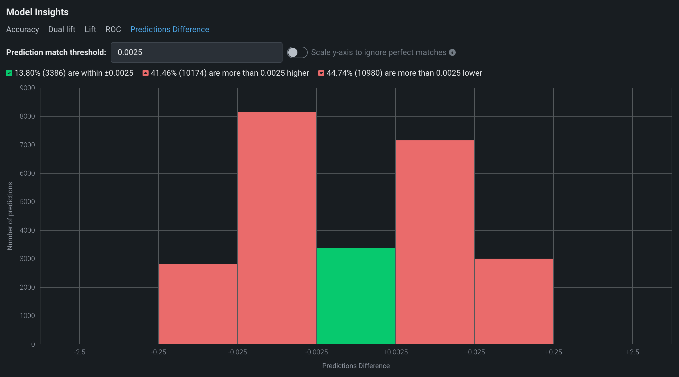
How are bin sizes calculated?
The size of the Predictions Difference bins in the histogram depends on the Prediction match threshold you set. The value of the prediction match threshold bin is equal to the difference between the upper match threshold (positive) and the lower match threshold (negative). The default prediction match threshold value is 0.0025, so for that value, the center bin is 0.005 (0.0025 + |-0.0025|). The bins on either side of the central bin are ten times larger than the previous bin. The last bin on either end expands to fit the full Prediction Difference range. For example, based on the default Prediction match threshold, the bin sizes would be as follows (where x is the difference between 250 and the maximum Prediction Difference):
| Bin -5 | Bin -4 | Bin -3 | Bin -2 | Bin -1 | Bin 0 | Bin 1 | Bin 2 | Bin 3 | Bin 4 | Bin 5 | |
|---|---|---|---|---|---|---|---|---|---|---|---|
| Range | (−250 + x) to −25 | −25 to −2.5 | −2.5 to −0.25 | −0.25 to −0.025 | −0.025 to −0.0025 | −0.0025 to +0.0025 | +0.0025 to +0.025 | +0.025 to +0.25 | +0.25 to +2.5 | +2.5 to +25 | +25 to (+250 + x) |
| Size | 225 + x | 22.5 | 2.25 | 0.225 | 0.0225 | 0.005 | 0.0225 | 0.225 | 2.25 | 22.5 | 225 + x |
If many matches dilute the histogram, you can toggle Scale y-axis to ignore perfect matches to focus on the mismatches. The bottom section of the Predictions Difference tab shows the 1000 most divergent predictions (in terms of absolute value). The Difference column shows how far apart the predictions are.