Accuracy
The Accuracy tab allows you to analyze the performance of model deployments over time using standard statistical measures and exportable visualizations. Use this tool to determine whether a model's quality is decaying and if you should consider replacing it. The Monitoring > Accuracy tab renders insights based on the problem type and its associated optimization metrics.
Processing limits
The accuracy scores displayed on this tab are estimates and may differ from accuracy scores computed using every prediction row in the raw data. This is due to data processing limits. Processing limits can be hourly, daily, or weekly—depending on the configuration for your organization. In addition, a megabyte-per-hour limit (typically 100MB/hr) is defined at the system level. Because accuracy scores don't reflect every row of larger prediction requests, span requests over multiple hours or days—to avoid reaching the computation limit—to achieve a more precise score.
Enable the Accuracy tab
The Accuracy tab is not enabled for deployments by default. To enable it, enable target monitoring, set an association ID, and upload the data that contains predicted and actual values for the deployment collected outside of DataRobot. Reference the overview of setting up accuracy for deployments by adding actuals for more information.
The following errors can prevent accuracy analysis:
| Problem | Resolution |
|---|---|
| Disabled target monitoring setting | Enable target monitoring on the Settings > Data drift tab. A message appears on the Accuracy tab to remind you to enable target monitoring. |
| Missing Association ID at prediction time | Set an association ID before making predictions to include those predictions in accuracy tracking. |
| Missing actuals | Add actuals on the Settings > Accuracy tab. |
| Insufficient predictions to enable accuracy analysis | Add more actuals on the Settings > Accuracy tab. A minimum of 100 rows of predictions with corresponding actual values are required to enable the Accuracy tab. |
| Missing data for the selected time range | Ensure predicted and actual values match the selected time range to view accuracy metrics for that range. |
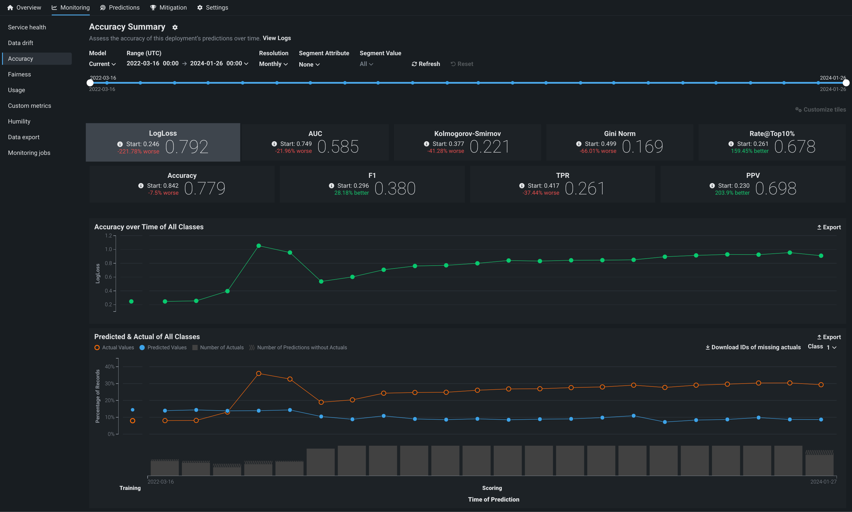
Configure the Accuracy dashboard
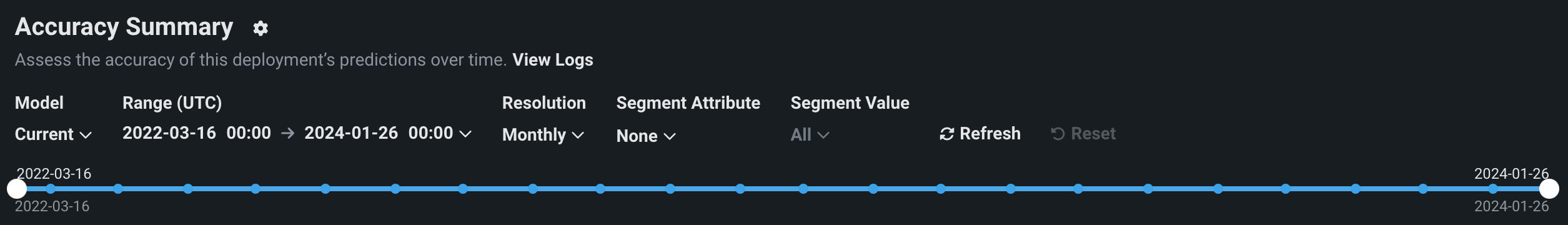
The controls—model version and data time range selectors—work the same as those available on the Data drift tab. The Accuracy tab also supports segmented analysis, allowing you to view accuracy for individual segment attributes and values.
Note
To receive email notifications on accuracy status, configure notifications and configure accuracy monitoring.
Configure accuracy metrics
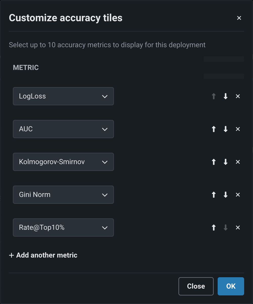
Deployment owners can configure multiple accuracy metrics for each deployment. The accuracy metrics a deployment uses appear as individual tiles above the accuracy charts. Click Customize tiles to edit the metrics used:
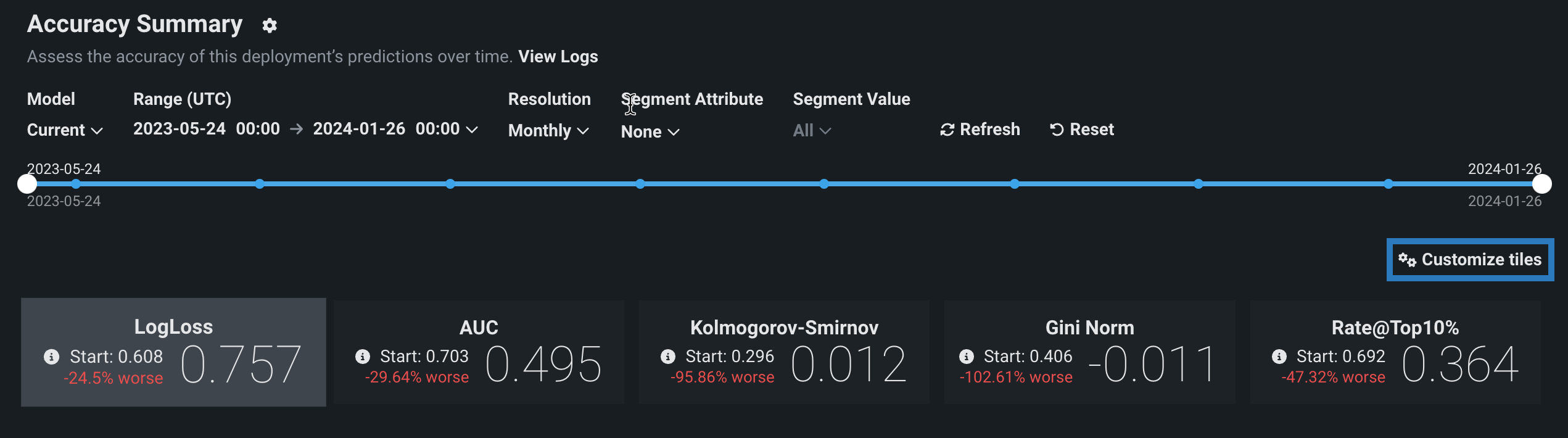
The dialog box lists all of the metrics currently enabled for the deployment, listed from top to bottom in order of their appearance as tiles, from left to right. The first metric, the default metric, loads when you open the page.
| Icon | Action | Description |
|---|---|---|
| Move metric up | Move the metric to the left (or up) in the metric grid. | |
| Move metric down | Move the metric to the right (or down) in the metric grid. | |
| Remove metric | Remove the metric from the metric grid. | |
| Add another metric | Add a new metric to the end of the metric list/grid. |
Each deployment can display up to 10 accuracy tiles. If you run out of metrics, change an existing tile's accuracy metric, clicking the dropdown for the metric you wish to change and selecting the metric to replace it. The metrics available depend on the type of modeling project used for the deployment: regression, binary classification, or multiclass.
| Modeling type | Available metrics |
|---|---|
| Regression | RMSE, MAE, Gamma Deviance, Tweedie Deviance, R Squared, FVE Gamma, FVE Poisson, FVE Tweedie, Poisson Deviance, MAD, MAPE, RMSLE |
| Binary classification | LogLoss, AUC, Kolmogorov-Smirnov, Gini-Norm, Rate@Top10%, Rate@Top5%, TNR, TPR, FPR, PPV, NPV, F1, MCC, Accuracy, Balanced Accuracy, FVE Binomial |
| Multiclass | LogLoss, FVE Multinomial |
Note
For more information on these metrics, see the optimization metrics documentation.
When you have made all of your changes, click OK. The Accuracy tab updates to reflect the changes made to the displayed metrics.
Accuracy charts
The Accuracy tab renders insights based on the problem type and its associated optimization metrics. In particular, the Accuracy over Time chart displays the change in the selected accuracy metric over time. The Accuracy over Time and Predicted & Actual charts are two charts in one, sharing a common x-axis, Time of Prediction.
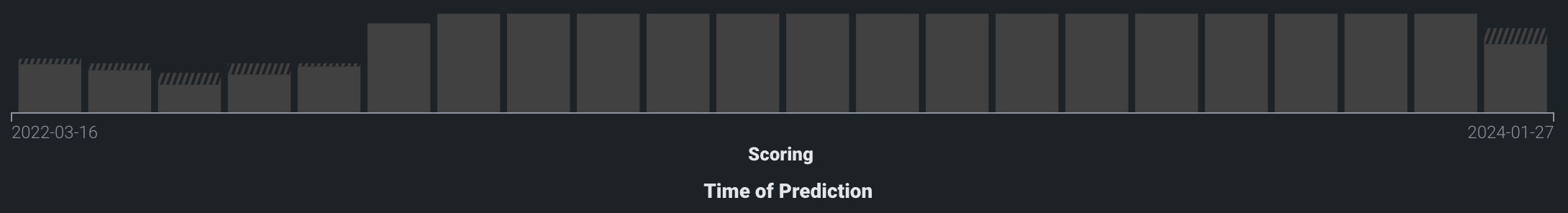
Time of Prediction
The Time of Prediction value differs between the Data drift and Accuracy tabs and the Service health tab:
-
On the Service health tab, the "time of prediction request" is always the time the prediction server received the prediction request. This method of prediction request tracking accurately represents the prediction service's health for diagnostic purposes.
-
On the Data drift and Accuracy tabs, the "time of prediction request" is, by default, the time you submitted the prediction request, which you can override with the prediction timestamp in the Prediction History and Service Health settings.
On the Time of Prediction axis (the x-axis), the volume bins display the number of actual values associated with the predictions made at each point. The light, shaded area represents the number of uploaded actuals; the striped area represents the number of predictions missing corresponding actuals:
Time of prediction for time series deployments
The default prediction timestamp method for time series deployments is forecast date (i.e., forecast point + forecast distance), not the time of the prediction request. Forecast date allows a common time axis to be used between the training data and the basis of data drift and accuracy statistics. For example, using forecast date, if the prediction data has dates from June 1 to June 10, the forecast point is set to June 10, and the forecast distance is set to +1 - + 7 days, predictions are available and data drift is tracked for June 11 - 17.
You can select from the following prediction timestamp options when deploying a model:
- Use value from date/time feature: Default. Use the date/time provided as a feature with the prediction data (e.g., forecast date) to determine the timestamp.
- Use time of prediction request: Use the time you submitted the prediction request to determine the timestamp.
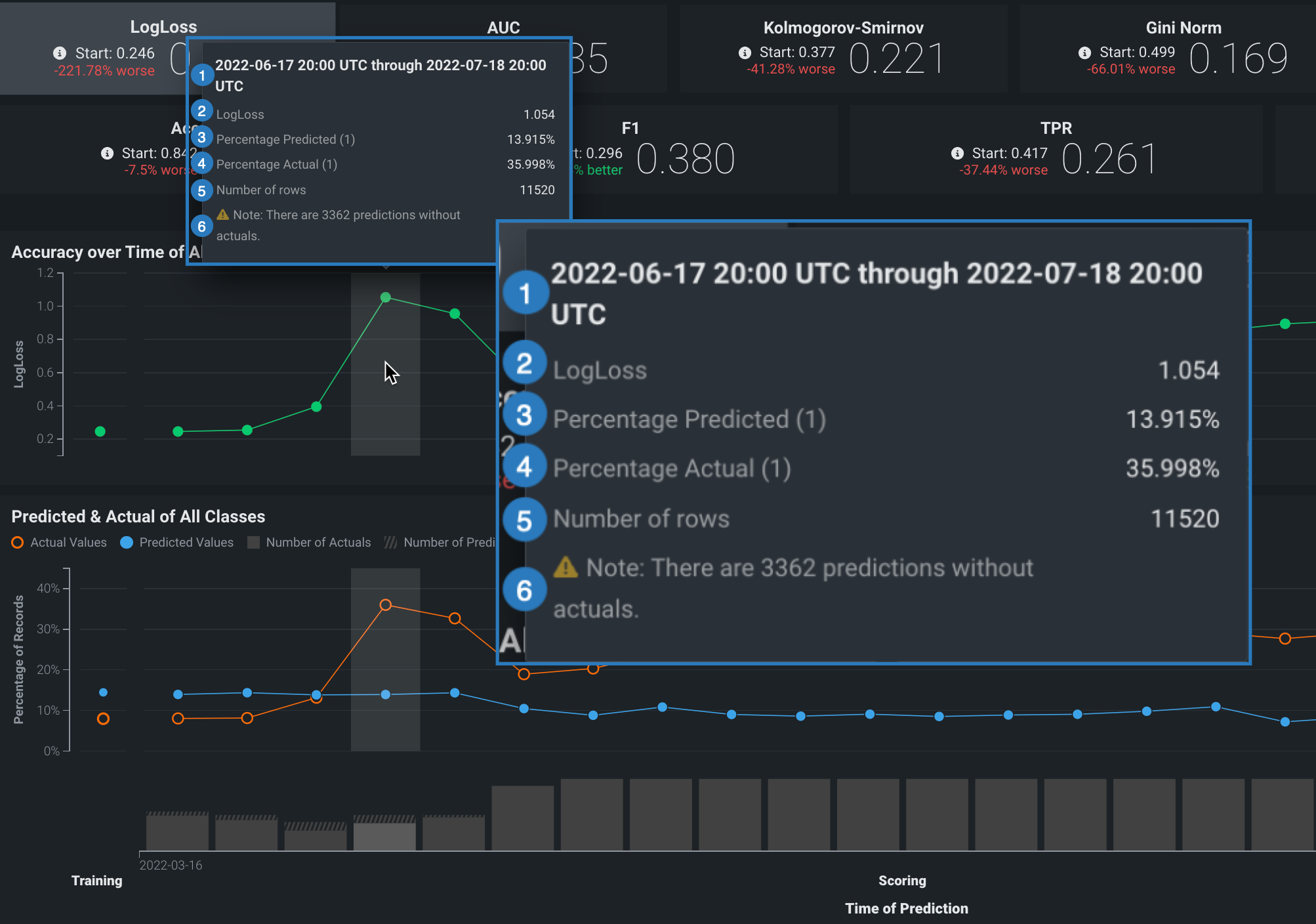
On either chart, point to a marker (or the surrounding bin associated with the marker) on the plot to see specific details for that data point. The following table explains the information provided for both regression and classification model deployments:
| Element | Regression | Classification |
|---|---|---|
| 1 | The period of time that the point captures. | |
| 2 | The selected optimization metric value for the point’s time period. It reflects the score of the corresponding metric tile above the chart, adjusted for the displayed time period. | |
| 3 | The average predicted value (derived from the prediction data) for the point's time period. Values are reflected by the blue points along the Predicted & Actual chart. | The frequency, as a percentage, of how often the prediction data predicted the value label (true or false) for the point’s time period. Values are represented by the blue points along the Predicted & Actual chart. See the image below for information on setting the label. |
| 4 | The average actual value (derived from the actuals data) for the point's time period. Values are reflected by the orange points along the Predicted & Actual chart. | The frequency, as a percentage, that the actual data is the value 1 (true) for the point's time period. These values are represented by the orange points along the Predicted & Actual chart. See the image below for information on setting the label. |
| 5 | The number of rows represented by this point on the chart. | |
| 6 | The number of prediction rows that do not have corresponding actual values recorded. This value is not specific to the point selected. | |
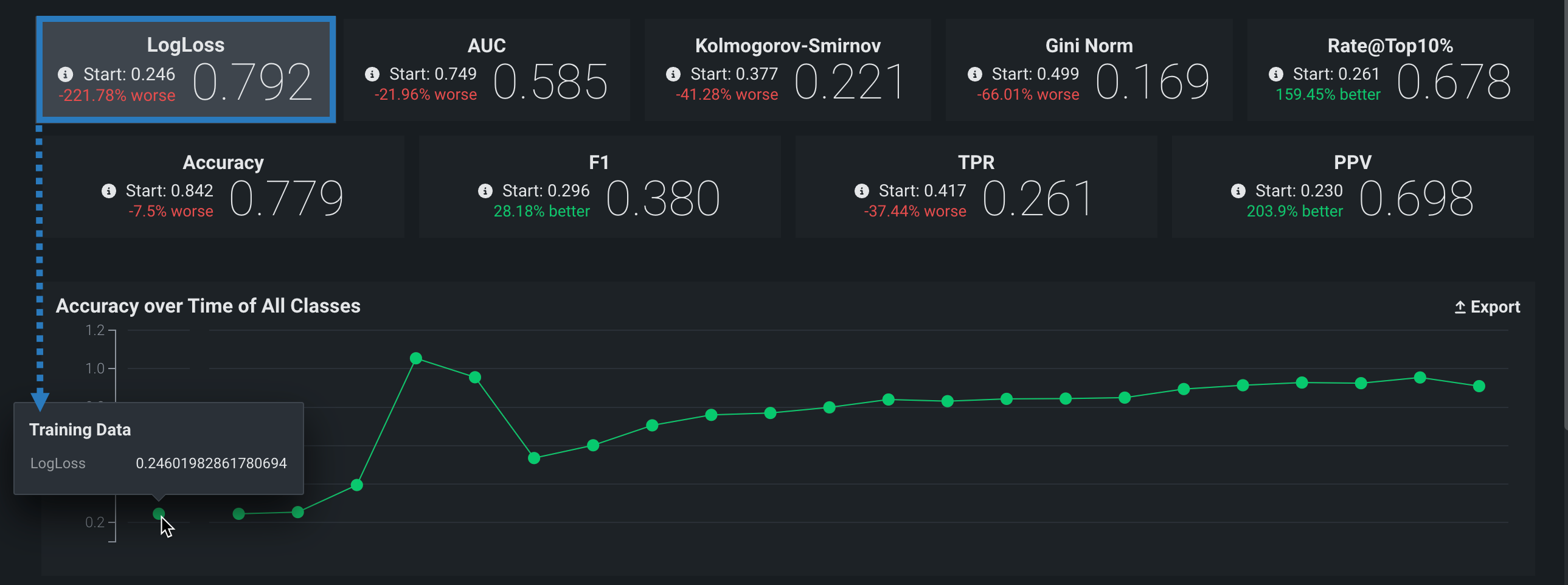
Accuracy over time chart
The Accuracy over time chart displays the change over time for a selected accuracy metric value. Click on any metric tile above the chart to change the display:
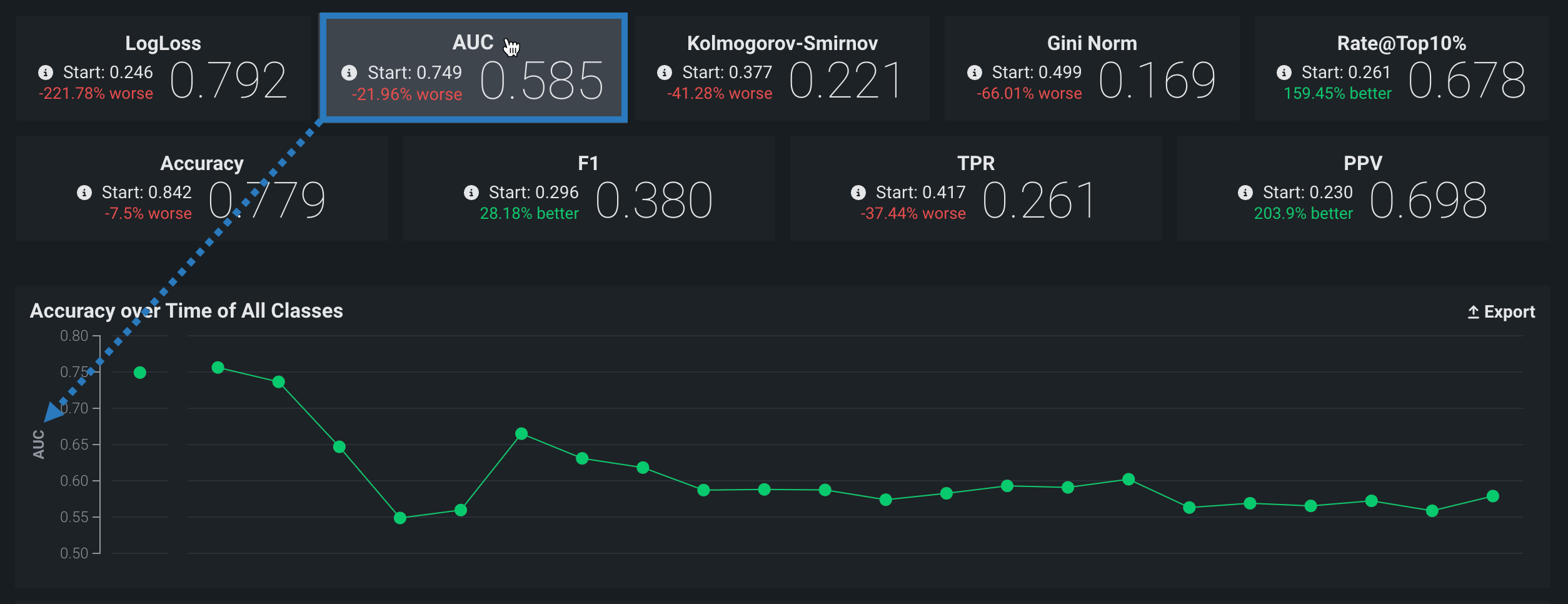
The Start value (the baseline accuracy score) and the plotted accuracy baseline represent the accuracy score for the model, calculated using the trained model’s predictions on the holdout partition:
Holdout partition for custom models
- For structured custom models, you define the holdout partition based on the partition column in the training dataset. You can specify the partition column while adding training data.
- For unstructured custom models and external models, you provide separate training and holdout datasets.
Predicted & actual chart
The Predicted & Actual chart shows the predicted and actual values over time. For binary classification projects, you can select which classification value to show (True or False in this example) from the dropdown menu at the top of the chart:
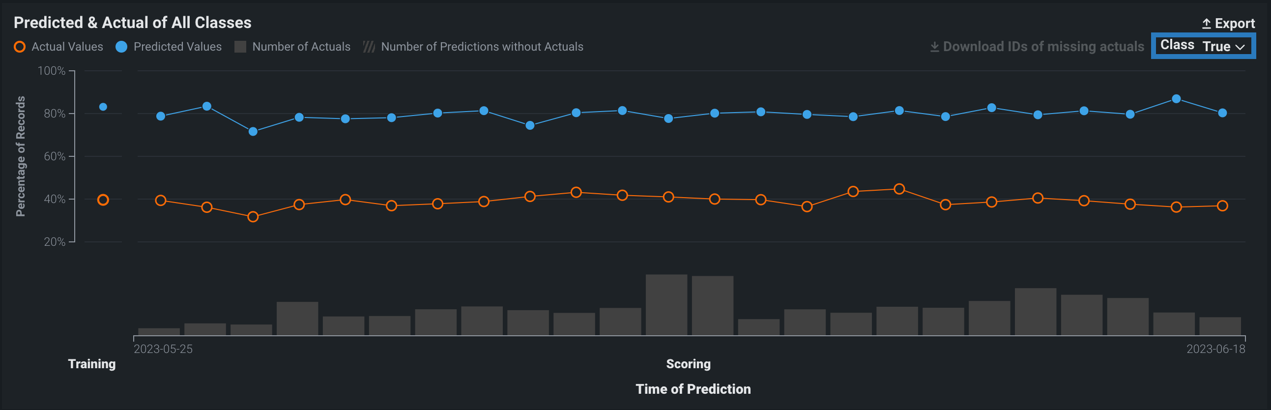
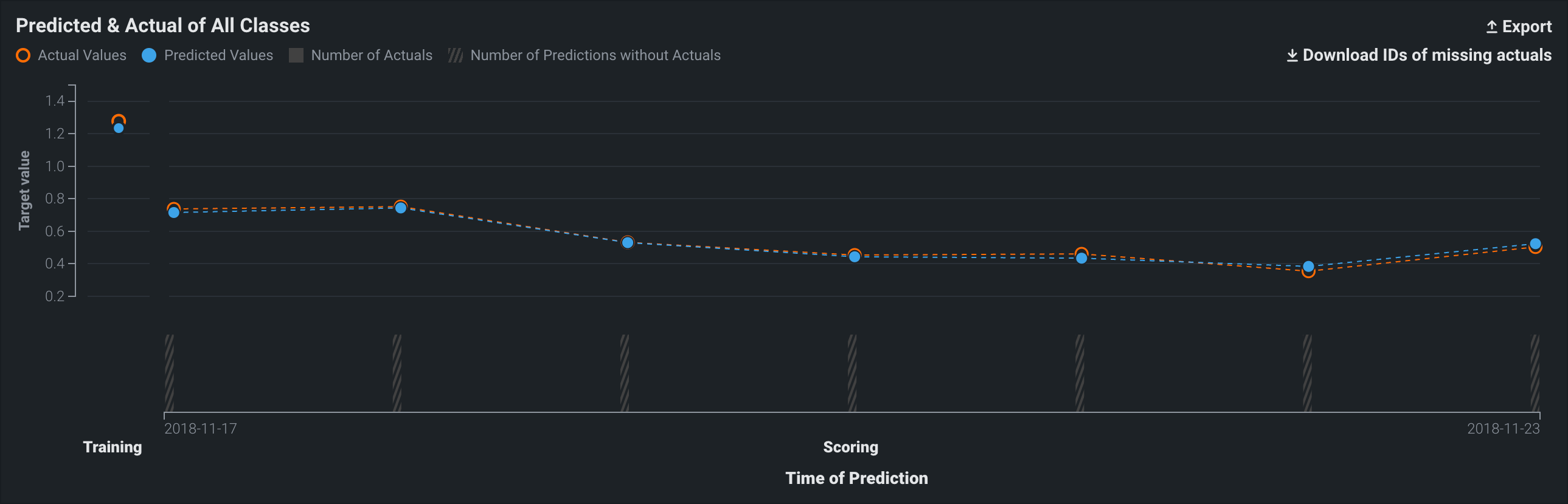
To identify predictions that are missing actuals, click the Download IDs of missing actuals link. This prompts the download of a CSV file (missing_actuals.csv) that lists the predictions made that are missing actuals, along with the association ID of each prediction. Use the association IDs to upload the actuals with matching IDs.
Multiclass accuracy charts
Multiclass deployments provide the same Accuracy over Time and Predicted vs Actual charts as standard deployments; however, the charts differ slightly as they include individual classes and offer class-based configuration to define the data displayed. In addition, you can choose between viewing the data as Charts or a Table:
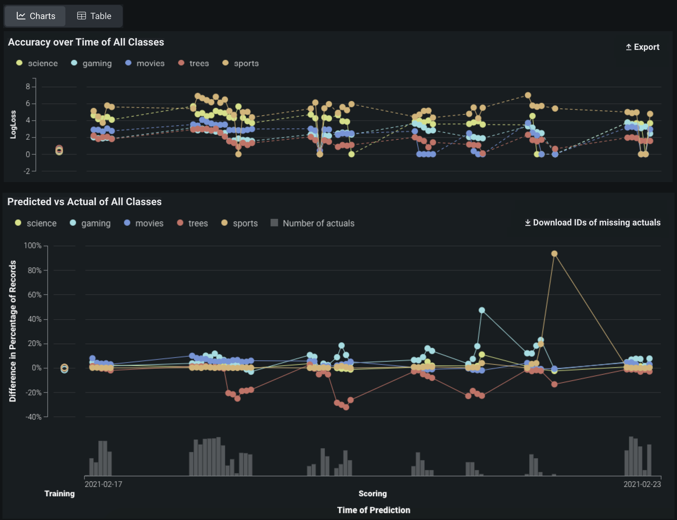
Note
By default, the charts display the five most common classes in the training data; if the number of classes exceeds five, all other classes are represented by a single line.
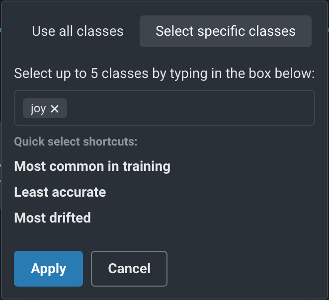
To configure the classes displayed, above the date slider, configure the Target Class dropdown, controlling which classes are selected to display on the selected tab:
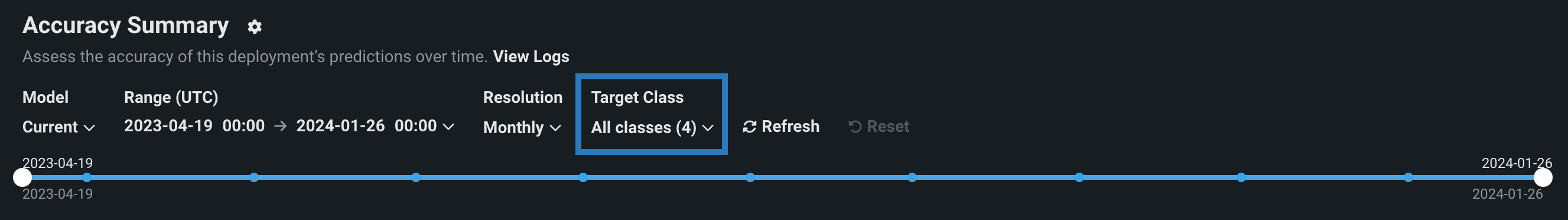
Click the dropdown to determine which classes you want to display, then select one of the following:
| Option | Description |
|---|---|
| Use all classes | Selects all five of the most common classes in the training data, along with a single line representing all other classes. |
| Select specific classes | Do either of the following to display up to five classes:
|
After you click Apply, the charts on the tab update to display the selected classes.
Accuracy charts for location data
Premium
Geospatial monitoring is a premium feature. Contact your DataRobot representative or administrator for information on enabling the feature.
Geospatial feature monitoring support
Geospatial feature monitoring is supported for binary classification, multiclass, regression, and location target types.
When DataRobot Location AI detects and ingests geospatial features, DataRobot uses H3 indexing and segmented analysis to segment the world into a grid of cells. On the Accuracy tab, these cells serve as the foundation for "accuracy over space" analysis, allowing you to compare locations to identify the difference in predictive accuracy, scoring data sample size, and the number of rows with actuals.
Enable geospatial monitoring for a deployment
For a deployed binary classification, regression, multiclass, or location model built with location data in the training dataset, you can leverage DataRobot Location AI to perform geospatial monitoring for the deployment. To enable geospatial analysis for a deployment, enable segmented analysis and define a segment for the location feature geometry, generated during location data ingest. The geometry segment contains the identifier used to segment the world into a grid of—typically hexagonal—cells, known as H3 cells.
Defining the location segment
You do not have to use geometry as the segment value if you provide a column containing the H3 cell identifiers required for geospatial monitoring. The column provided as a segment value can have any name, as long as it contains the required identifiers (described below). For custom or external models with the Location target type, a location segment, DataRobot-Geo-Target, is created automatically; however, you still need to enable segmented analysis for the deployment.
Location AI supports ingest of these native geospatial data formats:
- ESRI Shapefiles
- GeoJSON
- ESRI File Geodatabase
- Well Known Text (embedded in table column)
- PostGIS Databases
In addition to native geospatial data ingest, location AI can automatically detect location data within non-geospatial formats by recognizing location variables when columns in the dataset are named latitude and longitude and contain values in these formats:
- Decimal degrees
- Degrees minutes seconds
- -46° 37′ 59.988″ and -23° 33′
- 46.63333W and 23.55S
- 46*37′59.98"W and 23*33′S
- W 46D 37m 59.988s and S 23D 33m
When location AI recognizes location features, the location data is aggregated using H3 indexing to group locations into cells. Cells are represented by a 64-bit integer described in hexadecimal format (for example, 852a3067fffffff). As a result, locations that are close together are often grouped in the same cell. These hexadecimal values are stored in the geometry feature.
The size of the resulting cells is determined by a resolution parameter, where a higher resolution value represents more cells generated. The resolution is calculated during training data baseline generation and is stored for use in deployment monitoring.
When making predictions, each prediction row should contain the required location feature alongside the other prediction rows.
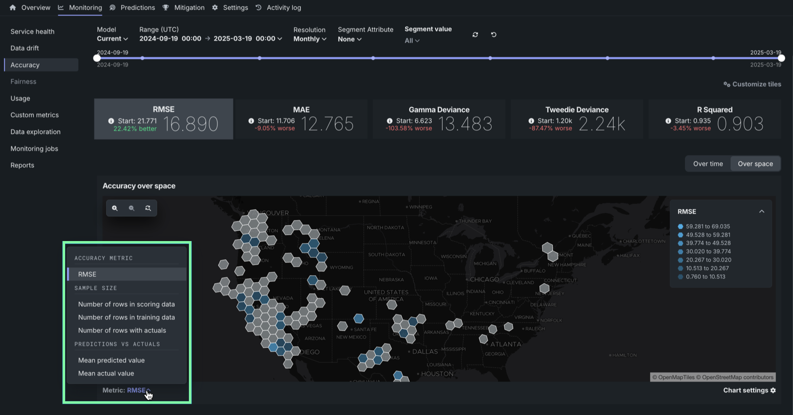
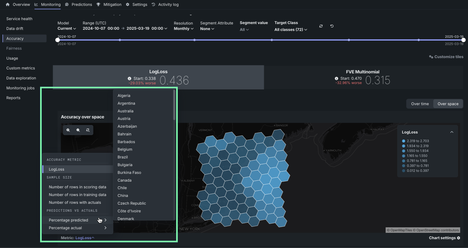
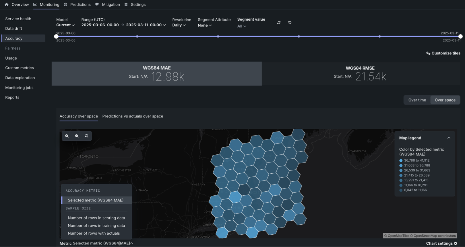
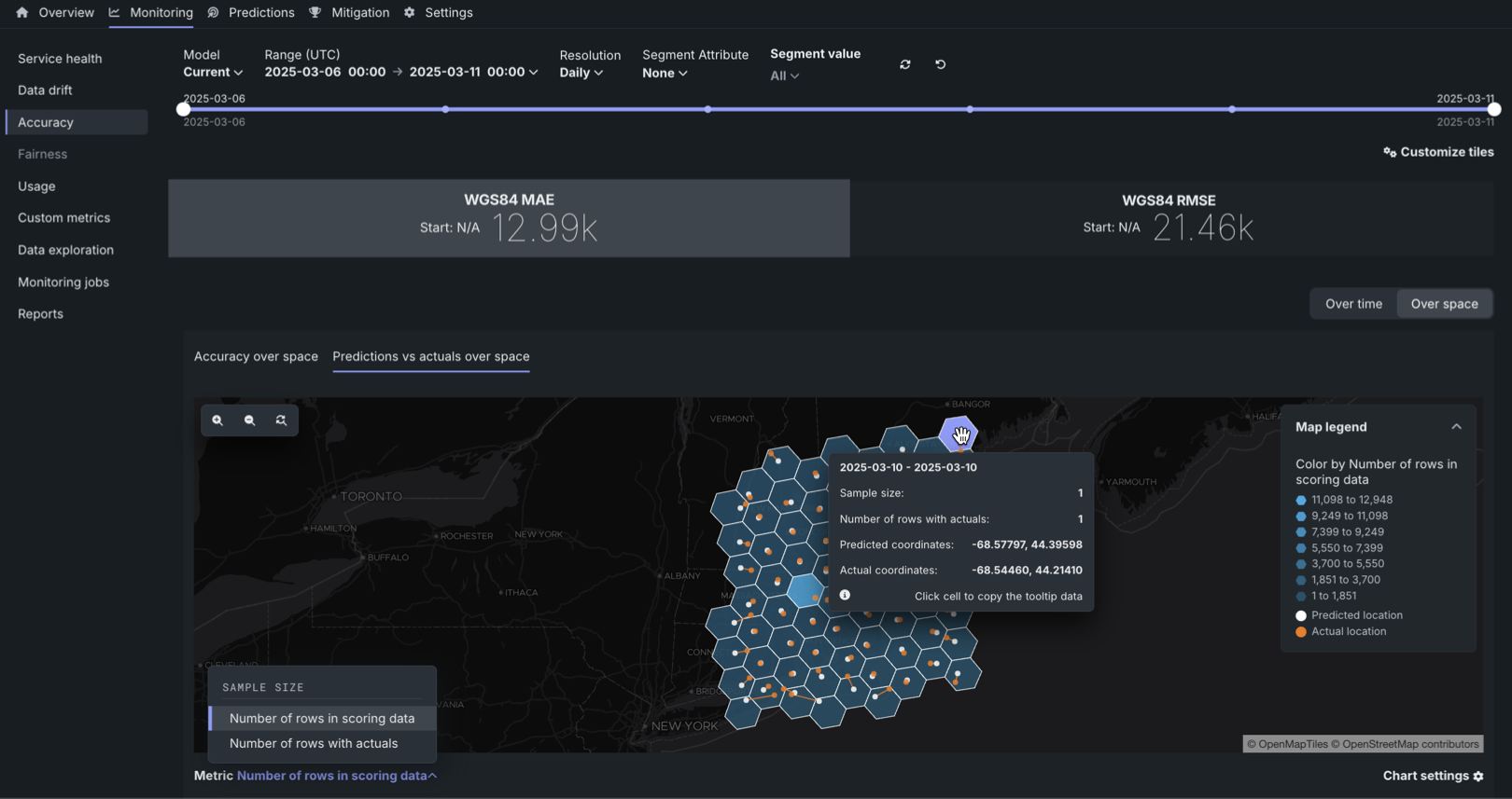
Accuracy over space chart
To access the Accuracy over space chart, in a deployment configured for accuracy over space analysis, click Over space to switch the Accuracy over time chart to accuracy over space mode.

In this chart, you can view a grid of H3 cells identifying differences in predictive accuracy between locations, differences in scoring data sample size between locations, or differences in the number of rows with actuals between locations.
To configure the Metric represented in the Accuracy over space chart, click the Metric: menu and select one of the following options:
| Metric | Description |
|---|---|
| Accuracy metric | |
| Selected metric | The calculated accuracy metric for the predictions in the cell. Click an accuracy metric tile above the Accuracy over space chart to select a metric for the chart. The available metrics depend on the modeling/target type:
|
| Sample size | |
| Number of rows in scoring data | The sample size contained in the cell for the scoring dataset. |
| Number of rows in training data | The sample size contained in the cell for the training dataset used for training baseline generation. |
| Number of rows with actuals | The number of prediction rows paired with an actual value for the cell. |
| Predictions vs. actuals | |
| Mean predicted value | For regression deployments, the mean predicted value for the cell. |
| Percentage predicted | For binary and multiclass deployments, the percentage of the predicted values in the cell classified as the selected class. |
| Mean actual value | For regression deployments, the mean actual value for the cell. |
| Percentage actual | For binary and multiclass deployments, the percentage of the actual values in the cell classified as the selected class. |
What are the WGS84 MAE and WGS84 RMSE accuracy metrics?
WGS84 MAE and WGS84 RMSE are measures of accuracy in meters. For example, in either metric, a value of 10k indicates that the predicted locations are, on average, 10,000 meters from the actual locations. Accuracy is computed using a modified RMSE formula and MAE formula, where the distance between two coordinates using a WGS84 reference ellipsoid is substituted for \((\hat{y}_i - y_i)\).
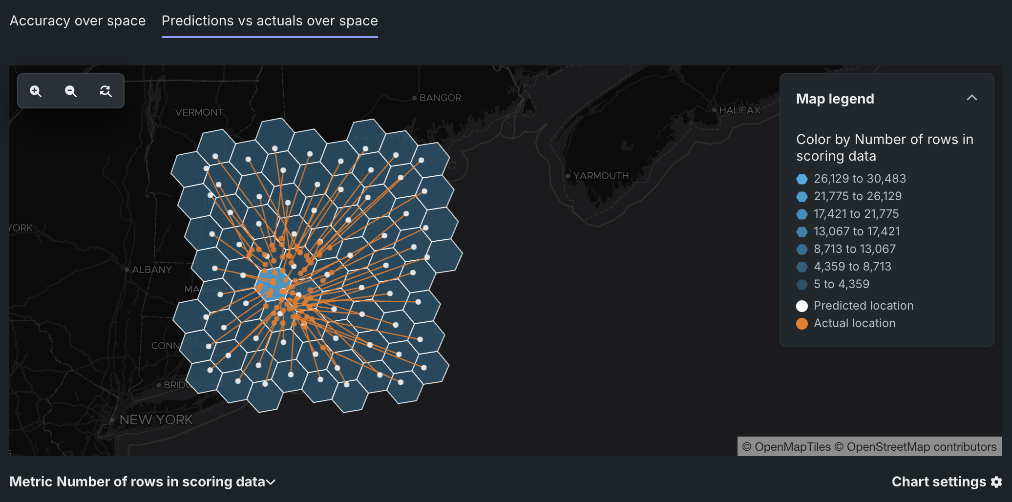
Predictions vs. actuals over space chart
Prediction vs. actuals over space monitoring support
The predictions over space visualization is available for the location target type.
For deployed models with a location target type, the Over space tab includes the Predictions vs. actuals over space chart. In this chart, you can view a grid of H3 cells identifying the difference in scoring data sample size between locations or the difference in the number of rows with actuals between locations. For each cell, this chart plots the mean Predicted location and the corresponding mean Actual location, connected by a line, to provide a direct visualization of the accuracy represented by the WGS84 MAE and WGS84 RMSE metrics. The smaller the distance between the mean locations, the more accurate the model is.
Identifying inaccurate models
For less accurate models, the mean Actual location corresponding to a mean Predicted location can be outside the segmentation cell, illustrated by the line connecting the two points. For example, below is an inaccurate model with predicted locations far from the actual location:
To configure the Metric represented in the Predictions vs. actuals over space chart, click the Metric: menu and select one of the following options:
| Metric | Description |
|---|---|
| Sample size | |
| Number of rows in scoring data | The sample size contained in the cell for the scoring dataset. |
| Number of rows with actuals | The number of prediction rows paired with an actual value for the cell. |
Interact with map-based charts
To interact with the Accuracy over space and Predictions vs. actuals over space charts, perform the following actions:
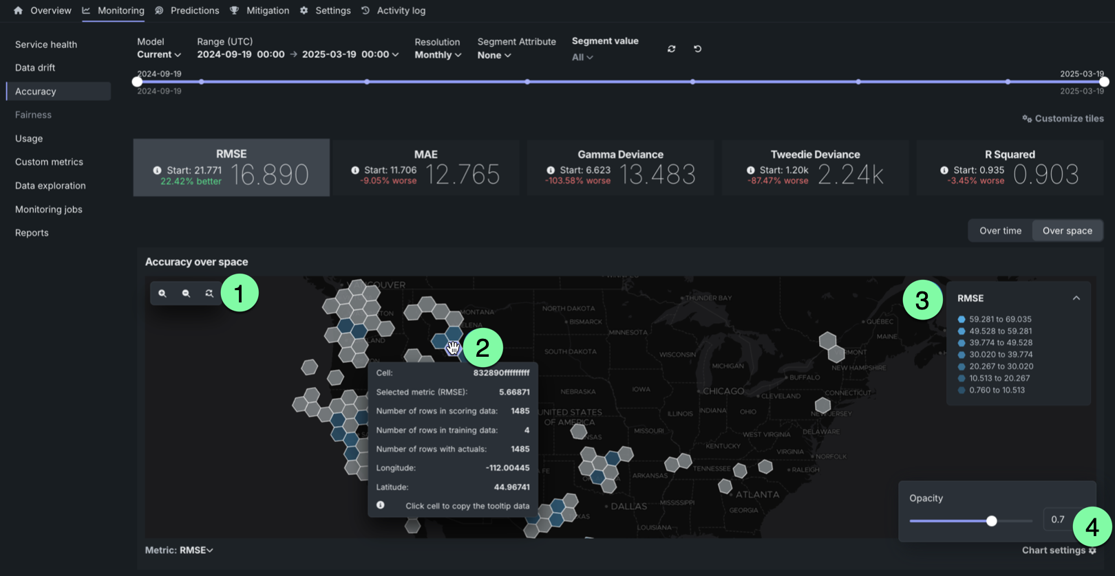
| Action | Description |
|---|---|
| 1 | Zoom settings:
|
| 2 | Map/mouse actions:
|
| 3 | Click open and close to show and hide the legend indicating the range of metric values associated with each color in the gradient. |
| 4 | Click the settings icon to adjust the opacity of the cells. |
Interpret accuracy alerts
DataRobot uses the optimization metric tile selected for deployment as the accuracy score to create an alert status. Interpret the alert statuses as follows:
| Color | Accuracy | Action |
|---|---|---|
| Green / Passing | Accuracy is similar to when the model was deployed. | No action needed. |
| Yellow / At risk | Accuracy has declined since the model was deployed. | Concerns found but no immediate action needed; monitor. |
| Red / Failing | Accuracy has severely declined since the model was deployed. | Immediate action needed. |
| Gray / Disabled | Accuracy tracking is disabled. | Enable monitoring and make predictions. |
| Gray / Not started | Accuracy tracking has not started. | Make predictions. |
| Gray / Unknown | No accuracy data is available. An insufficient number of predictions have been made (minimum 100 required). | Make predictions. |