使用状況
モデルをデプロイし、本番環境で予測を行った後、モデルの品質とパフォーマンスを長期にわたって監視することは、モデルの有効性を維持するうえで非常に重要です。 この監視は、データドリフトタブと精度タブで行われ、大量の予測データを処理する必要があります。 予測データの処理には、遅延やレート制限が発生することがあります。 使用状況タブで予測処理の進捗状況を追跡します。
Two different versions of the Usage tab are available, depending on deployment type:
- For non-agentic and non-NIM (NVIDIA Inference Microservices) deployments, this page provides prediction tracking details.
- For agentic workflow and NIM deployments, this page provides quota usage monitoring details.
Prediction tracking chart
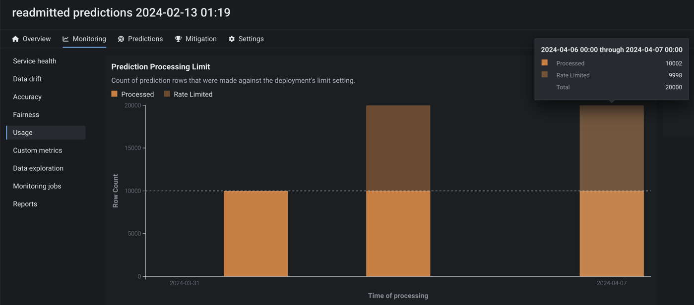
On the left side of the Monitoring > Usage tab is the Prediction tracking chart, a bar chart of the prediction processing status over the last 24 hours or 7 days, tracking the number of processed, missing association ID, and rate-limited prediction rows. 選択したビュー(24時間または7日間)に応じて、ヒストグラムのビンは1時間または1日単位になります。
![]()
| チャートの要素 | 説明 | |
|---|---|---|
| 1 | 期間の選択 | 過去24時間または過去7日間のビューを選択します。 |
| 2 | ログスケーリングを使用 | 250,000行を超える予測を含むデプロイで、予測追跡チャートにログスケーリングを適用します。 |
| 3 | 予測データの受信日時 (X軸) |
ビンで表される時間範囲(日または時間単位)を表示し、その範囲内で受信した予測データの行を追跡します。 システムが処理用に予測を受信すると、予測値にタイムスタンプが付けられます。 この「受信日時」の値は、サービスの正常性、データドリフト、および精度のタイムスタンプとは異なります。 DataRobotの予測環境では、このタイムスタンプ値は予測タイムスタンプより若干遅れる場合があります。 エージェントのデプロイでは、タイムスタンプは、DataRobot APIがエージェントから予測データを受信した日時を表します。 |
| 4 | 行数 (Y軸) |
ビンの時間範囲内(日または時間単位)でタイムスタンプが付けられた予測行の数を表示します。 |
| 5 | 予測処理のカテゴリー | 予測行のステータスを追跡する棒グラフを表示します。
|
予測レート制限はどのように機能しますか?
使用状況タブには、組織の監視レート制限の対象となる予測行数が表示されます。 ただし、レート制限は予測_監視_にのみ適用され、レートの上限に達した後でも、すべての行が予測_結果_に含まれます。 処理制限は、組織の 設定に応じて、1時間単位、1日単位、または1週間単位で設定できます。 さらに、1時間あたりのメガバイト制限(通常は100MB/時間)がシステムレベルで定義されます。 これらの制限内で作業するには、リクエストを複数の時間または複数の日にまたがるようにする必要があります。
大規模監視での予測追跡
監視エージェントのデプロイでは、大規模な監視を実装した場合、予測行はこの棒グラフに表示されません。ただし、予測値の処理(チャンピオン)の遅延では、事前に集計されたデータが追跡されます。
予測追跡チャートで追加情報を表示するには、列にカーソルを合わせると、予測データを受信した時間範囲と、処理済みの行、レート制限された行、または関連付けIDがない行の数が表示されます。
![]()
予測値と実測値の処理遅延
使用状況タブの右側には、予測値の処理(チャンピオン)と実測値の処理の遅延情報が表示されます(実測値の処理の遅延は、デプロイのすべてのモデルが対象です)。

使用状況タブでは、ページを再読み込みすることなく、処理遅延が再計算されます。 更新された情報では、遅延情報が最後に更新された日時を確認できます。
予測値と実測値のアップロード制限
本機能の提供について
設定可能な予測値と実測値のアップロード制限は、デフォルトではオフになっています。 このプレビュー機能を有効にする方法については、DataRobotの担当者または管理者にお問い合わせください。
機能フラグ:設定可能な予測値と実測値の制限を有効にする
使用状況タブから、組織のデプロイに設定されている時間単位、日単位、週単位のアップロード上限値を監視できます。 処理された予測値と実測値の数を視覚化するチャートと、返された予測結果のテーブルサイズの上限値を示すタイルが表示されます。
合計タイルには、設定済みの間隔制限(タイルの下部に表示)で相対的に処理された予測値と実測値が表示されます。 さらに、返される予測結果のテーブルサイズ制限を表示できます。 テーブルサイズは、デプロイ用にDataRobotのデータベースに保存される予測行の数を制限します。 DataRobotは、予測ごとに1つの行(二値分類デプロイの場合は2つの行)を保存します。 多クラスデプロイの場合、すべてのクラスの情報は1つの行に保存されます。 時間間隔の制限(毎時、毎日、毎週)を変更しても、テーブルの制限は変更されません。 テーブル制限を超えるリクエストは、時間に関係なく拒否されます。
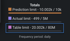
処理制限値に達した場合(50,000を上限として1時間で50,000件の実測値をアップロードする場合など)、追加のリクエスト(さらに10,000件の実測値をアップロード)を行うと、DataRobotは追加のリクエストを処理し、どの実測値もレート制限されません。 しかし、予測は小さいチャンクで処理されるため、DataRobotでは異なる方法で予測が処理されます。 小さいチャンクが処理されますが、残りの予測ではレートが制限されます。 たとえば、50,000件の予測制限に達し、さらに50,000件の予測をアップロードすると、小さいチャンクの一部として1,000件の予測のチャンクが処理されることがあります。
設定 > サービスの正常性タブに移動してデプロイ向けに設定された予測制限を表示することによって、すでに処理制限に達している場合に、次に予測を作成できるタイミングを把握できます。
Quota usage monitoring
On the Monitoring > Usage tab for agentic workflow and NIM (NVIDIA Inference Microservices) deployments, the Quota monitoring dashboard visualizes the historical usage of an agentic workflow or NIM deployment segmented by user or agent.
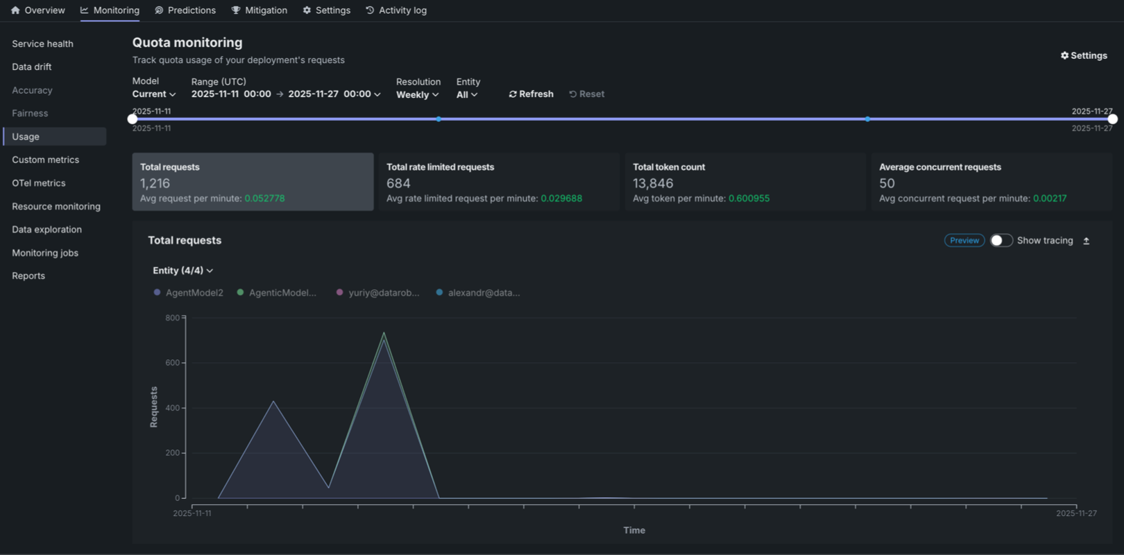
The Quota monitoring dashboard displays three key metric tiles at the top of the page:
| 指標 | 説明 |
|---|---|
| リクエストの合計数 | The total number of requests made during the selected time range, along with the average requests per minute. |
| レート制限されたリクエストの総数 | The total number of requests that were rate limited during the selected time range, along with the average rate limited requests per minute. |
| 総トークン数 | The total number of tokens consumed during the selected time range, along with the average tokens per minute. |
| 平均同時リクエスト数 | The average number of simultaneous API calls processed by the agent service over the defined interval, tracked as a key metric for observability and used to enforce the system's quota limit on simultaneous operations. |
Each metric displays the value for the selected time frame and the average per minute in green. Click the metric tile to review the corresponding chart below:
- リクエストの合計数
- レート制限されたリクエストの総数
- 総トークン数
- 平均同時リクエスト数
You can configure the Quota monitoring dashboard to focus the visualized statistics on specific entities and time frames. 次のコントロールを使用できます。
| フィルター | 説明 |
|---|---|
| モデル | Select the model version to monitor. The Current option displays data for the active model version. |
| 範囲 (UTC) | Select the date and time range for the data displayed. Use the date pickers to set the start and end times in UTC. |
| 単位 | Select the time resolution for aggregating data: Hourly, Daily, or Weekly. |
| エンティティ | Filter by entity type: All, User, or Agent. |
| 表示を更新 | Updates the dashboard with the latest data based on the current filter settings. |
| リセット | Resets all filters to their default values. |
Quota monitoring charts
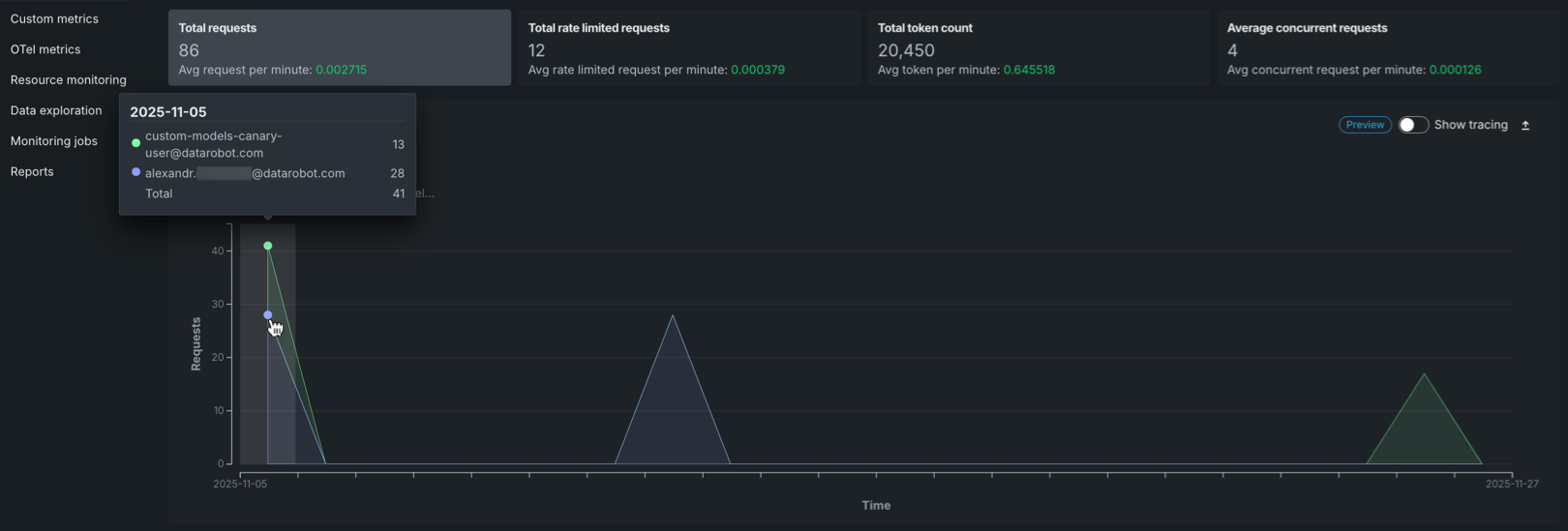
The Quota monitoring charts display an area chart showing the distribution of requests over time, rate limited requests over time, or token count over time. This chart is a stacked chart (or stacked graph), a chart stacking multiple data series on top of each other to visualize how each entity contributes to the total over time and across categories. Each chart is segmented by entity (user or agent). Each entity is represented by a different color in the chart legend.
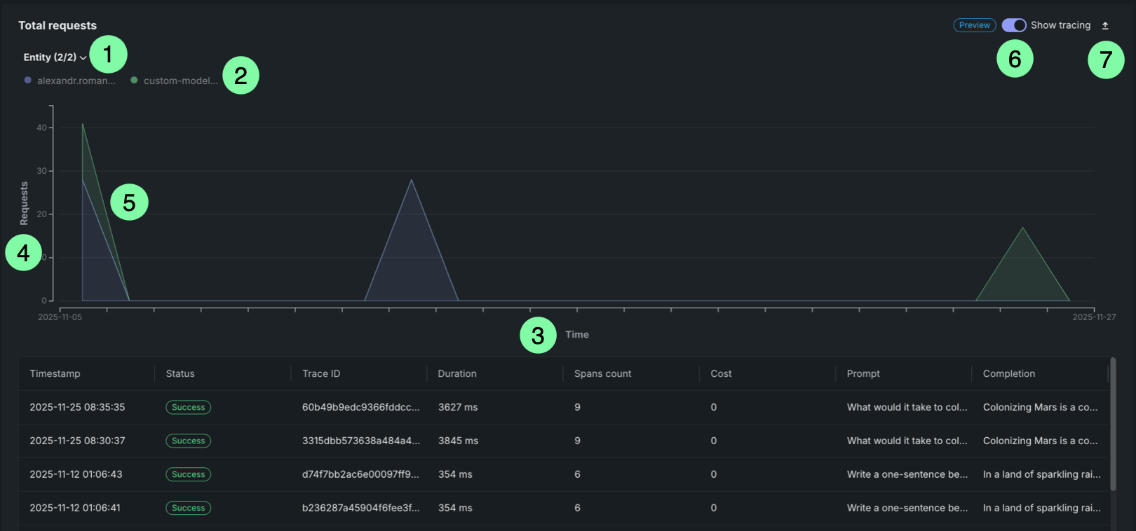
| チャートの要素 | 説明 | |
|---|---|---|
| 1 | Entity filter | Displays all entities (users or agents) included in the selected time range. Each entity is represented by a dot that matches the area in the chart. |
| 2 | Entity legend | Displays all entities (users or agents) included in the selected time range. Each entity is represented by a dot that matches the area in the chart. |
| 3 | Time range (X-axis) | Displays the time range selected in the filters, showing the date range from start to end. |
| 4 | Metric (Y-axis) | Displays the number of requests, rate limited requests, or tokens on the vertical axis. |
| 5 | Request areas | Overlapping areas show the volume of requests per entity over time. The height of each area at any point represents the number of requests for that entity at that time. This chart is a stacked chart (or stacked graph), a chart stacking multiple data series on top of each other to visualize how each entity contributes to the total over time and across categories. |
| 6 | トレース | Click Show tracing to view tracing data for the requests. |
| 7 | エクスポート | Click Export to download a .csv file. |
Hover over the chart to view detailed information about the number of requests for each entity at specific time points.
Request tracing table
プレミアム機能
トレースはプレミアム機能です。 この機能を有効にする方法については、DataRobotの担当者または管理者にお問い合わせください。
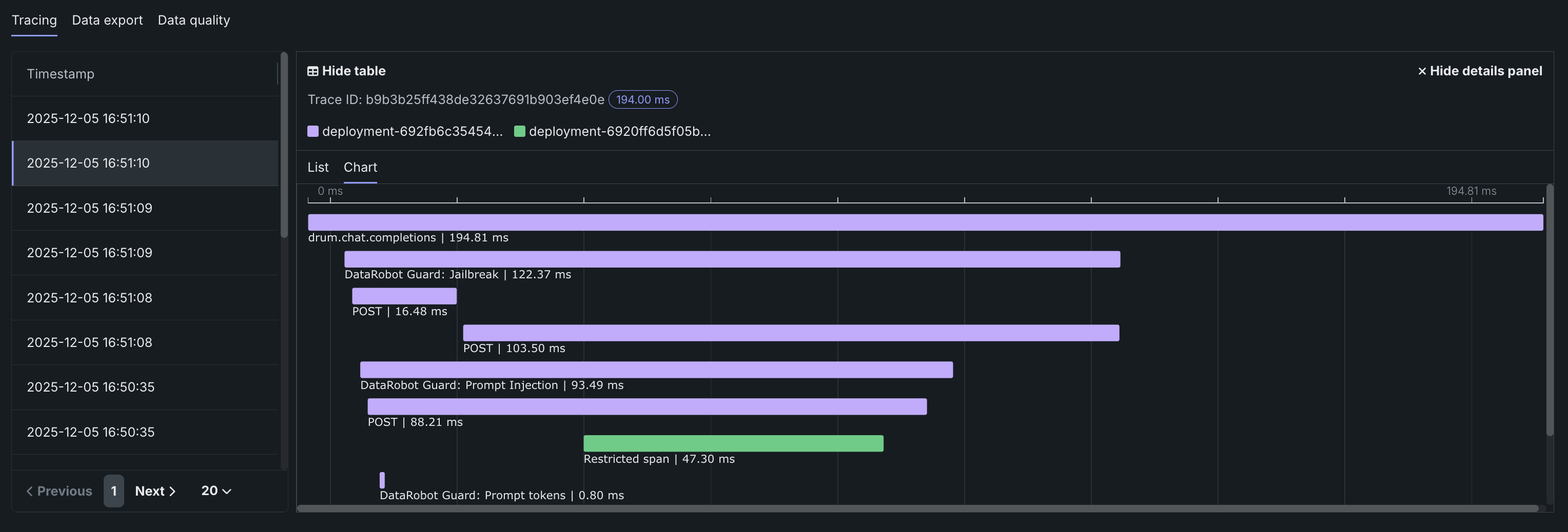
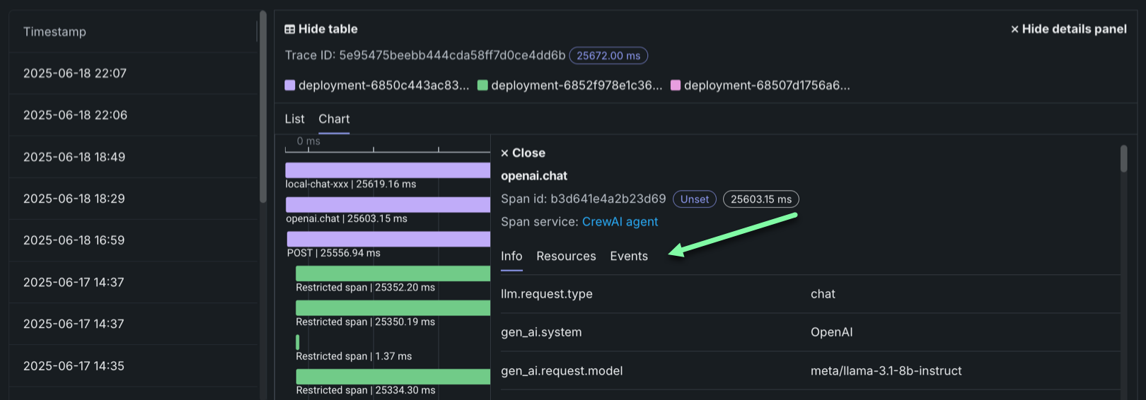
On any Quota monitoring chart, click Show tracing to view tracing data for the deployment. このトレースチャートは、データ探索タブにあるトレースチャートと同様に機能します。
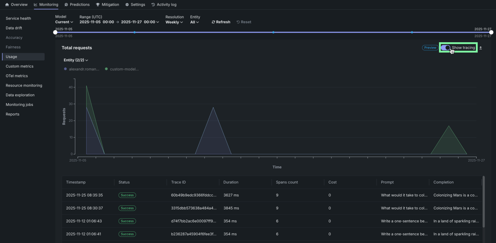
トレースは、モデルまたはエージェントのワークフローに対するリクエストがたどった経路を表します。 DataRobotでは、トレースにOpenTelemetryフレームワークを使用しています。 トレースは、起点から解決まで、リクエストのエンドツーエンドの経路全体を追跡します。 各トレースには、ルートスパンから始まる1つ以上のスパンが含まれます。 ルートスパンはリクエストの経路全体を表し、プロセスの各ステップの子スパンが含まれます。 ルート(または親)スパンと各子スパンは、同じトレースIDを共有します。
アクセスと保持
トレーステーブルは、すべてのカスタムモデルおよび外部モデルのデプロイで利用できます。 トレースデータは30日間保存され、その後自動的に削除されます。
トレーステーブルでは、各トレースに関連する以下のフィールドを確認できます。
| 列 | 説明 |
|---|---|
| タイムスタンプ | YYYY-MM-DD HH:MM形式でのトレースの日時。 |
| ステータス | すべてのスパンを含むトレースの全体的なステータス。 依存タスクが失敗した場合、ステータスはエラーになります。 |
| トレースID | トレースの一意の識別子。 |
| 期間 | トレースの完了にかかった時間(ミリ秒単位)。 この値は、(四捨五入された)ルートスパンの期間と同じで、子スパンによって表されるすべてのアクションが含まれます。 |
| スパン数 | トレースに含まれる完了したスパン(アクション)の数。 |
| コスト | コストデータが指定されている場合は、トレースの総コスト。 |
| プロンプト | トレースに関連するユーザープロンプト。 |
| 補完 | トレースのプロンプトに関連付けられているエージェントまたはモデルの回答(補完)。 |
| ツール | トレースで表されたリクエスト中に呼び出されるツールまたはツール群。 |
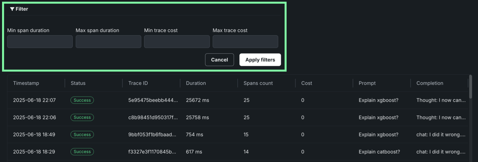
フィルターをクリックして、最小スパン期間、最大スパン期間、最小トレースコスト、最大トレースコストでフィルターします。 スパンフィルターの単位はナノ秒(ns)です。チャートにはスパンがミリ秒(ms)で表示されます。
フィルターのアクセシビリティ
スパンが詳細ビューに展開されると、 フィルターボタンは非表示になります。 フィルターを適用したチャートビューに戻るには、 詳細パネルを表示しないをクリックします。
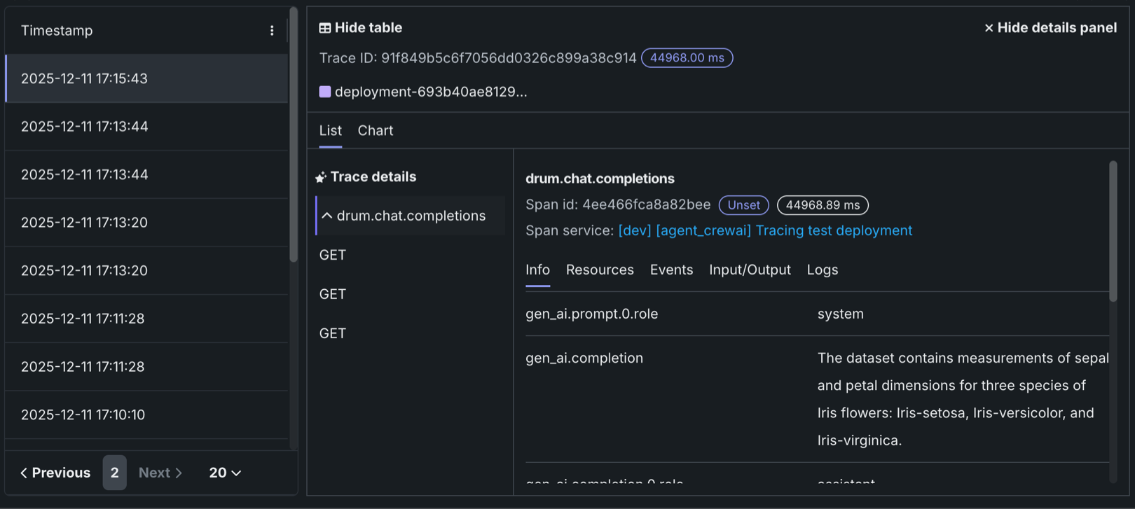
トレースに含まれるスパンとトレースの詳細を確認するには、トレーステーブルのトレース行をクリックします。 スパンの色は、スパンサービス(通常はデプロイ)に対応します。 スパンに関連付けられたデプロイまたはサービスへのアクセス権がない場合、制限されたスパンが表示されます。 スパンはチャート形式またはリスト形式で表示できます。
スパンの詳細をコントロール
どちらのビューからでも、 テーブルを表示しないをクリックしてタイムスタンプテーブルを折りたたんだり、 詳細パネルを表示しないをクリックして展開されたトレーステーブルビューに戻ったりすることができます。
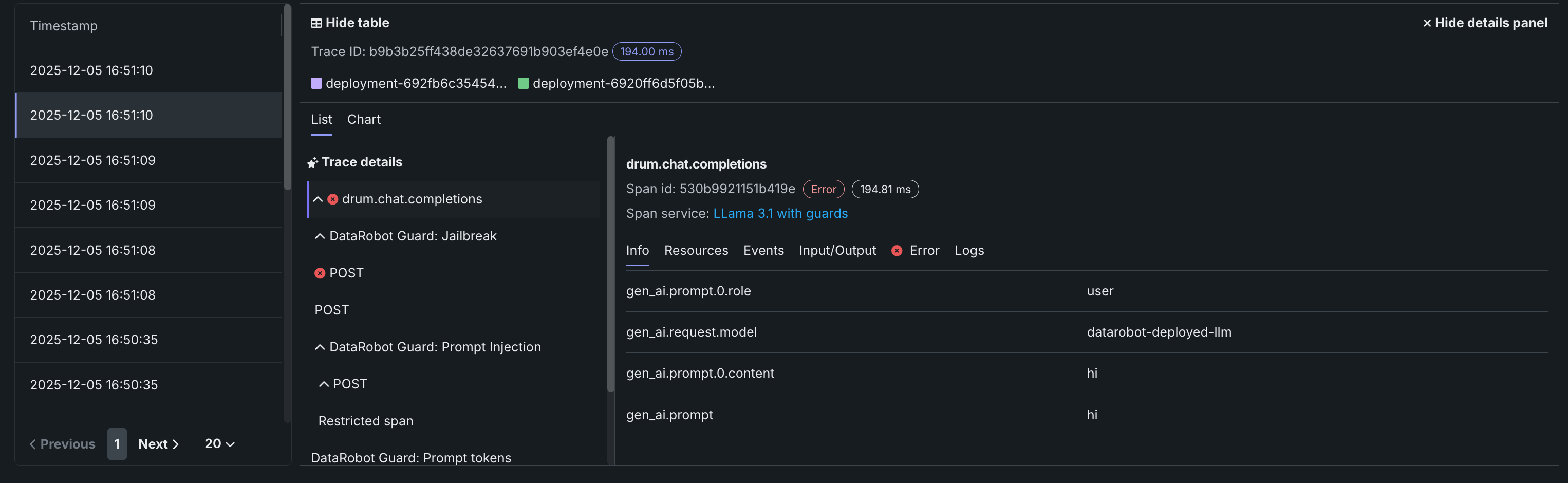
トレースの詳細
リストビューでトレースの詳細をクリックすると、現在のスパンに関連付けられているトレースに関する入力/出力(プロンプトと補完)および評価の詳細を表示できます。
どちらのビューでも、スパンサービス名をクリックして、デプロイまたはリソースにアクセスします(アクセス権がある場合)。 生成AIモデルまたはエージェントワークフローの設定に応じた追加情報を、情報、リソース、イベント、入力/出力、エラー、ログの各タブで入手できます。 エラータブは、トレースでエラーが発生した場合にのみ表示されます。
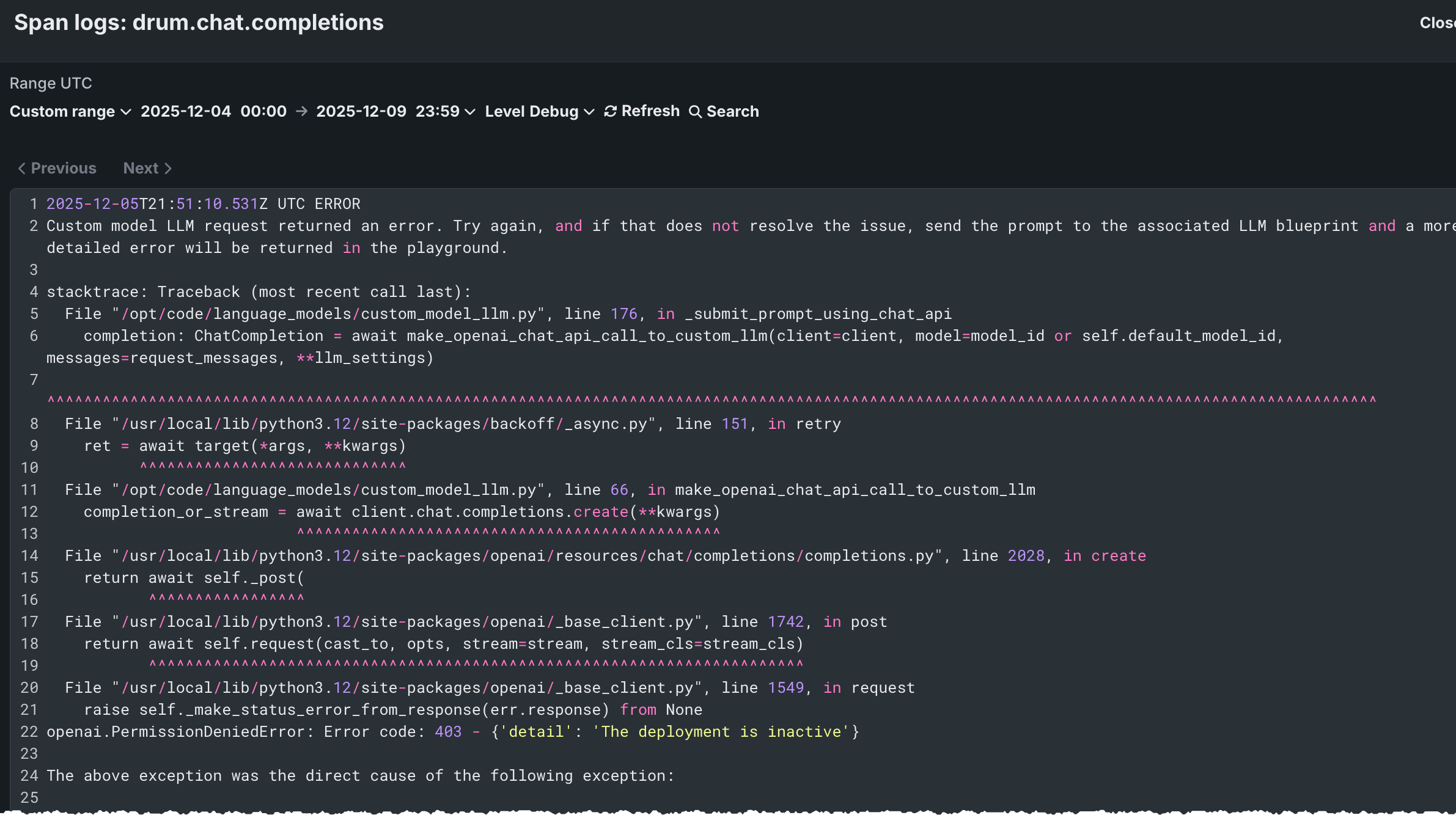
トレースログをフィルター
リストビューから、スパンのOTelログを表示できます。 表示される結果は完全なデプロイログのサブセットであり、以下のようにアクセスされます。
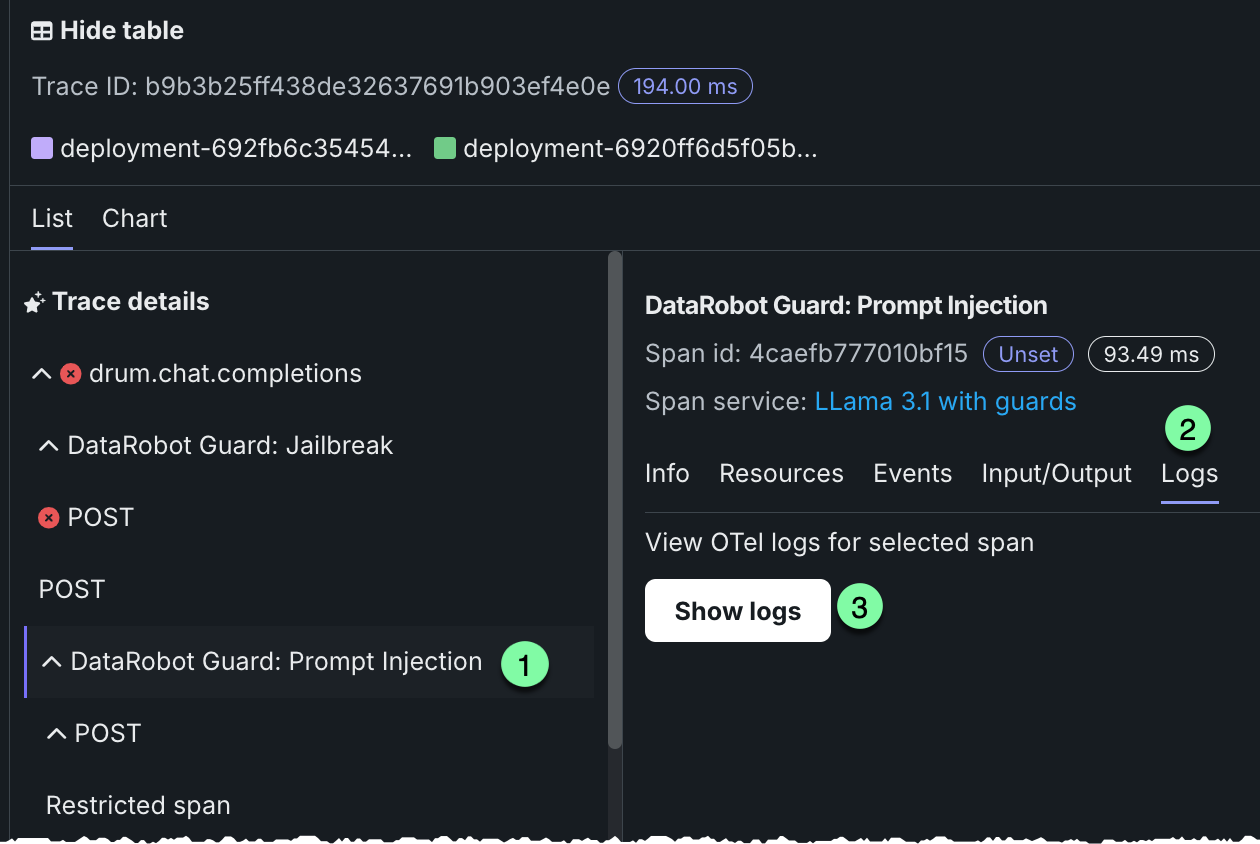
-
リストビューを開き、トレースの詳細でスパンを選択します。
-
ログタブをクリックします。
-
ログを表示をクリックします。
トレーステーブルのOTel属性
コスト、プロンプト、補完、およびツールについては、DataRobotはトレースに属するすべてのスパンにわたる特定のスパン属性を読み取ります。 その他の列(タイムスタンプや期間など)は、これらの属性ではなく、トレースおよびスパンのメタデータから取得されます。
| 列 | OpenTelemetryのマッピング |
|---|---|
| コスト | トレース内のスパンにある datarobot.moderation.cost属性の数値を合計します(その属性が存在する場合)。 |
| プロンプト | gen_ai.prompt属性を使用します。 複数のスパンにgen_ai.promptが含まれている場合、トレース順で最初に検出された値が表示されます。 |
| 補完 | gen_ai.completion属性を使用します。 複数のスパンにgen_ai.completionが含まれている場合、トレース順で最後に検出された値が表示されます。 |
| ツール | トレース内のスパンで検出されたtool_name属性の一意の値をすべて収集し、それらのツール名を列に一覧表示します。 |
属性キーは完全に一致する必要があります(gen_ai内のアンダースコアも含みます)。 genai.promptやGenAI.promptといった名前は、プロンプトおよび補完列では読み込まれません。
自動計装(DataRobotのエージェントテンプレートを含む)では、多くの場合、gen_ai.prompt、gen_ai.completion、そして場合によってはtool_nameが設定されます。 カスタムモデルや外部モデルの場合、フレームワークが異なります。ツールが実行されても(たとえば、一部のLangGraphコールバックフロー)、実行時にtool_nameが出力されない場合があります。 その場合、プロンプトと補完には値を設定できますが、ツールについては、ツール内で実行されるスパンにtool_nameが設定されるまでは空のままになります。トレースの実装を参照してください。
レート制限されたリクエストテーブル
The Rate limited requests table provides a detailed breakdown of rate limiting by entity:
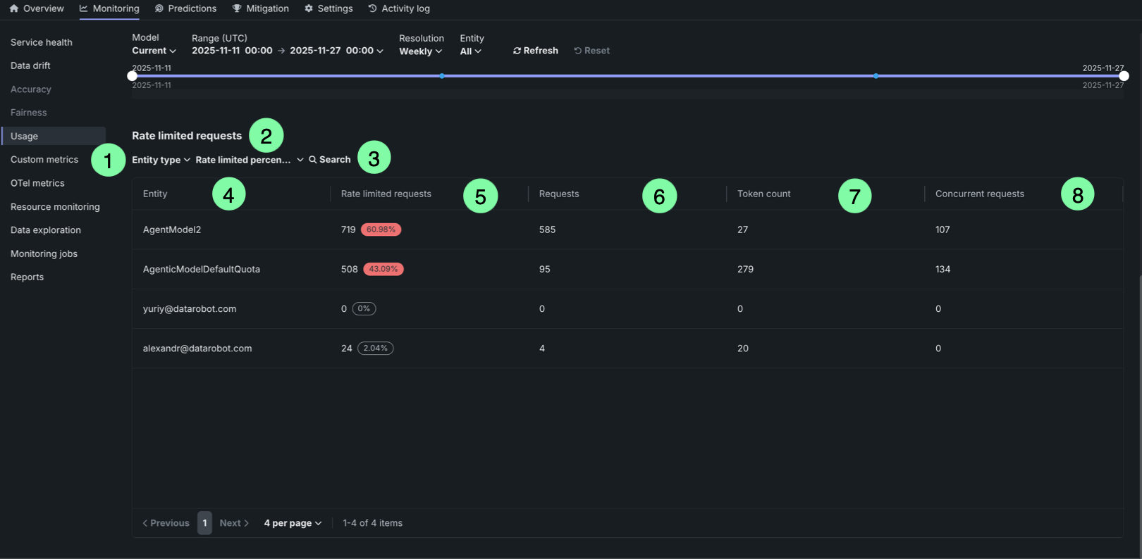
| テーブル要素 | 説明 | |
|---|---|---|
| 1 | Entity type filter | Filter the table by entity type (user or agent). |
| 2 | Rate limited percentage filter | Filter entities by their rate limited percentage threshold (zero, low, medium, or high). |
| 3 | Search box | Search for specific entities by name or identifier. |
| 4 | Entity column | Displays the entity identifier (user email or agent name). |
| 5 | Rate limited requests column | Shows the number of rate limited requests and the percentage of total requests that were rate limited. The percentage is highlighted in red when it exceeds a threshold, or displayed in gray when it is 0%. |
| 6 | Requests column | Displays the number of requests that were rate limited due to exceeding the request quota. |
| 7 | Token count column | Displays the number of requests that were rate limited due to exceeding the token quota. |
| 8 | Concurrent requests column | Displays the number of requests that were rate limited due to exceeding the concurrent requests quota. |
The table helps identify which entities are experiencing rate limiting and to what extent, allowing you to adjust quotas or usage patterns accordingly.