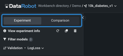
エクスペリメントの評価(エクスペリメントタブ)
リーダーボードから、モデルをクリックして視覚化にアクセスして、さらに詳しく調べることができます。 これらのツールを使用すると、次のエクスペリメントで何をする必要があるかを評価するのに役立ちます。 リーダーボードには2つの「フレーバー」があります。
- This page describes the insights available from the Experiment tab, which helps to understand and evaluate models from a single experiment.
- 比較タブページも参照してください。このタブページでは、単一のユースケース内の任意の数のエクスペリメントから、同じタイプ(二値、連続値など)のモデルを最大3つ比較できます。 比較ツールは、タブまたはパンくずのエクスペリメント名のドロップダウンからアクセスできます。
モデルのインサイト
モデルのインサイトは、モデルによる予測の根拠を解釈、説明、検定するのに役立ちます。 得られるインサイトはエクスペリメントのタイプによって異なりますが、以下の予測モデリングインサイトの表にリストされているインサイトが含まれる場合があります。 スライスされたインサイトが利用できるかどうかもモデルに依存します。
本機能の提供について
The following insights are in preview in Workbench. For those that are off by default, contact your DataRobot representative or administrator for information on enabling them.
- Confusion matrix is on by default. 機能フラグ: 無制限の多クラス
- SHAPベースの予測の説明は、デフォルトで_オン_になっています。 機能フラグ: NextGenでユニバーサルSHAP
- ワードクラウドはデフォルトで オン になっています。 機能フラグ:ワークベンチでワードクラウド
| インサイト | 説明 | 問題のタイプ | スライスされたインサイト? |
|---|---|---|---|
| ブループリント | データの前処理とパラメーター設定を表すグラフを提供します。 | すべて | |
| 係数 | 最も有用な30の特徴量の相対的な影響を視覚的に示します。 | すべて。線形モデルのみ | |
| 混同行列 | Compares actual with predicted values in multiclass classification problems to identify class mislabeling. | 分類、時間認識 | |
| 特徴量ごとの作用 | 各特徴量の値の変化によってモデル予測がどのように変化するかを示します | すべて | ✔ |
| 特徴量のインパクト | モデルの決定を推進している特徴量を表示します。 | すべて | ✔ |
| リフトチャート | モデルがターゲットの母集団をどの程度うまく分割しているか、そしてターゲットを予測することができるかを示します。 | すべて | ✔ |
| 残差 | モデルの予測パフォーマンスと妥当性を理解するための散布図とヒストグラムを提供します。 | 連続値 | ✔ |
| ROC曲線 | モデルに関連した分類、パフォーマンス、および統計を調べるためのツールを提供します。 | 二値分類 | ✔ |
| SHAPでの予測説明 | 各特徴量が特定の予測にどの程度寄与するかを、平均値との差に基づいて推定します。 | 二値分類、連続値 | |
| ワードクラウド | テキスト特徴量がモデル予測に与える影響を視覚化します。 | 二値分類、連続値 |
モデルのインサイトを表示するには、左ペインのリーダーボードでモデルをクリックします。 時間を認識したエクスペリメントでは、得られるインサイトが異なることに注意してください。
ブループリント
ブループリントは、モデル構築に必要な前処理のステップ(タスク)、モデリングアルゴリズム、後処理のステップを含むMLパイプラインです。 ブループリントタブには、各ステップを示すブループリントのグラフィック表現を表示します。 ブループリント内のタスクをクリックすると、より完全なモデルドキュメント(ブループリントのタスク内からDataRobot Model Docsをクリック)を始めとする詳細が表示されます。
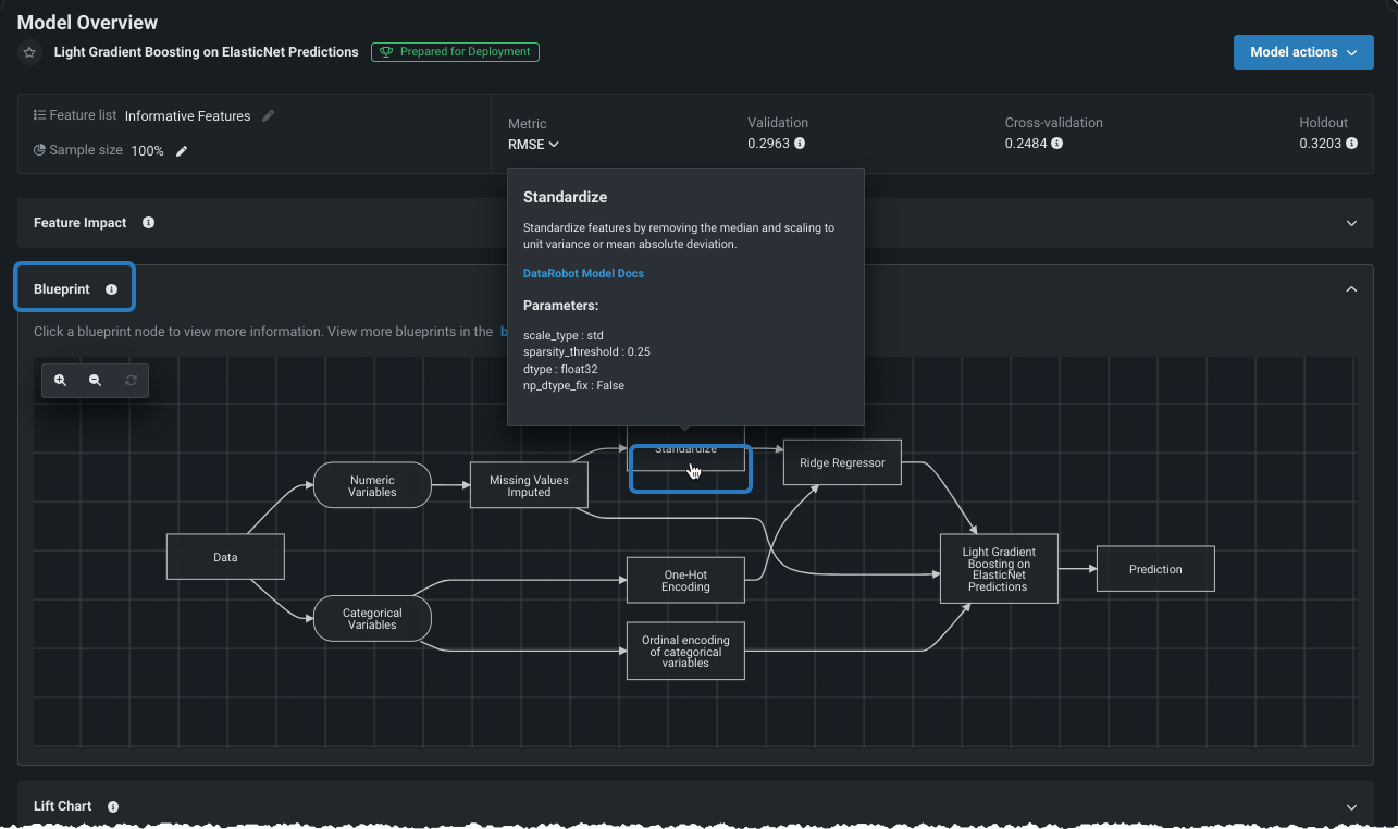
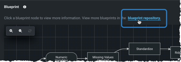
さらに、 ブループリントリポジトリに、ブループリントタブからアクセスできます。
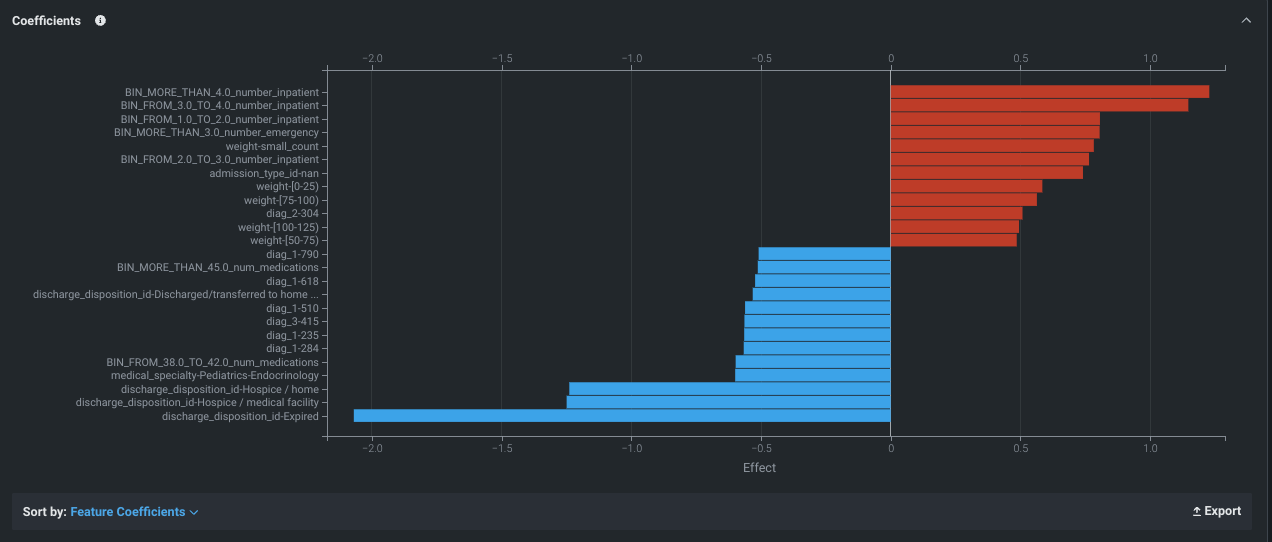
係数
サポートされているモデル(線形回帰およびロジスティック回帰)では、係数タブには、最も有用な30個の特徴量の相対的な影響が、(デフォルトでは)最終的な予測への影響が大きい順に並べ替えて表示されます。 positive効果のある特徴量は赤色で表示され、negative効果のある特徴量は青色に表示されます。 係数チャートは、モデル結果の評価に役立てるため、下記を判断します。
- そのモデルでの予測形成にどの特徴量が選択されたのか?
- 各特徴量の重要性はどの程度なのか?
- どの特徴量がプラスやマイナスの影響を与えるのか?
係数タブは、限られたモデルに対してのみ利用可能であることに注意してください。なぜなら、複雑なモデルの係数を短い解析形式で導き出すことは必ずしも可能ではないからです。
インサイトから、選択したモデルで予測を生成するためにDataRobotで使われるパラメーターと係数をエクスポートできます。
混同行列
The multiclass Confusion Matrix helps evaluate model performance in multiclass experiments. 「混同行列」という名前は、1つのクラスを別のクラスとして一貫した形で誤ったラベル設定(混同)を行うことにより、モデルがどのように2つ以上のクラスを混同するかを意味します。 The matrix compares actual with predicted values, making it easy to see if any mislabeling has occurred and with which values. (There is also a confusion matrix available for binary classification experiments, which can be accessed from the ROC Curve tab.)
See the Confusion Matrix deep dive for more detail, as well as insight considerations.
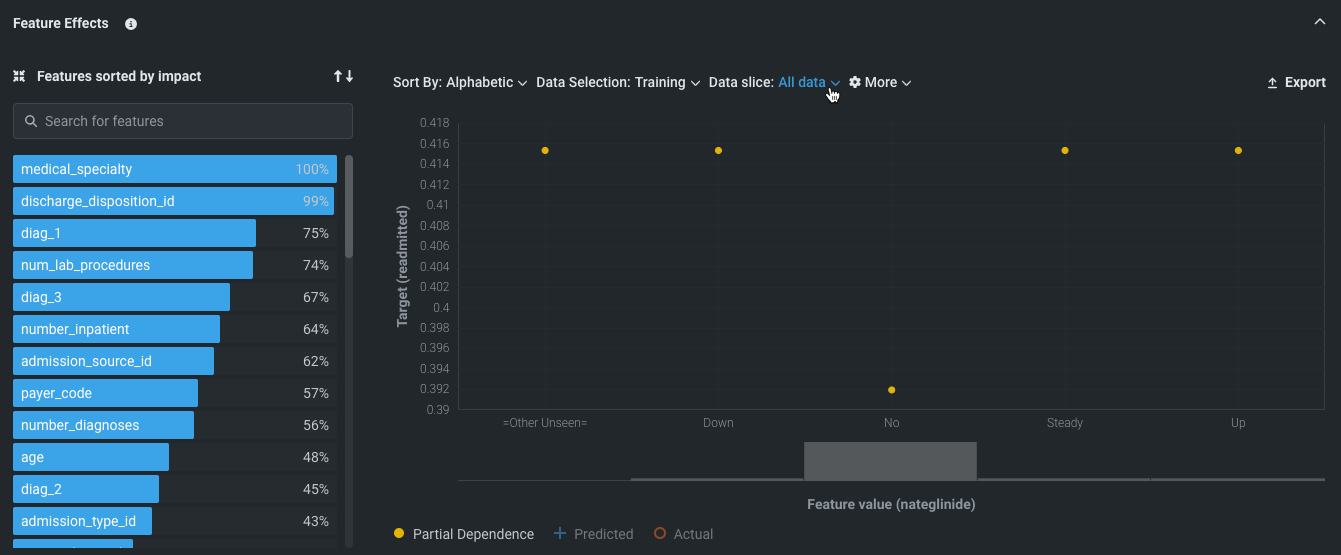
特徴量ごとの作用
特徴量ごとの作用のインサイトは、各特徴量の値の変化がモデル予測に与える影響を示します。モデルは各特徴量とターゲットの関係性をどのように「理解」しているのでしょうか? これはオンデマンドの機能で、最初に視覚化を開いたときに求められる 特徴量のインパクトの計算に依存します。 インサイトは、他のすべての特徴量が変化せずに維持された状態で1つの特徴量の値の変化によってモデルの予測にどのような影響が生じるかを示す 部分依存の観点から表示されます。
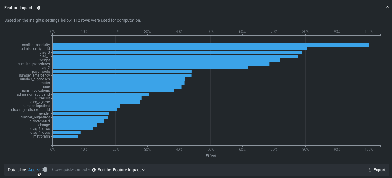
特徴量のインパクト
特徴量のインパクト モデルの決定を最も強力に推進している特徴量の高レベルの視覚化を提供します。 これはすべてのモデルタイプで使用可能で、オンデマンドの特徴量です。つまり、デプロイ用に準備されたモデルを除くすべてのモデルで、結果を表示するには計算を開始する必要があります。
- 特徴量の名前やバーにカーソルを合わせると、追加情報が表示されます。
- ソート条件を使用して、インパクトまたは特徴量名でソートするように表示を変更します。
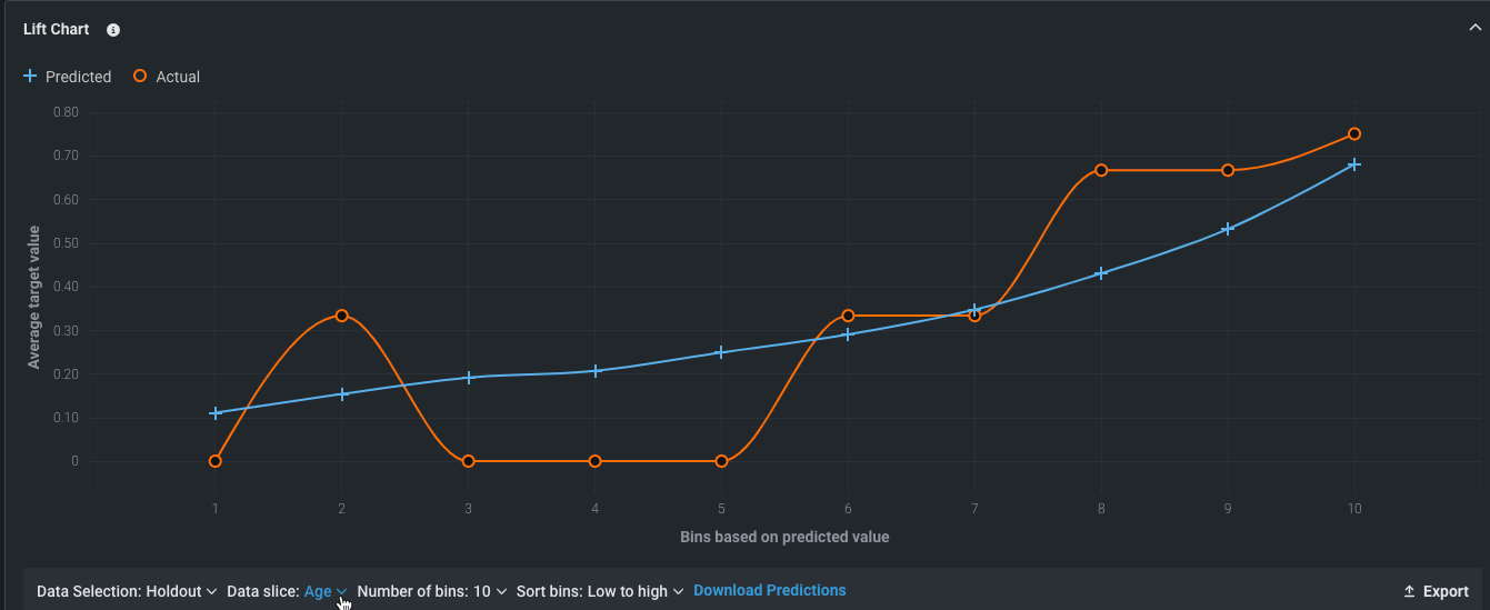
リフトチャート
モデルの有効性を視覚化するために、 リフトチャートは、モデルがターゲット母集団をどの程度適切にセグメント化しているか、およびターゲット特徴量の値のさまざまな範囲に対して、モデルのパフォーマンスがどの程度良好かを示します。
- 任意のポイントにカーソルを合わせると、そのビンの行の予測値スコアと実測値スコアが表示されます。
- 表示条件を変更するにはコントロールを使用します
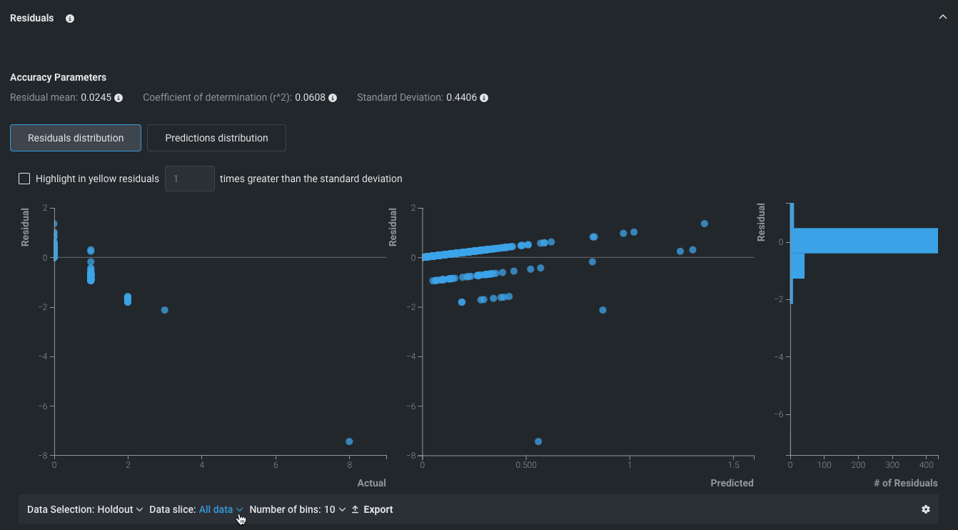
残差
連続値エクスペリメントでは、 残差タブが、連続値モデルの予測パフォーマンスおよび検定の正しい理解に役立ちます。 このタブでは、使用するデータセットの実測値に相対的にモデルがどのように正比例的にスケールするかを測定できます。 これには、残差分析に役立つ複数の散布図および1つのヒストグラムが表示されます。
- 予測値と実測値の比較
- 残差と実測値の比較
- 残差と予測値の比較
- 残差ヒストグラム
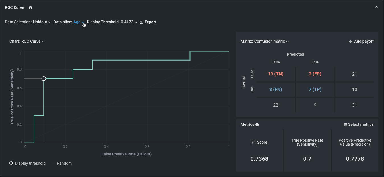
ROC曲線
分類エクスペリメントでは、ROC曲線タブには、確率スケール上の任意のポイントで、選択したモデルに関する分類、パフォーマンス、および統計を探索する以下のツールが用意されています。
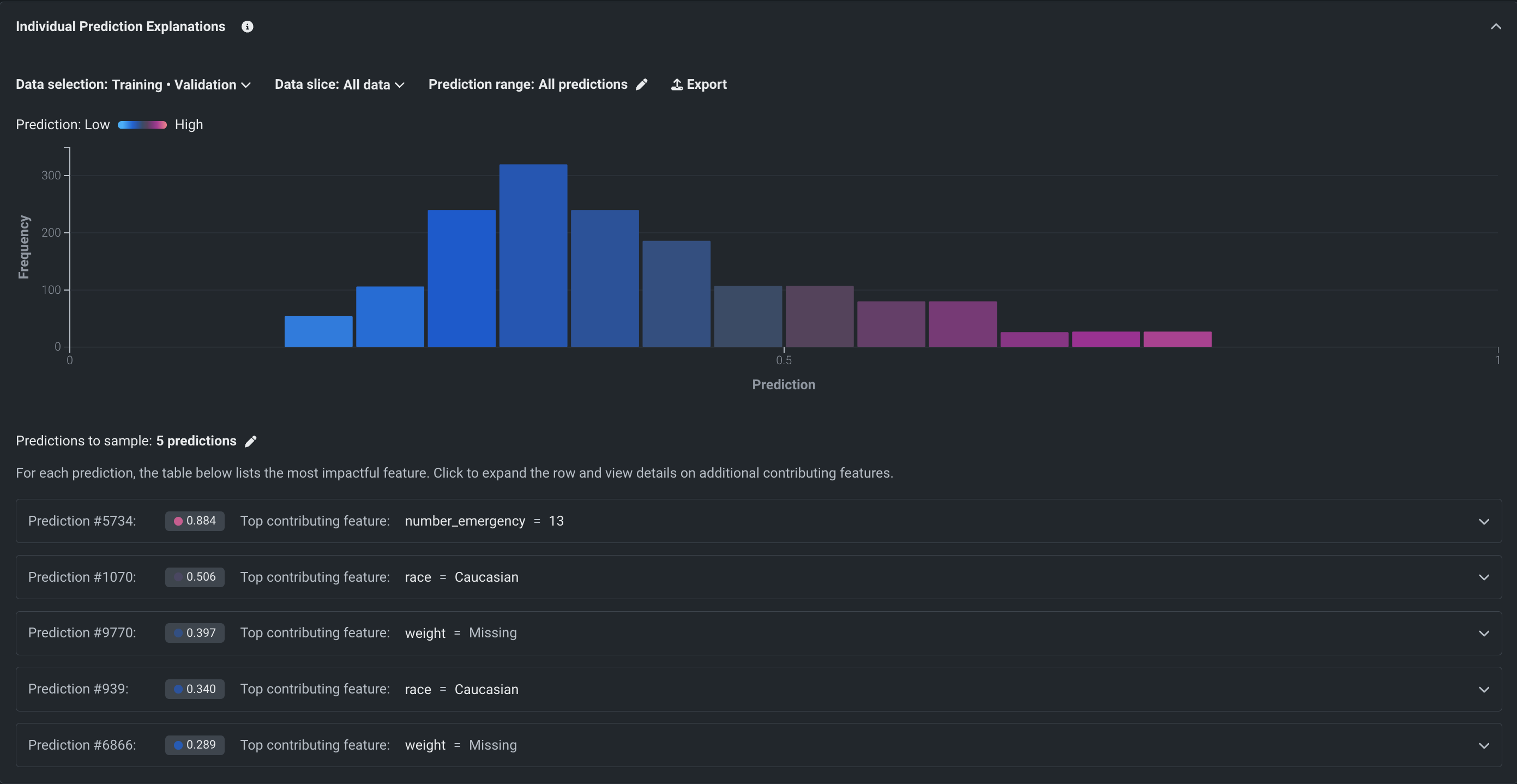
SHAPでの予測説明
時系列以外のプロジェクトの場合、SHAPベースの予測の説明は、予測を左右するものを行単位で説明します。 特徴量が予測に与える影響を定量的に示し、モデルがなぜそのような予測をしたのか、その理由を答えます。
SHAPの予測の説明は、各特徴量が平均とは異なる所定の予測にどの程度寄与しているかを推定します。 これらは直感的で、制限がなく(すべての機能について計算されます)、高速で、SHAPのオープンソースの性質上、透過的です。 SHAPは、モデルの動作をより深く、迅速に理解できるという利点があるだけでなく、モデルがビジネスルールに準拠しているかどうかを簡単に検証することもできます。
SHAPを使用して、モデルの決定ごとに鍵となる特徴量を理解します。 特定の顧客が購入を決断する要因(年齢、性別、購買習慣)。各要因に関する決定の度合い。
ワードクラウド
テキスト特徴量には、強い反応を示す単語が含まれていることがよくあります。 ワードクラウドのインサイトでは、最も影響力のある単語や短いフレーズを最大200個までワードクラウド形式で表示します。 文字の色は、単語の係数値を示します。クラウド内のレンダリングサイズは、データ内の単語の出現頻度を示します。
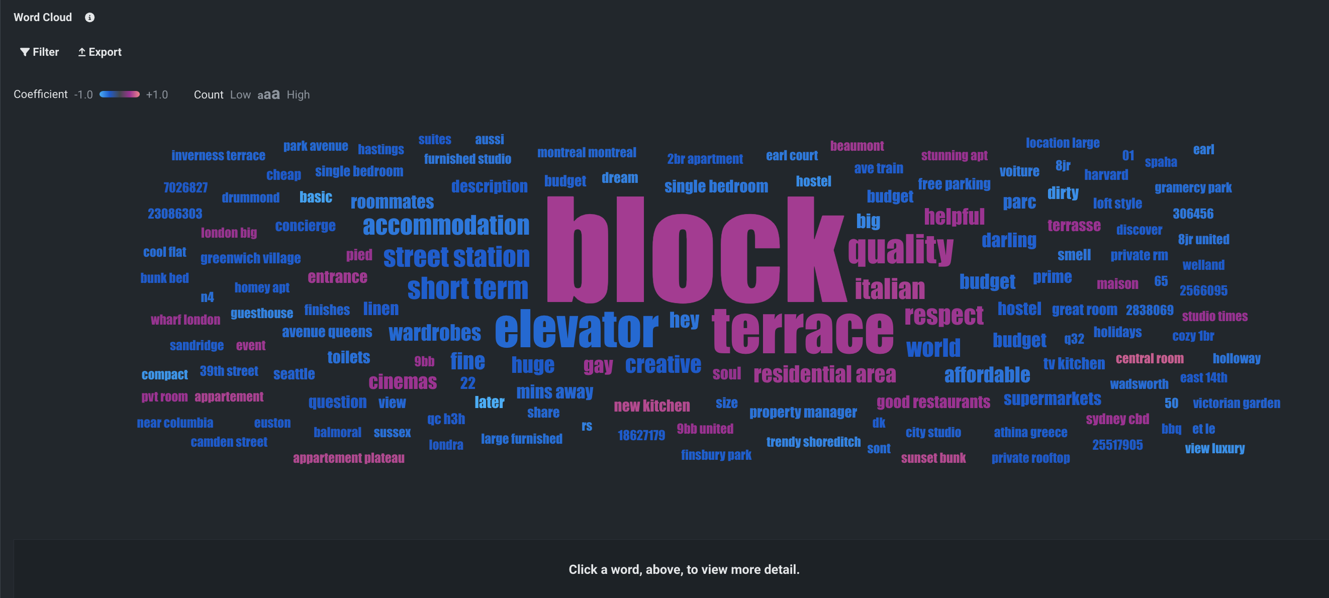
See the Word Cloud deep dive for more detail.
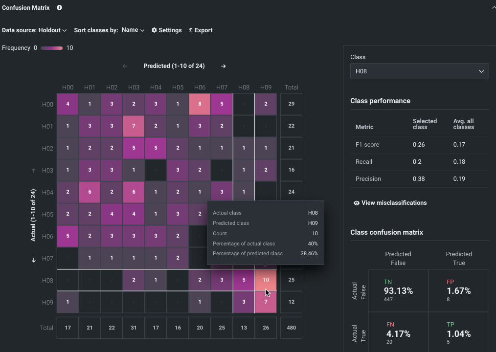
Confusion Matrix deep dive
The Confusion Matrix provides two visualizations:
- The multiclass matrix (1), which provides an overview of every class found for the selected target.
- The selected class matrix (2), which analyzes a specific class.
プロジェクトの構築に使用したトレーニングデータの結果に基づいて、両方の行列で各クラスの予測値と実測値が比較され、グラフィック要素によってクラスの誤ラベルが示されます。 多クラス分類混同行列は、選択したターゲットに対して見つかった各クラスの概要を示し、選択されたクラスの混同行列は特定のクラスを分析します。 これらの比較から、DataRobotモデルのパフォーマンスを判断することができます。 Wikipedia provides thorough details for help understanding confusion matrices.
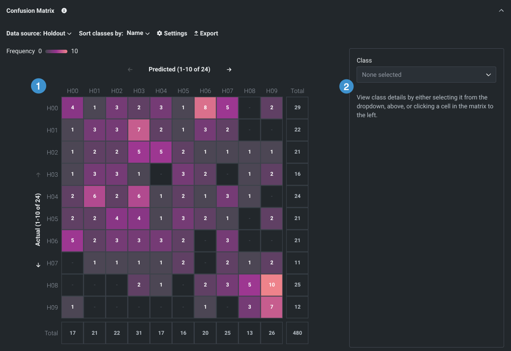
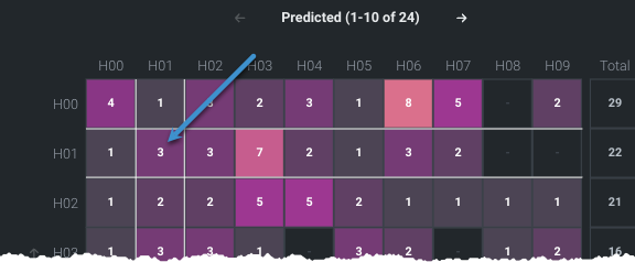
Multiclass matrix overview
The multiclass matrix, a heat map, provides a 10-cell by 10-cell overview, color-coded by frequency of occurrences, of every class (value) that DataRobot recognized for the selected target. Some tools for working with the matrix display include a multi-option toolbar (1), page scrolling (2), and two Total columns (3) to help understand the selected page in the context of the entire training set and the prevalence of a class across the dataset.
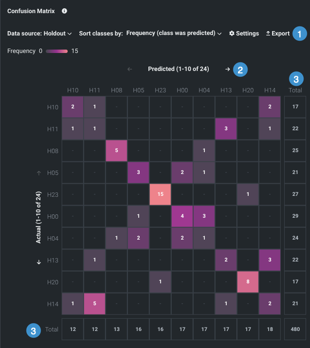
Cell ordering is dependent on the settings selected in the toolbar at the top of the insight.
| Selector | 説明 |
|---|---|
| データソース | Sets the partition from the training data that is used to build the matrix, with options dependent on the experiment type— validation or holdout for non-time aware, and backtest selection for OTV. |
| クラスのソート条件 | Sets the method used to sort and orient the matrix (name, frequency, scores), as well as the sort order (ascending or descending). |
| 設定 | Controls the representation basis (count or percentage) as well as the axis orientation. |
| エクスポート | Exports the full confusion matrix a CSV of the data, PNG of the image, or ZIP of both. The class matrix is not included. |
Sort classes options
The following describes the sort options:
| オプション | 説明 |
|---|---|
| 名前 | Sorts alphanumerically by the name of the class found in the training data, either ascending or descending based on the Order sort option. Each name is presented on both axes. Position—vertical or horizontal—is determined by the orientation chosen in Settings. |
| 頻度(クラスは実測) | Sorts by the number of times the given class was the predicted class. Occurrences for each class are recorded in the corresponding Total row or column. |
| 頻度(クラスは予測) | Sorts by the number of times the given class appeared as the actual class across the training data. Occurrences for each class are recorded in the corresponding Total row or column. |
| F1スコア | Provides a measure of the model's accuracy, computed based on precision and recall. |
| プレシジョン | Provides, for all the positive predictions, the percentage of cases in which the model was correct. Also know as Positive Predictive Value (PPV). |
| リコール | Reports the ratio of true positives (correctly predicted as positive) to all actual positives. Also known as True Positive Rate (TPR) of sensitivity. |
Settings options
The settings options set how to report the instances of actual vs predicted "confusion" in each cell:
| オプション | 説明 |
|---|---|
| 件数 | Reports the raw number of occurrences for the combination of actual and predicted classes. |
| 実測値のパーセンテージ | Reports the percentage of rows in which the actual class appeared in a given cell, in relation to the Total count (also known as "Recall"). |
| 予測値のパーセンテージ | Reports the percentage of rows in which the actual class appeared in a given cell, in relation to the Total count (also known as "Precision"). |
| 実測値の傾向 | Sets the axis that displays the actual values for each class. |
Understand the multiclass matrix
A perfect model would result in the matrix showing a diagonal line through the middle, with those cells referencing either 100% (if set to percentages) or the total number of classes (if set to count). All other cells would be empty. Because this is an unlikely outcome, use the following examples for help interpreting the matrix based on different sorting and settings. 以下の点に注意してください。
- When using percentages as the setting, all cells, across all pages, will total to 100% in the matrix for the result you are displaying by. (If set to percentage of actual, the actual class will sum to 100%.)
- When using count, all cells, across all pages, will total to the value in Total column.
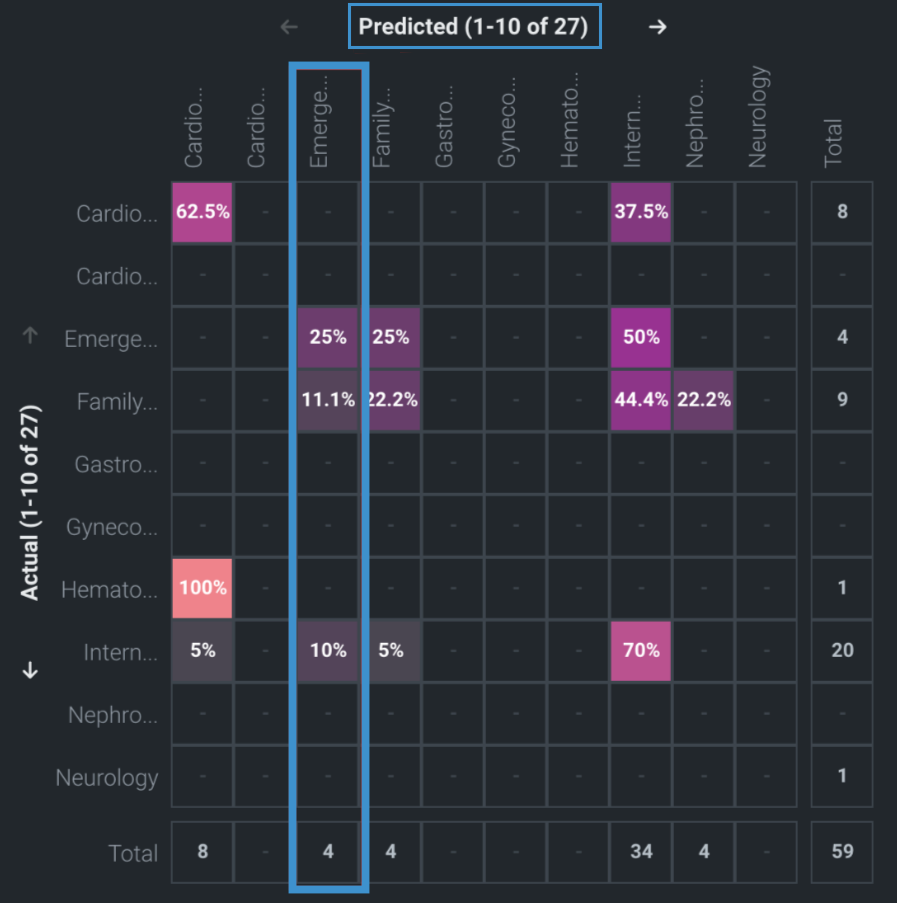
Consider the matrix below, where actuals are on the left axis, representing the actual class; predicted classes are across the top. Reading left to right tells you, "for all the rows where Actual = X, how often did DataRobot predict each the other class?" This matrix sets the display by Count.
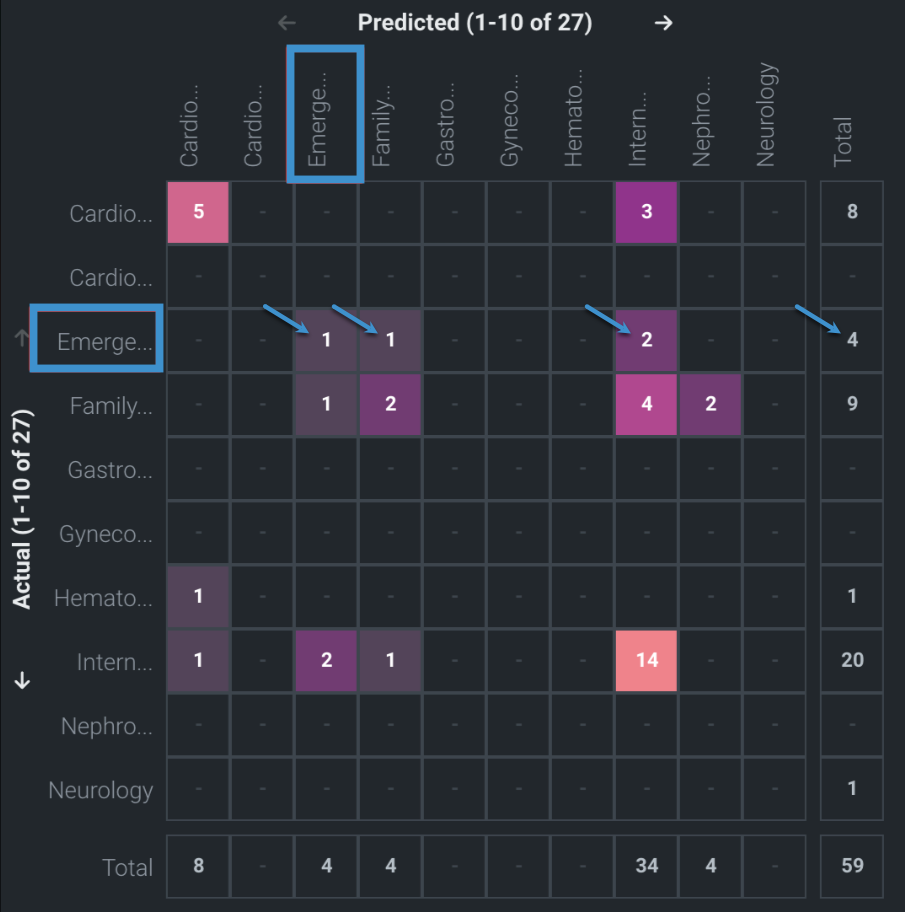
For this example, the model found 27 classes, reported on the axis labels (for example, "Predicted (1-10 of 27")).
Focusing on Emergency/Trauma = Actual, looking across the row:
- The Total column reports that there are
4rows with this actual class. -
The interior cells indicate that, for rows where
Actual = Emergency/Trauma, DataRobot predicted:- Emergency/Trauma
1time (correct prediction) - Family/General Practice
1time - Internal Medicine
2times
- Emergency/Trauma
Now view the matrix set to Percentage of actuals, which shows the values as the raw count divided by the total:
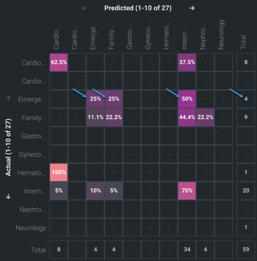
The percentages for Emergency/Trauma = PREDICTED do not sum to 100%. This is because the percentages are taken from actuals, not predicted.
If you change the setting to Percent of predicted, the percentages in that column will sum to 100%.
Now consider the story that coloring tells by viewing the three settings side-by-side:
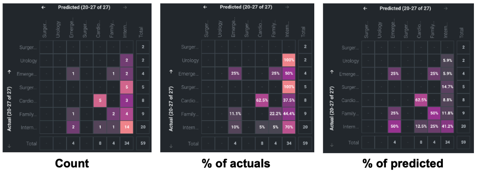
When viewing by Count, the coloring is based on the maximum value in the visible cells. This means that the most common classes will dominate over rarer classes. In the first screenshot, InternalMedicine is the most common class in both actuals and predicted, so it is assigned the brightest cell. Predicted InternalMedicine vs Actual InternalMedicine is the brightest, with 14 occurrences.
To understand how well the model performs per-class, set to Percentage of actuals; the coloring now reflects an absolute 0-100% scale. This effectively normalizes the data, and because of that, a different story unfolds. Now, Predicted InternalMedicine vs Actual InternalMedicine is a lot less bright because those 14 occurrences represent only 70% (14 occurrences of correct prediction divided by 20 total occurrences) of all the rows where Actual = InternalMedicine
Now consider Actual Urology vs Predicted InternalMedicine. By Count it is colored very dark because there were only two occurrences, versus the maximum of 14 occurrences in this view—there were only two rows in total where Actual = Urology. But looking at Percentage of actuals, the matrix (brightly) reports that in 100% of the rows DataRobot predicted Actual = InternalMedicine.
Switching the setting (coloring) to Percentage of predicted tells a similar story, but for the predicted classes. The third screenshot shows that Predicted InternalMedicine vs Actual InternalMedicine that was so bright when colored by count is even darker still. Because those 14 occurrences are just 41.2% of all the rows where we predicted InternalMedicine.
Work with the matrix
To work with the matrix:
- Use the arrows in the axes Predicted and Actual legends to scroll through all classes in the dataset.
-
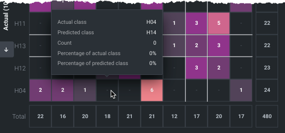
Click in a row or column to highlight (with white border lines) all occurrences of that feature in the cell. The four-sided cell indicates the count of times in which the actual class and predicted class are the same. Notice that the cell you click sets the select class matrix to the right.
-
Hover on a cell to view statistics. The values report the cell's class combination as well as the values for each option selectable from the Settings dropdown.
Selected class matrix
Use the selected class matrix to analyze a specific class. To select a class, either click in the full matrix or choose from the dropdown. Choosing from the dropdown updates the highlighting in the multiclass matrix to focus on the current individual selection. Changing axes in the multiclass matrix changes the layout of the selected class confusion matrix.
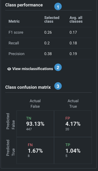
The selected class matrix shows:
-
Individual and aggregate statistics for a class—per-class performance (1).
Metric descriptions
The following provides a brief description of each metric.
指標 説明 F1スコア モデルの精度を測るスケールで、陽性的中率とリコールに基づき計算されます。 リコール Also known as Sensitivity or True Positive Rate (TPR). 実測されたすべての陽性の中で、True Positives(陽性だと正しく予測された場合)が占める比率。 プレシジョン Also known as Positive Predictive Value (PPV). すべての陽性(Positive)の予測に関してモデルが正しかったパーセンテージ。 -
Percentage of actual and predicted misclassifications for a selected class (2).
-
An individual class confusion matrix, in the same format as the matrix available in the ROC Curve for binary projects (3).
Quadrant descriptions
選択されたクラスの混同行列は、四分割されます。その概要を以下の表に示します。
象限 説明 True Positive (TP) For all rows in the dataset that were actually ClassX, what percent did DataRobot correctly predict as ClassX? True Negative (TN) For all rows in the dataset that were not ClassX, what percent did DataRobot correctly predict as not ClassX? False Positive (FP) For all rows in the dataset that DataRobot predicted as ClassX, what percent were not ClassX? This is the sum of all incorrect predictions for the class in the full matrix. False Negative (FN) For all rows in the dataset that were ClassX, what percent did DataRobot incorrectly predict as something other than ClassX?
Word Cloud deep dive
ワードクラウドでは、個々の単語の詳細を表示したり、表示を絞り込んだり、インサイトをエクスポートしたりできます。
備考
モデルのワードクラウドは、データセット全体ではなく、そのモデルのトレーニングに使用されたデータに基づいています。 たとえば、64%のサンプルサイズでトレーニングされたモデルは、同じ64%の行を反映したワードクラウドになります。
単語の詳細を表示
インサイトに表示される用語をクリックすると、詳細が表示されます。 例:
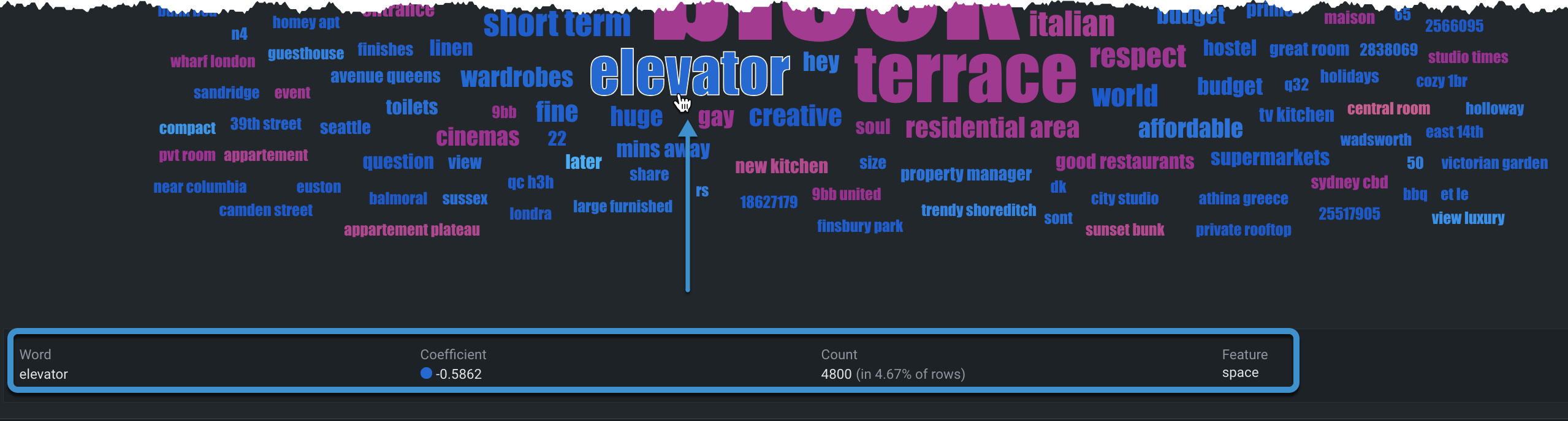
| 詳細 | 説明 |
|---|---|
| 単語 | 選択した単語。 もう一度クリックすると選択が解除され、詳細がクリアされます。 |
| 係数 | 指定された親特徴量のコンテキストにおける、その単語とターゲットの正または負の相関関係。 たとえば、糖尿病のデータセットでは、insulinという単語が複数の異なるテキスト列に表示され、それぞれの列で係数が異なる可能性があります。 |
| 件数 | データ内でその単語が出現した行の数を、実際の行数とパーセンテージの両方で表します。 |
| 特徴量 | その単語が見つかったデータの特徴量(親特徴量)。 |
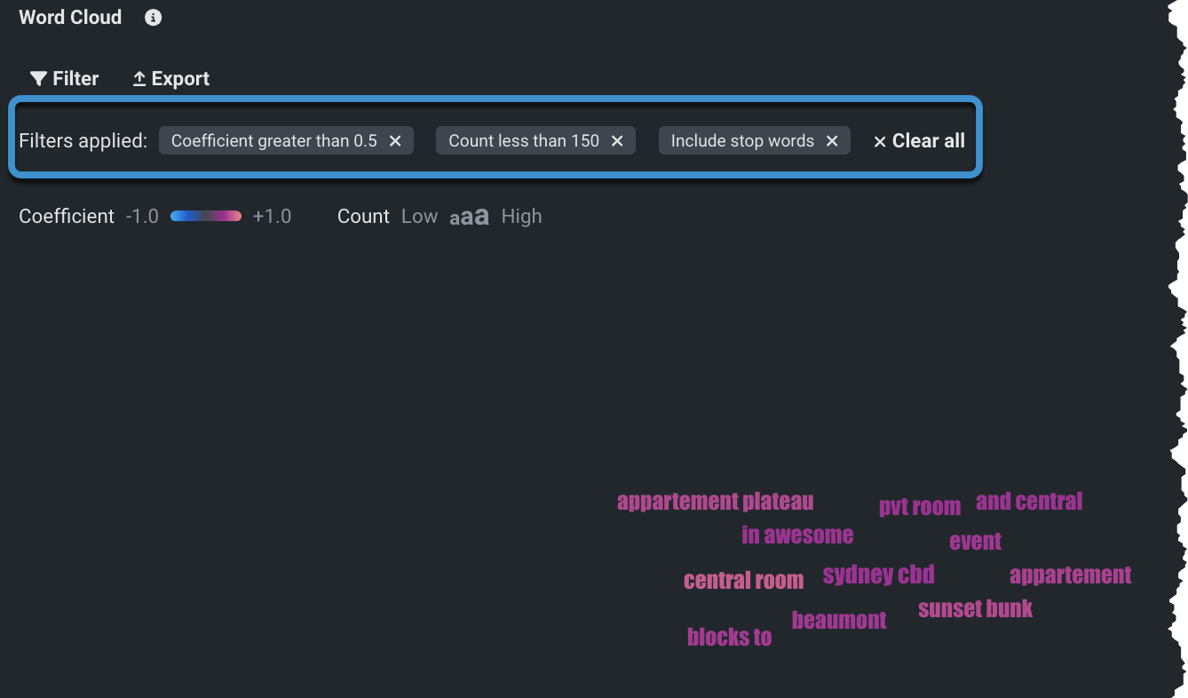
表示のフィルター
フィルターオプションを使用して、結果に含める単語の条件を設定します。 フィルターを適用すると、ワードクラウドが更新され、該当する単語のみが表示されます。
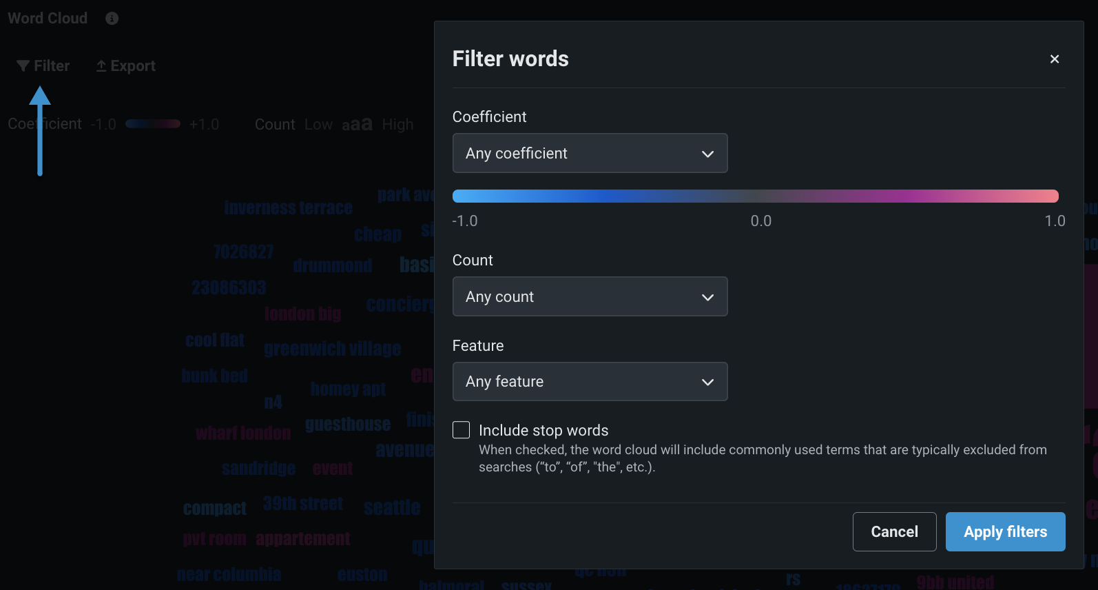
| フィルター | 説明 |
|---|---|
| 係数 | ドロップダウンを使用して、表示される単語の係数値の範囲を設定します。 選択内容(任意、より大きい、より小さい、含まれる、含まれない)に応じて、追加のエントリーボックスが使用可能になります。 |
| 件数 | ドロップダウンを使用して、単語数の値の条件を設定します。 選択内容(任意、より大きい、より小さい)に応じて、追加のエントリーボックスが使用可能になります。 |
| 特徴量 | ドロップダウンを使用して、特定の親特徴量を選択します。 その特徴量の列に出現した単語だけが表示されます。 |
| ストップワードを含める | このチェックボックスをオンにすると、通常検索から除外される一般的な用語("to"、"of"、"the"など)が表示されます。 オフにすると、一般的な用語は表示されません。 |
フィルターを個別にクリアするか、すべてクリアすると、元の表示に戻ります。
エクスポート
ワードクラウド全体をCSV、PNG、またはZIPファイルとしてエクスポートできます。 適用されたフィルターはエクスポートされたファイルには反映されませんが、ストップワードの削除は 適用されます 。
テキストベースのインサイトの可用性
これらのテキストインサイトのいずれかが表示されることを予期していたのに表示されない場合には、ログタブでエラーメッセージを表示して、モデルがない理由を確認してください。
テキストモデルが構築されない最も一般的な理由は、DataRobotでモデルを構築する際に単一文字の「ワード」が削除されるからです。 この処理は、そのようなワードが一般的に情報を提供するものではないからです(英語の「a」や「I」など)。 この削除による副作用は、1桁の数字も削除されることです。 したがって、「1」、「2」、「a」、「I」などが削除されます。 これはテキストマイニングにおける一般的な手法です(Sklearn Tfidf Vectorizerの「2つ以上の英数文字のトークンを選択」する手法など)。
これは、(一部の組織でデータを匿名化するために行っているように)エンコードしたワードを数値として使用する場合に問題となります。 たとえば、「john jacob schmidt」の代わりに「1 2 3」を使用した場合、および「john jingleheimer schmidt」の代わりに「1 4 3」を使用した場合、1桁の数字が削除され、テキストは「」と「」になります。 DataRobotで(1桁の数値であるために)テキスト型の特徴量のワードがまったく検出できない場合、エラーになります。
このエラーの回避策として、2つの方法があります。
- 番号の振り当てを10から開始する(「11 12 13」や「11 14 13」など)
- 各IDに1文字を追加する(「x1 x2 x3」や「x1 x4 x3」など)。
コンプライアンスドキュメント
DataRobotは、モデル開発に関連する多くの重要なコンプライアンスタスクを自動化することによって、規制の厳しい業界でデプロイまでの時間を短縮できます。 各モデルに対して個々のドキュメントを生成し、効果的なモデルリスク管理に関する包括的なガイダンスを提供できます。 レポートは、編集可能なMicrosoft Wordドキュメント(.docx)としてダウンロードできます。 生成されたレポートには、規制への準拠要求に応じた適切なレベルの情報および透明性が含まれます。
モデルコンプライアンスレポートの形式と内容は規定されていませんが、十分に堅牢なモデル開発、実装、および使用ドキュメントを作成するテンプレートとして機能します。 ドキュメントは、モデルのコンポーネントが意図したとおりに機能すること、それが意図したビジネス目的に対して適切であること、およびモデルが概念的に堅牢であることを示す証拠を提供します。 このため、レポートは、連邦準備制度理事会のシステムのSR11-7:モデルリスク管理に関するガイダンス完成に役立ちます。Guidance on Model Risk Management(モデルリスク管理に関するガイダンス)への準拠に役立ちます。
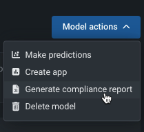
コンプライアンスレポートを生成するには:
- リーダーボードからモデルを選択します。
-
モデルアクションドロップダウンから、コンプライアンスレポートを生成を選択します。
-
ワークベンチはダウンロード先の場所を求めるメッセージを表示します。選択すると、エクスペリメントを続けている間に、バックグラウンドでレポートを生成します。
次のアクション
モデルを選択した後、エクスペリメント内から以下の操作を行うことができます。